
VYBE
Six flavours. One recognisable system.
- Problem
- Six energy-pouch flavours had to stand apart on a small round lid and still read as one brand.
- Solution
- A fixed system: angular wordmark, dark base and set positions. Only flavour colour, imagery and name change.
- Result
- 18 print-ready labels (lid, side and back for all six flavours), plus a taller rectangular format on the same rules.
My role Visual identity · packaging system
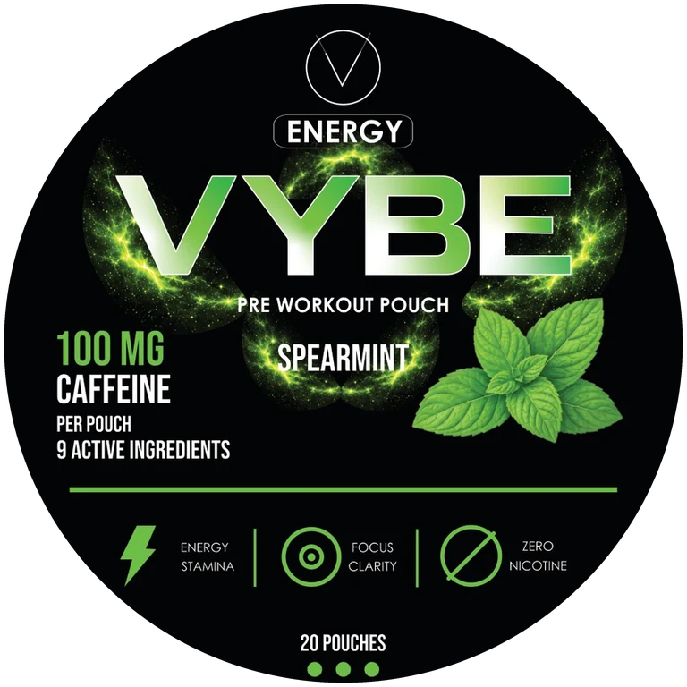
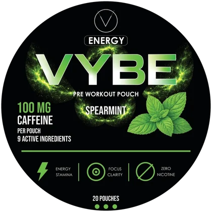
VYBE Spearmint
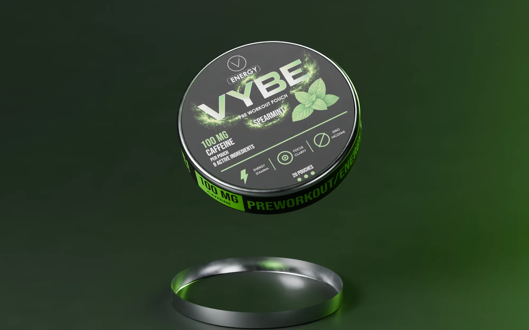
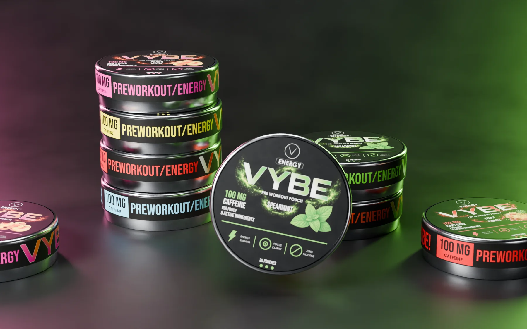
3D model — original artwork Lid, 193 × 11.5 mm side label and Ø 48 mm back label from the production files.
Visual identity and pouch packaging for a six-flavour energy range: one angular wordmark, one dark base, a clear signal for each flavour.
 Open full-size image
Part by part
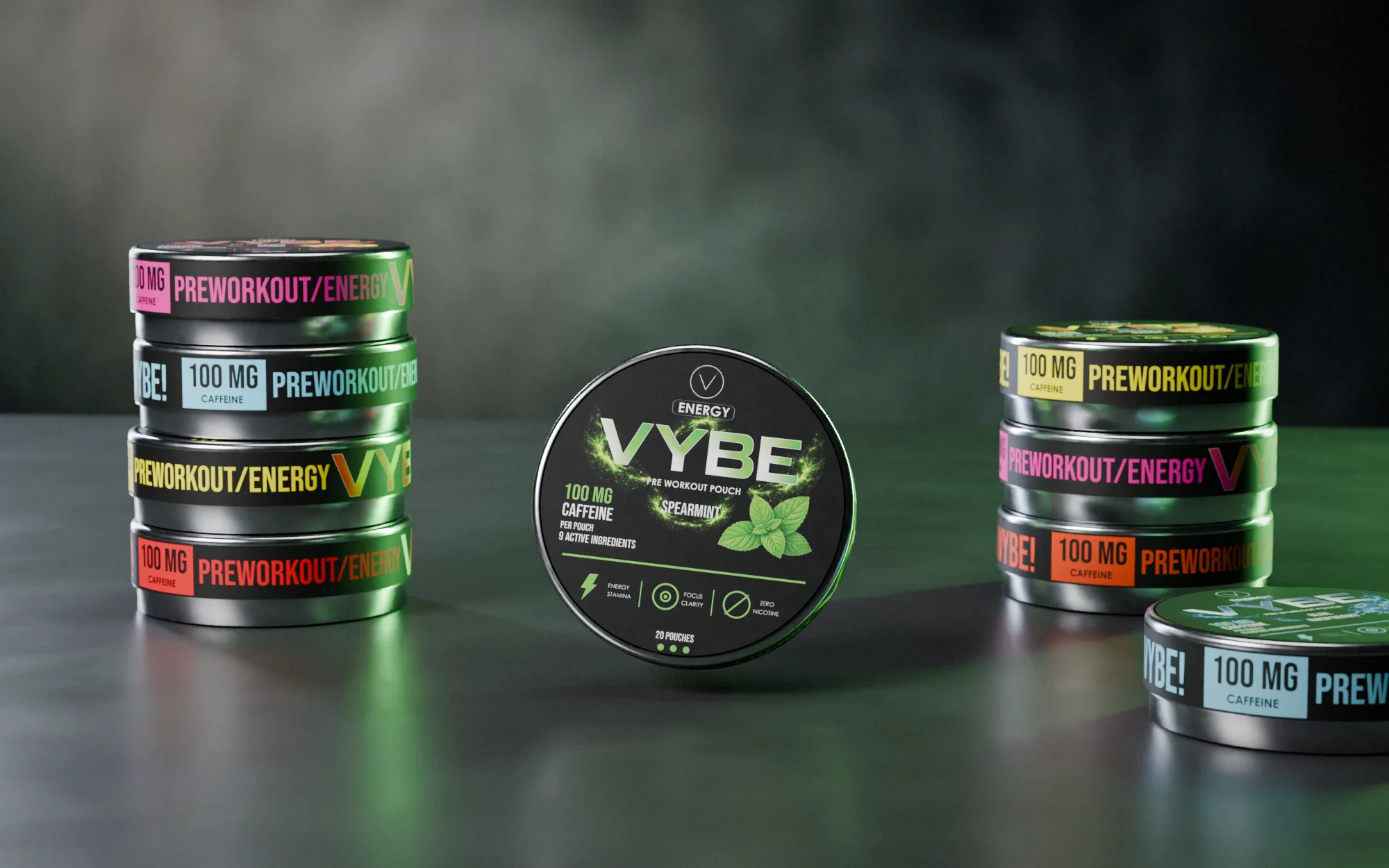
One tin, six flavours
-
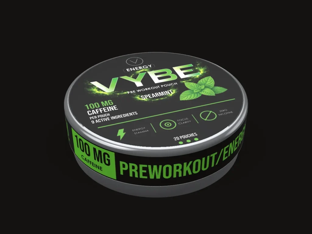
An angular wordmark leads
Visual identity and packaging for a six-flavour energy range in a round tin.
-
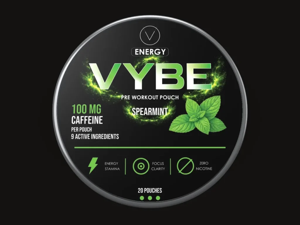
Fixed positions
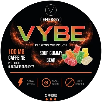
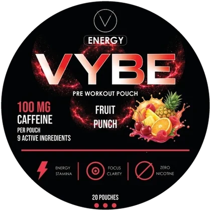
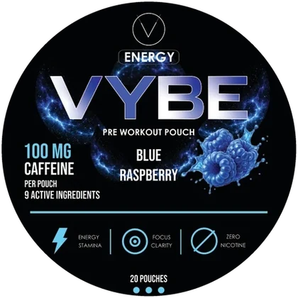
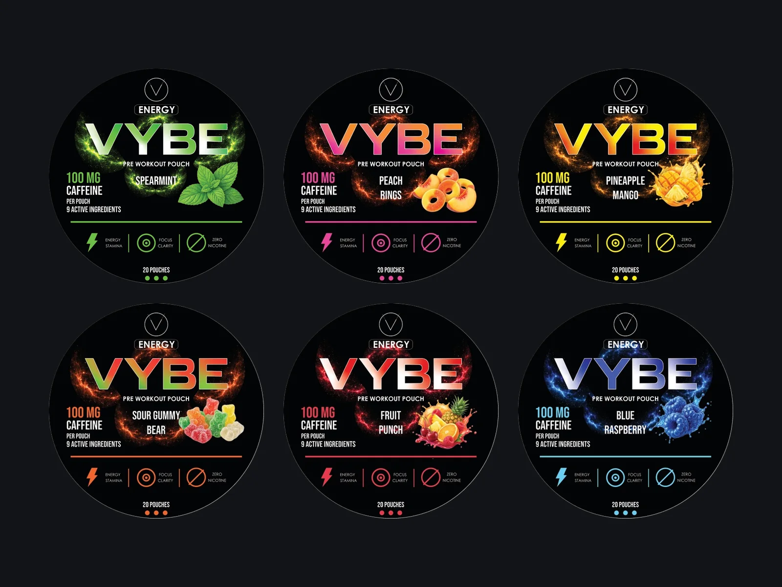
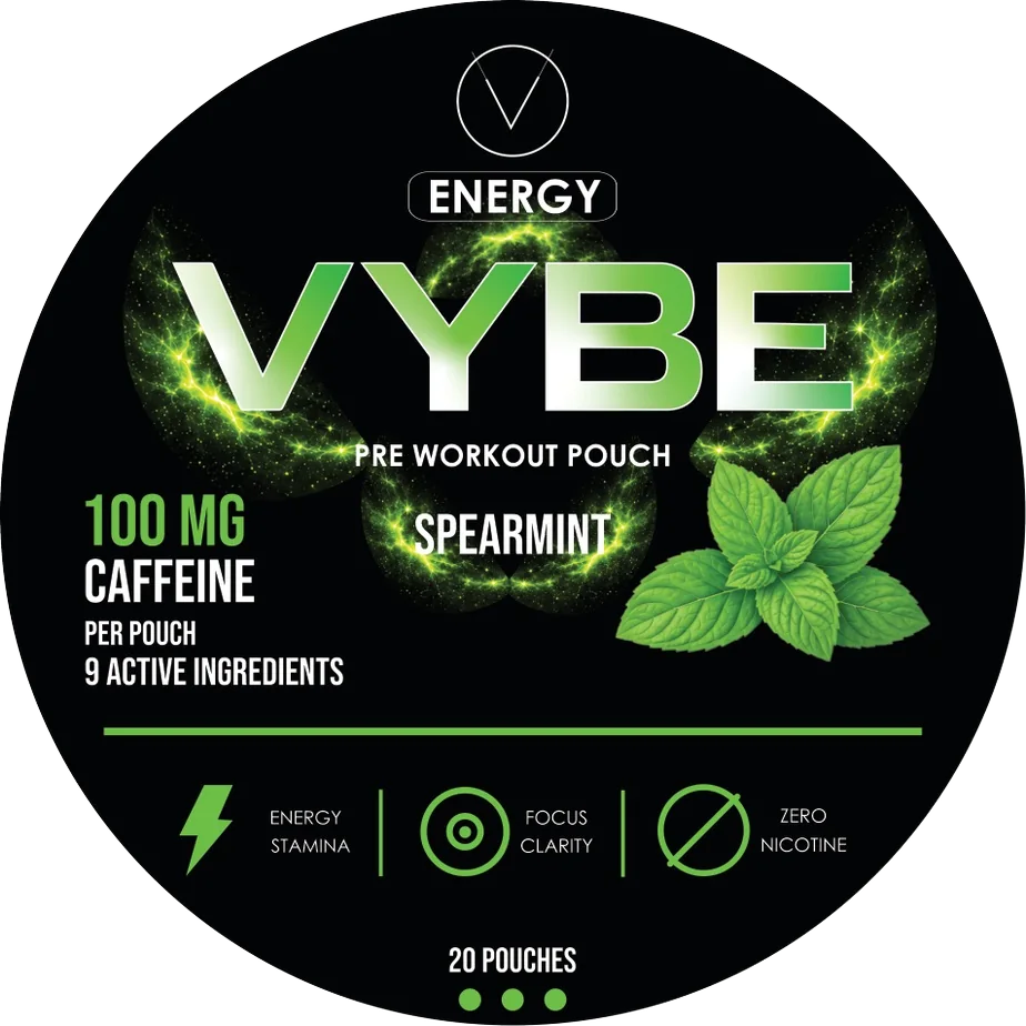
Brand, product category, caffeine content and flavour sit in the same places on every lid.
-
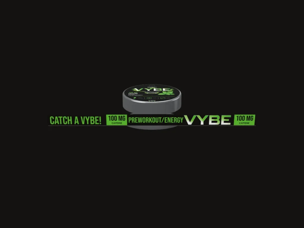
The side wrap
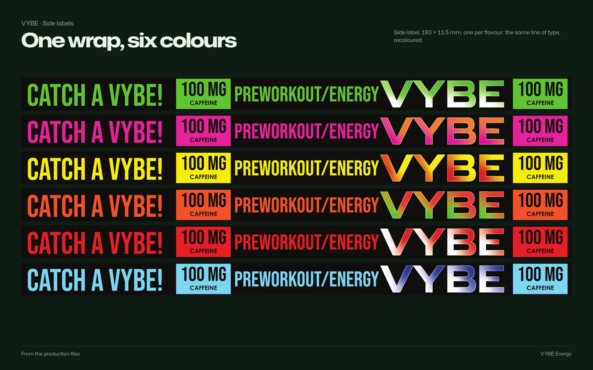
A 193 × 11.5 mm band repeats the brand, so it stays visible as the tin turns.
-
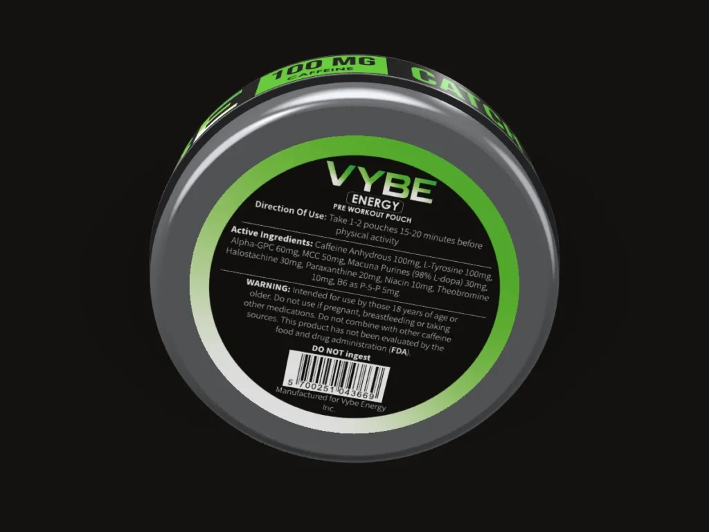
The reverse
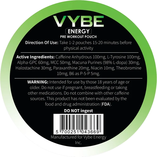
A Ø 48 mm back label holds the detailed copy, apart from the identity.
-
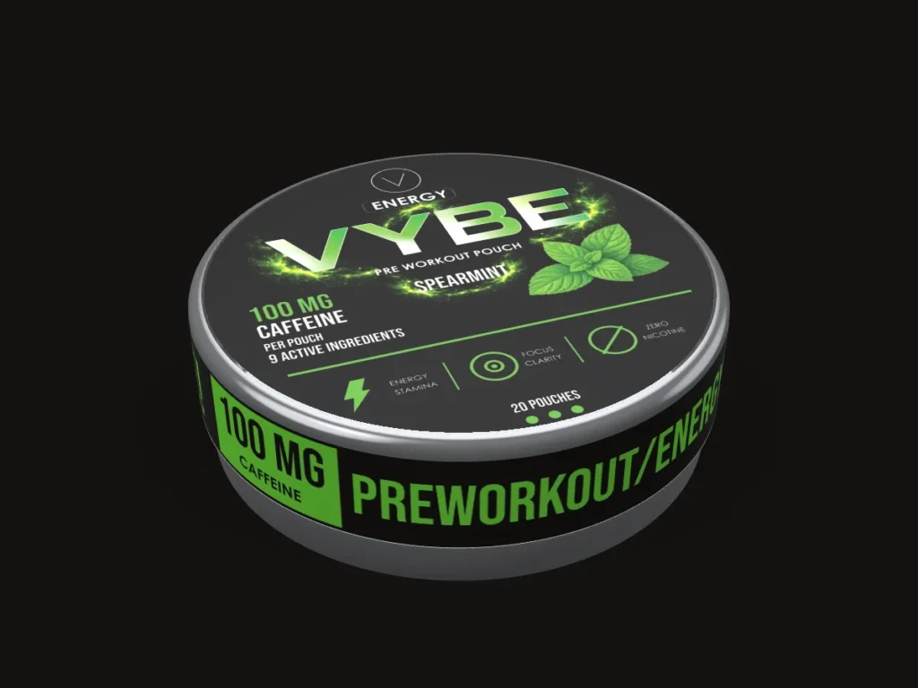
Only the flavour changes
Colour, imagery and name change; every position stays.
-
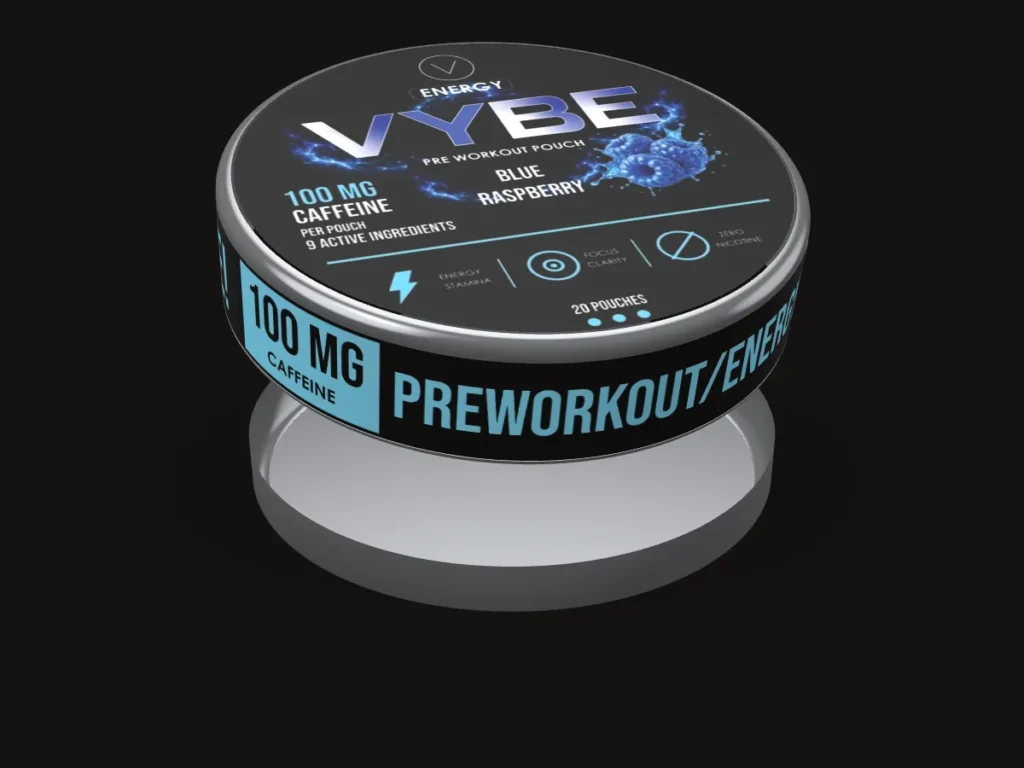
Six flavours
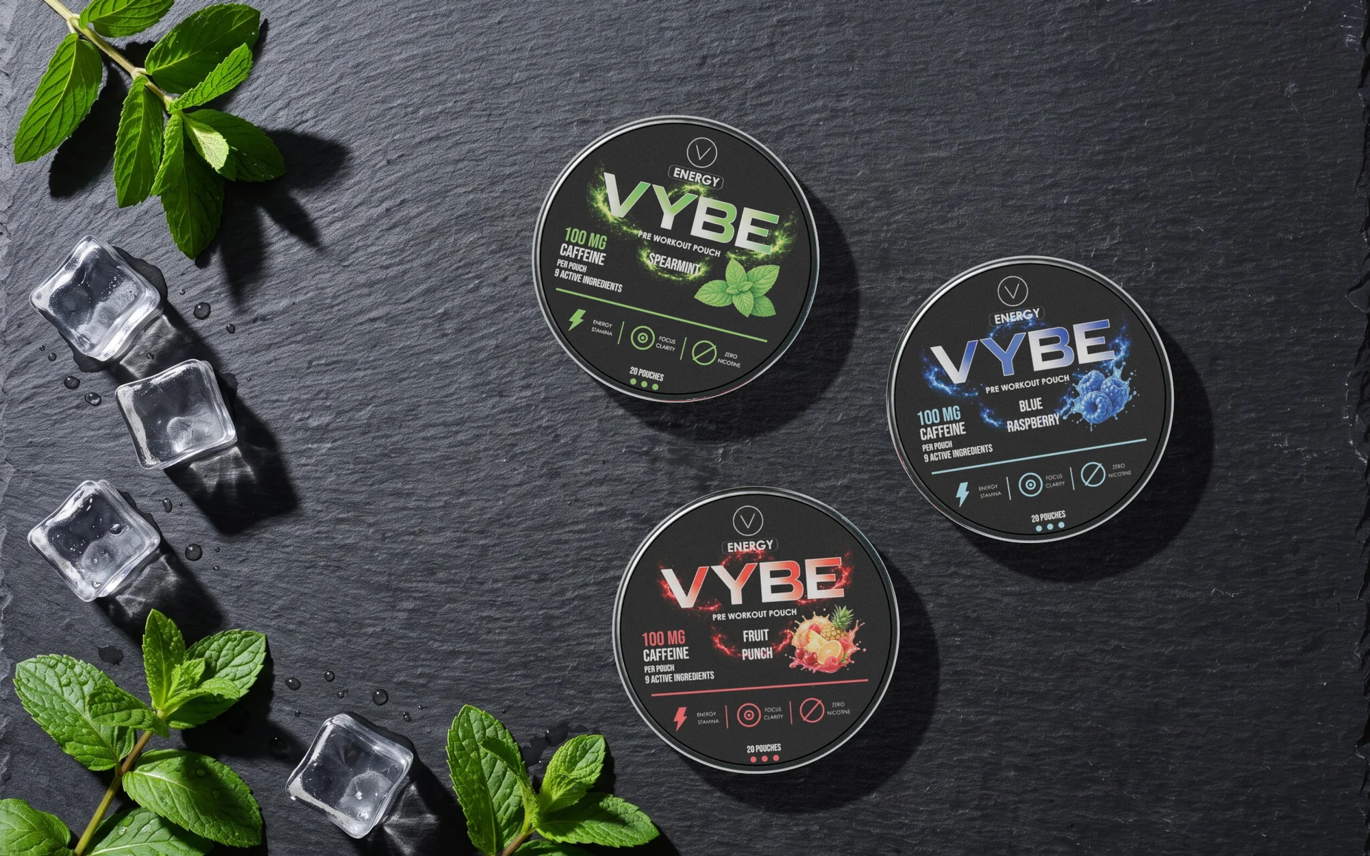
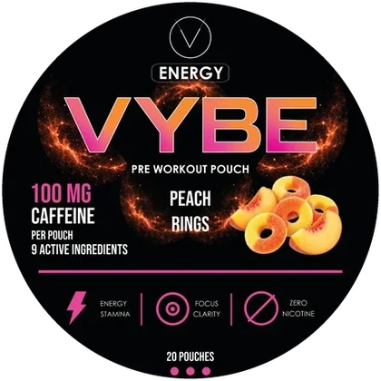
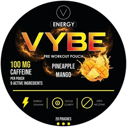
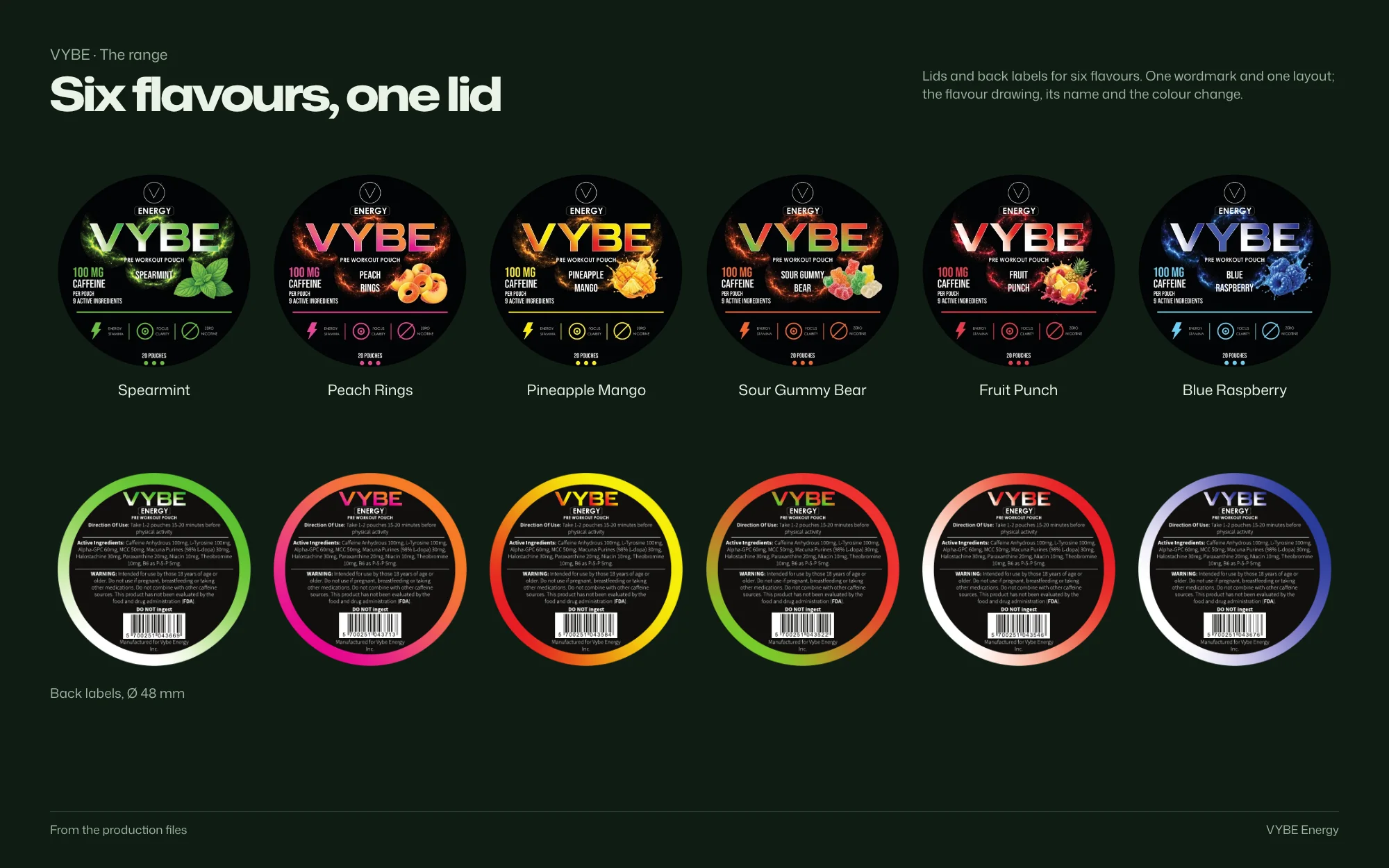
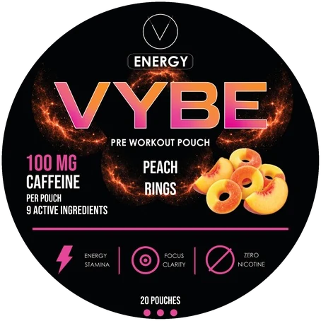
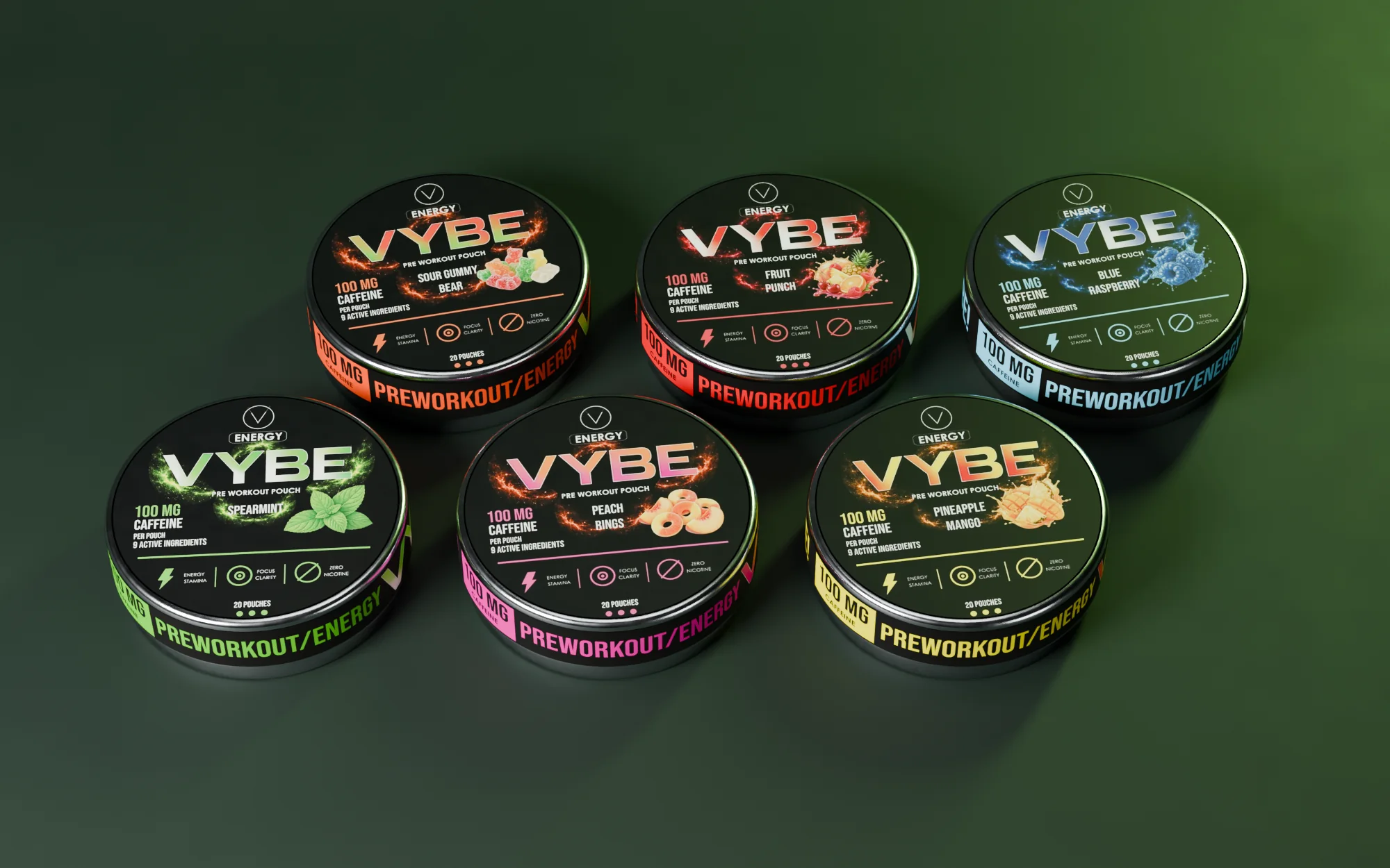
Spearmint, Peach Rings, Pineapple Mango, Sour Gummy Bear, Fruit Punch and Blue Raspberry.
3D: the production artwork on the real dimensions
Identity
Colour, type and system
Palette
Sampled from the production files
- #040507 RGB 4 5 7
- #3E302B RGB 62 48 43
- #6C8775 RGB 108 135 117
- #C56342 RGB 197 99 66
- #DEC993 RGB 222 201 147
Type

System
Palette sampled from the production files; type and system as printed
Brandbook
The system, board by board
 Open full-size image
 Open full-size image
 Open full-size image
The artwork
Designed in detail
 Open full-size image
 Open full-size image
 Open full-size image
The range
6 variants, one system
-
Spearmint
-
 Peach Rings
-
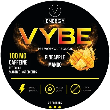 Pineapple Mango
-
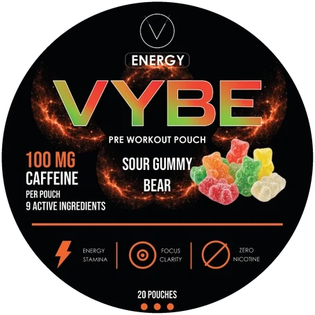 Sour Gummy Bear
-
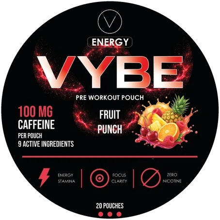 Fruit Punch
-
 Blue Raspberry
Design decisions
Why it looks this way
-
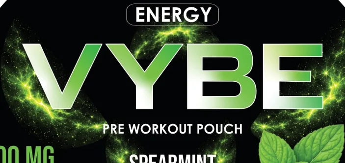 Open full-size image
Detail An angular wordmark leads
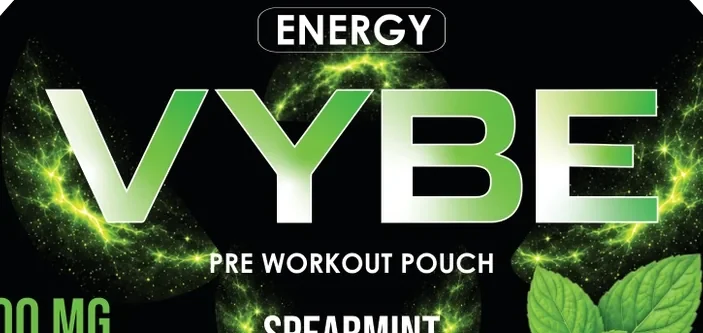
The wide, angled VYBE wordmark is the main recognition device. Repeated diagonals give the four letters one direction, and open counters keep it clear inside a dense circular label.
-
 Open full-size image
Original artworkSpearmint lid Fixed positions, changing flavour
Brand, product category, caffeine content and flavour sit in the same places on every lid. Only the flavour colour, imagery and name change.
-
 Open full-size image
Original artworkReverse label Three surfaces, one pack
The reverse label separates the detailed copy from the identity; the narrow side wrap repeats the brand so it stays visible as the tin turns.
In context
 Open full-size image
 Open full-size image
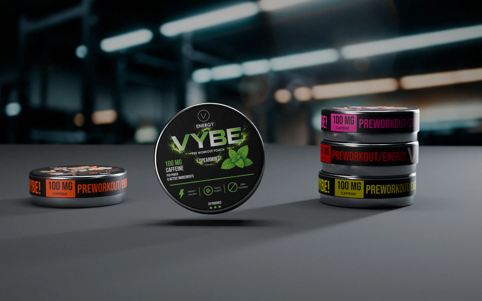 Open full-size image
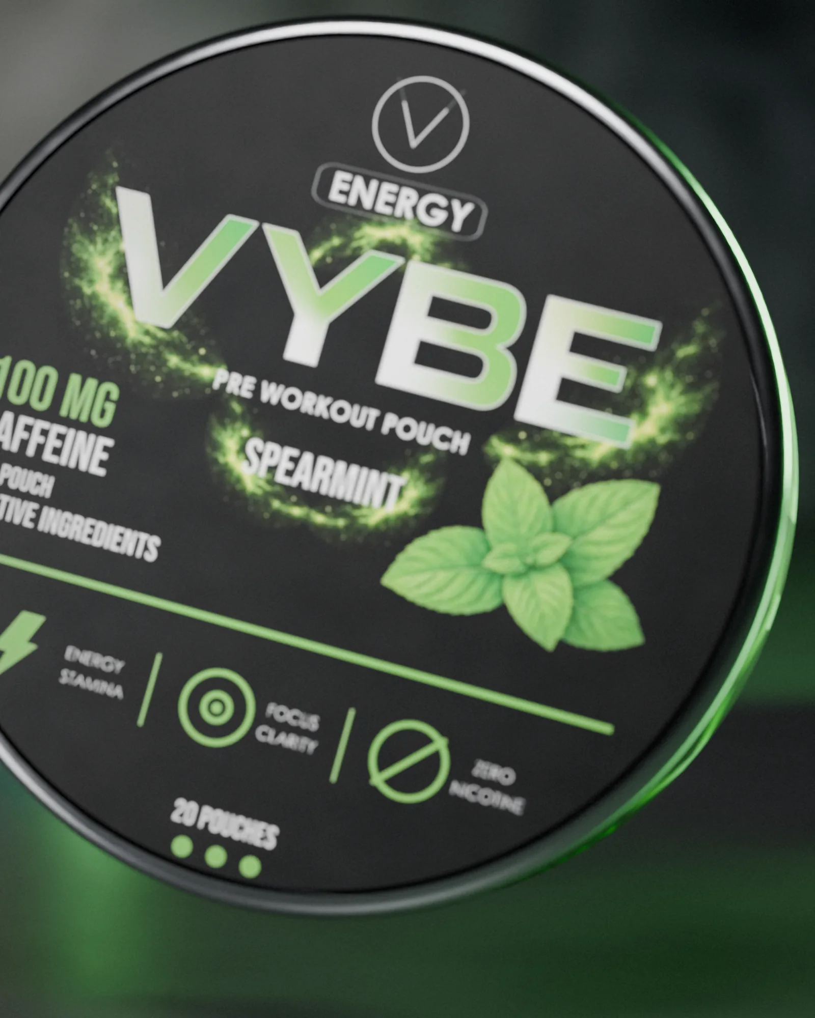 Open full-size image
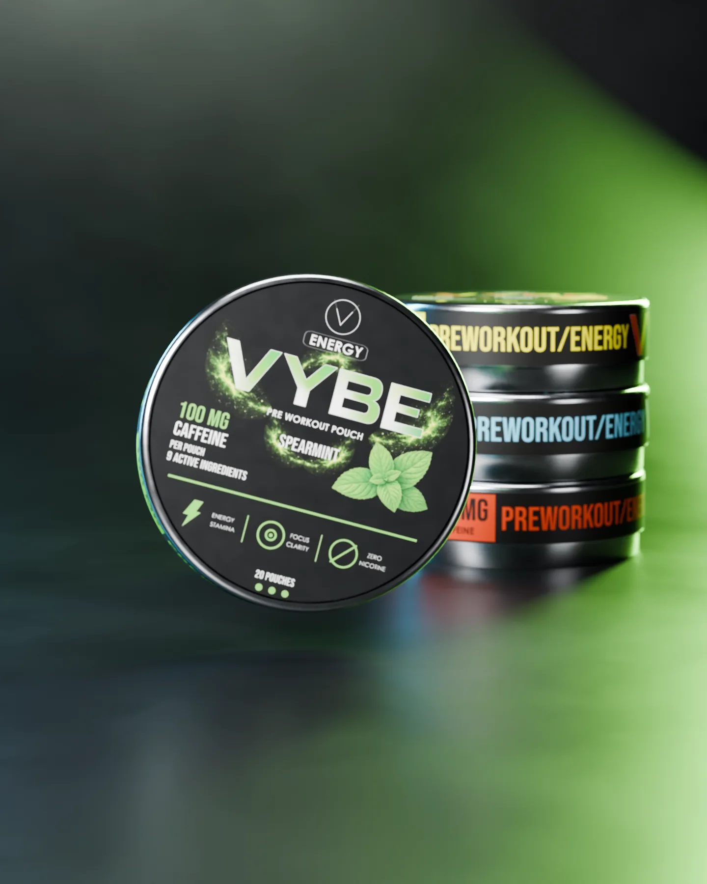 Open full-size image
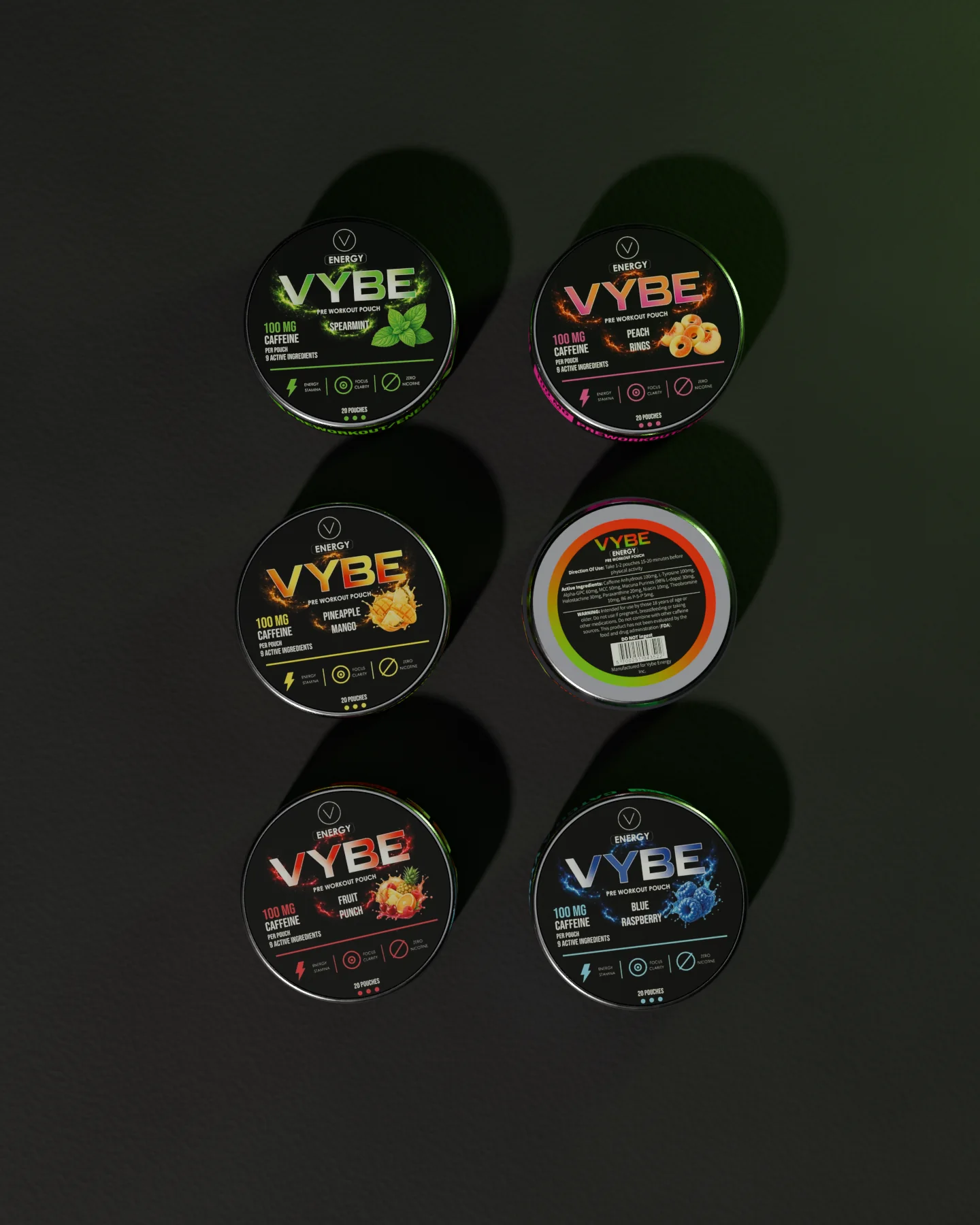 Open full-size image
 Open full-size image
 Open full-size image
Campaign
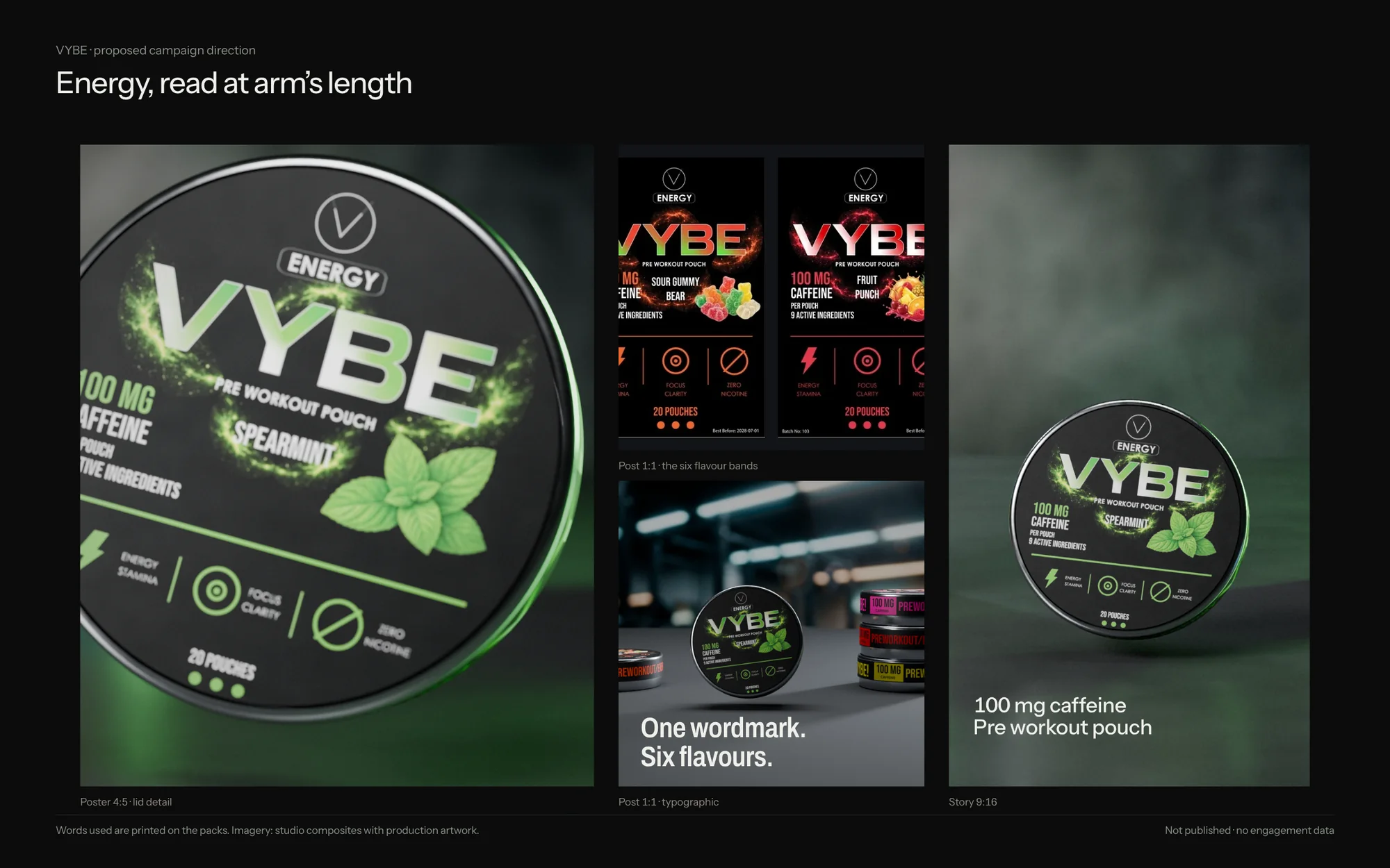
A proposed direction
 Open full-size image
By the numbers
- flavours on one system
- 6
- flavours on one system
- print-ready labels: lid, side and back
- 18
- print-ready labels: lid, side and back
- layouts including the rectangular format
- 24
- layouts including the rectangular format
- for all twelve side and back labels
- 5days
- for all twelve side and back labels
Process & productionFull write-up, print specs, timeline, files, credits
Overview
VYBE Energy is a pre-workout pouch in a round tin; every lid states 100 mg caffeine per pouch. The supplied range has six flavours: Spearmint, Peach Rings, Pineapple Mango, Sour Gummy Bear, Fruit Punch and Blue Raspberry.
The challenge
A six-flavour range needed distinct variants while keeping a clear family identity. The front, reverse and wrap also had to work as connected parts of the same pack.
Creative direction
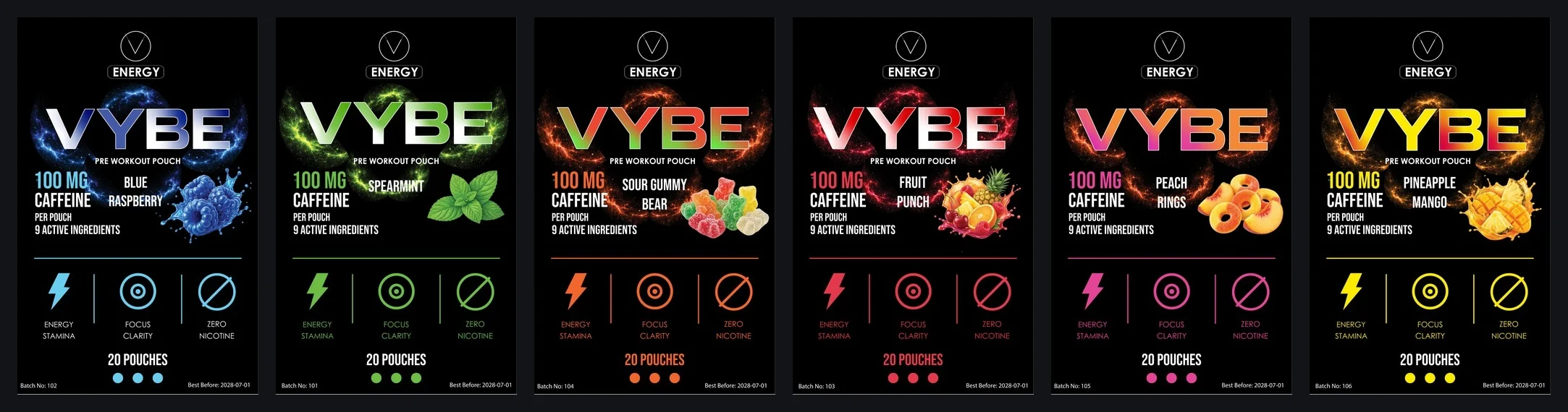
Fixed: the wordmark, product category and order of information. Variable: flavour colour, imagery and name. The same rules carry from the lid to the reverse label, the narrow side wrap and a taller rectangular label format.
What was delivered
Six flavour identities with lid, reverse and side artwork, plus six taller label layouts that carry the system into a rectangular format.
Design value
The system gives the brand a repeatable way to distinguish variants without rebuilding each label. Sales or recognition gains were not measured.
The problem is framed from the finished work, not quoted from a client brief.
Delivered
- Six flavour lid labels
- Six side labels, 193 × 11.5 mm
- Six back labels, Ø 48 mm
- Six taller rectangular label layouts
Built to print
- Side label
- 193 × 11.5 mm wrap
- Back label
- Ø 48 mm: directions, active ingredients, warnings, FDA disclaimer
- Barcode
- EAN-13 on the back label
- Fixed callout
- 100 mg caffeine per pouch
- Files
- Adobe Illustrator, vector PDF per label
Timeline
- 4 Jul 2026
Side and back labels for all six flavours
- 8 Jul 2026
Side labels final
Evidence
- Verified fact
- Six flavour lids are supplied, each stating 100 mg caffeine per pouch.
- Lid, reverse label, side wrap and six rectangular layouts are in the source files.
- Design reading
- Fixed positions with a changing flavour colour make the range read as one family.
- Intended benefit
- New flavours can be added by changing colour, imagery and name.
Credits & notes
- Identity and label artwork — Faraz Khadivdjam
- Studio renders — made in Blender from the production artwork, 2026
- Studio composites — production artwork rendered in Blender on background plates generated with Magnific (Freepik) from text prompts, 2026
- Studio sets — production artwork on the 3D models, rendered in Blender, 2026 (no generated imagery)
- Flat lays — production artwork rendered in Blender on top-down scenes generated with Magnific (Freepik) from text prompts, 2026
In short
A fixed frame and six flavour signals: one brand at arm’s length, six products up close.
Contact
Have a project in mind?
Tell me what you’re making, what you need designed, and your timeline. For design roles or collaborations, email me directly.
Email info@farazdesign.com