
Work Brand identity Custom lettering Packaging
Gum Pillows
Soft lettering. A bold five-flavour family.
- Problem
- A five-flavour nicotine-pouch range needed its own personality, across five strengths per flavour.
- Solution
- Rounded bubble lettering as the constant, with the flavour colour changing around it on lid, wrap and back.
- Result
- 25 SKUs and 75 print-ready labels, from first file to final artwork in 16 days.
My role Brand identity · packaging range
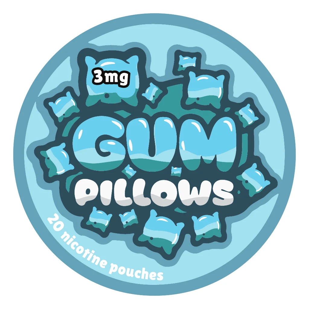
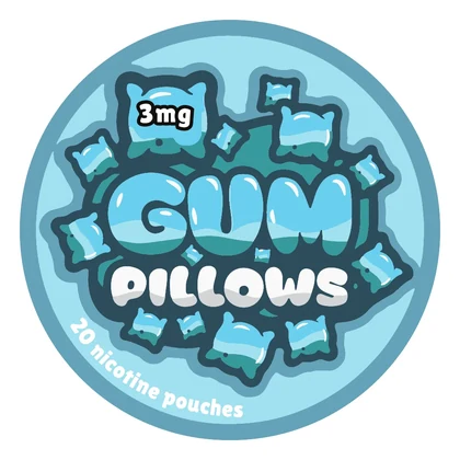
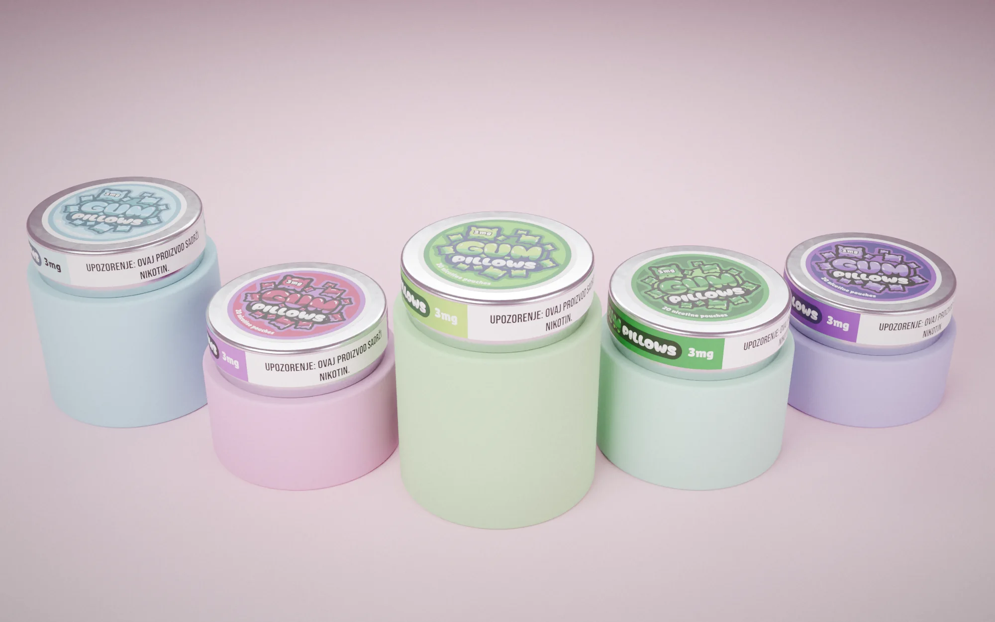
Gum Pillows Cool Mint
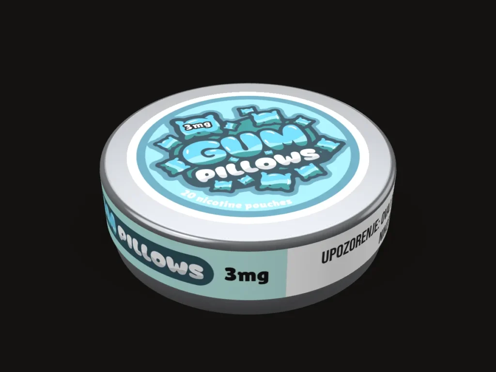
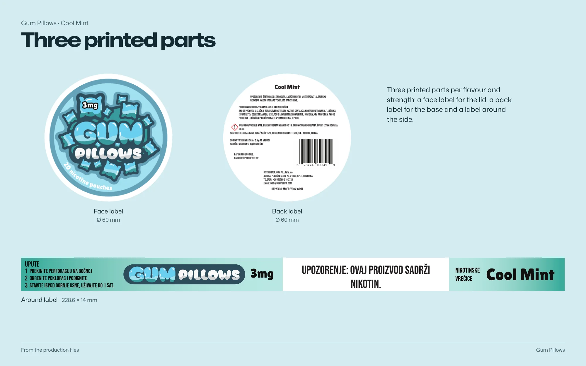
3D model — original artwork Ø 60 mm face label, 228.6 × 14 mm wrap and Ø 60 mm back label from the production files.
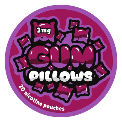
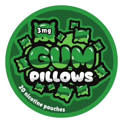
Brand identity and packaging range for five nicotine-pouch flavours, built around rounded bubble lettering and pillow shapes.
 Open full-size image
Part by part
Lettering as the pack
-
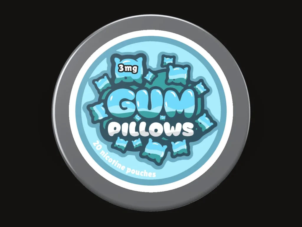
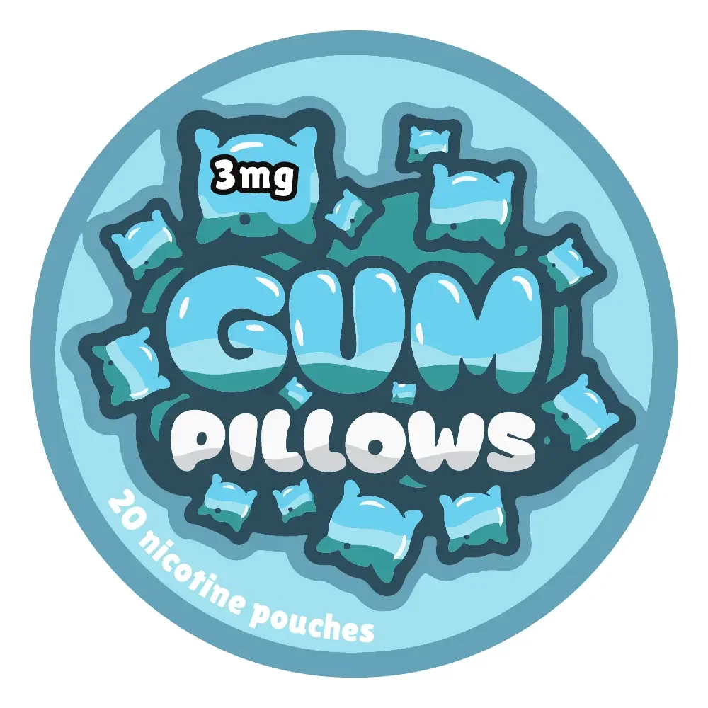
The name becomes the shape
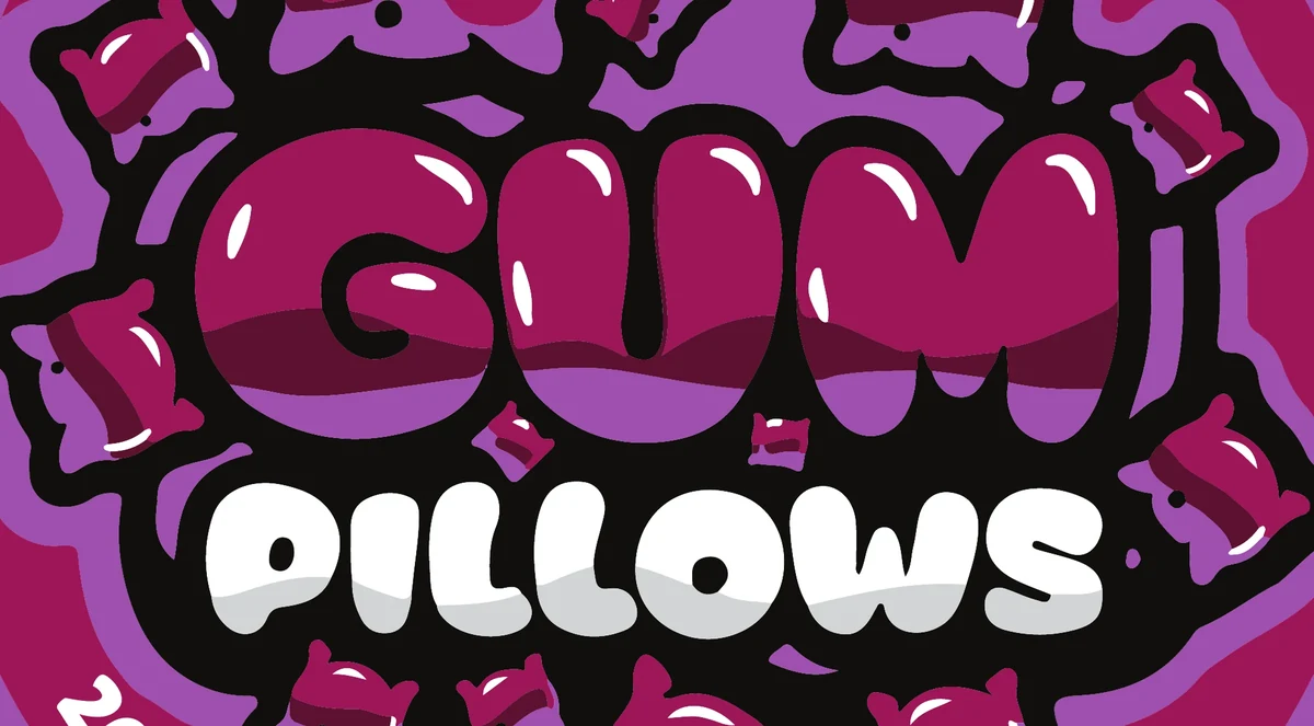
Rounded lettering and pillow-like shapes fill the lid, so the brand reads first.
-
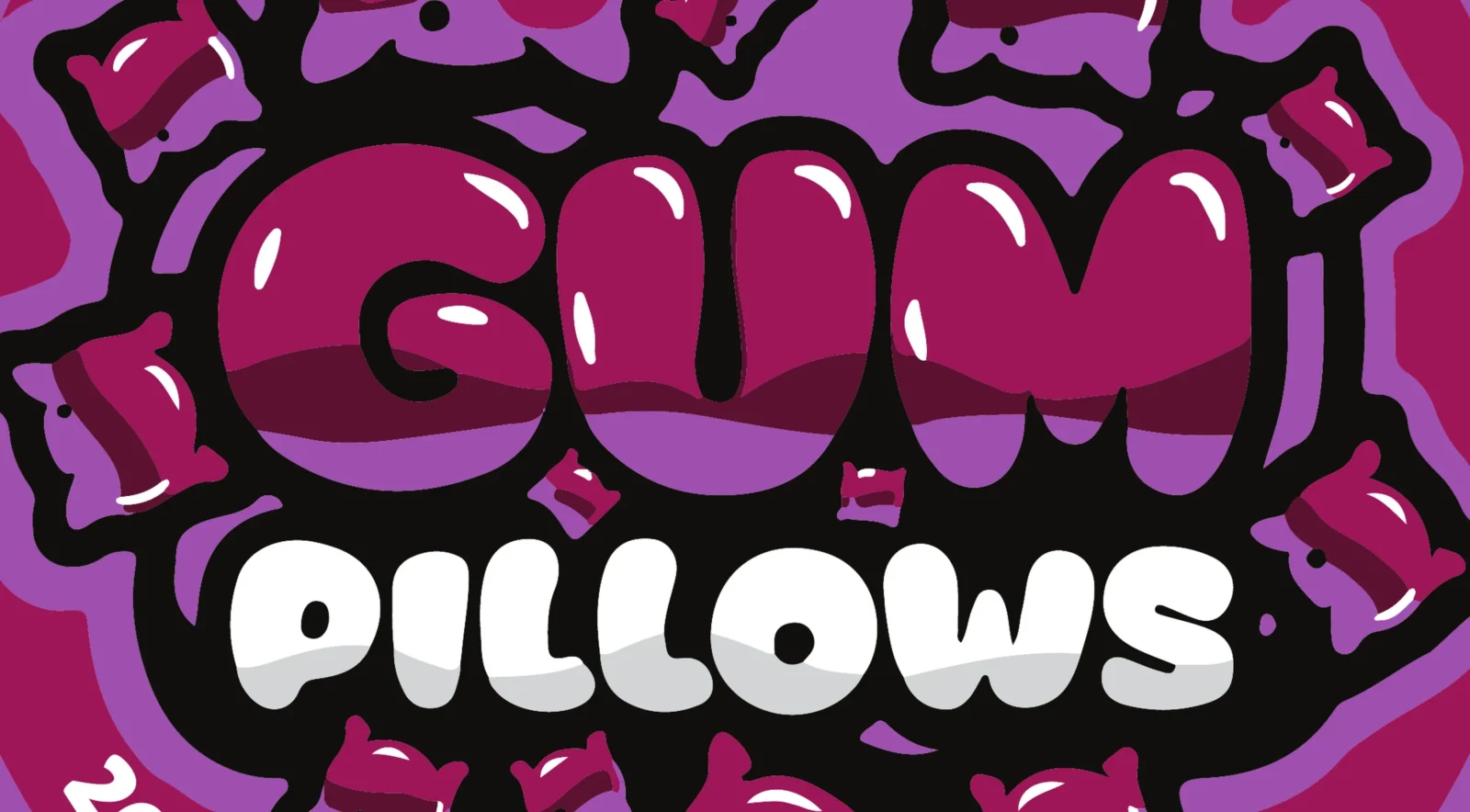
Hierarchy over decoration
The stacked name dominates; flavour, strength and pouch count drop to a simpler style.
-
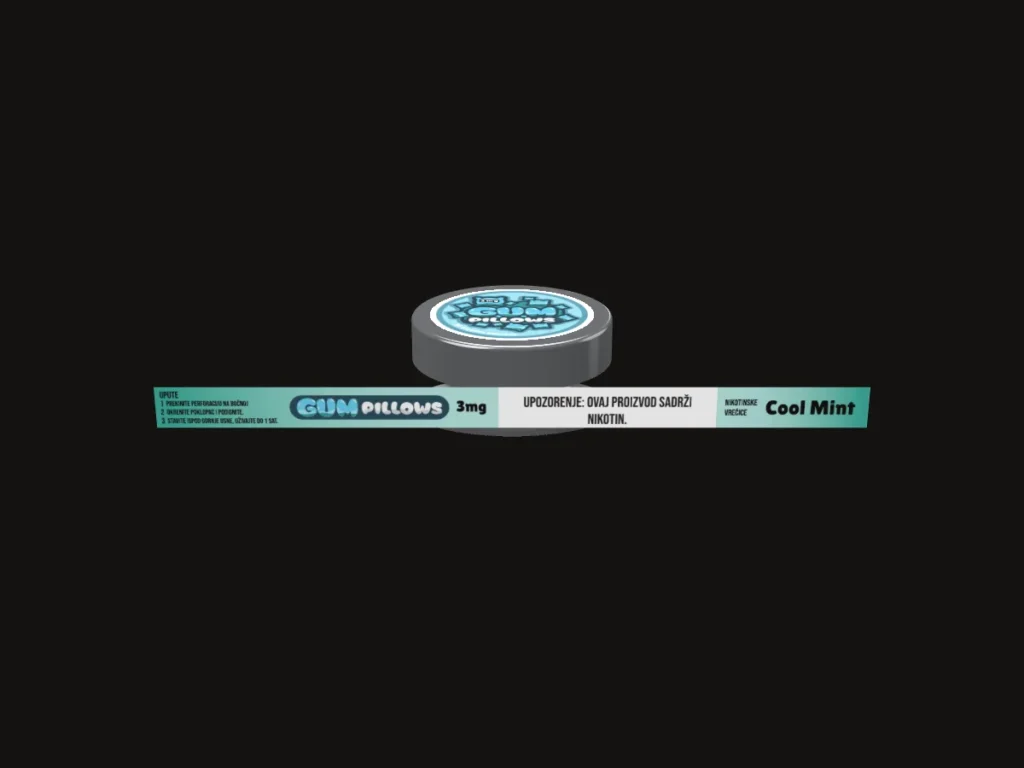
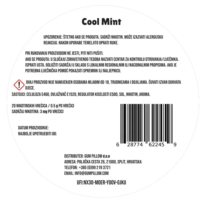
Information moves off the lid
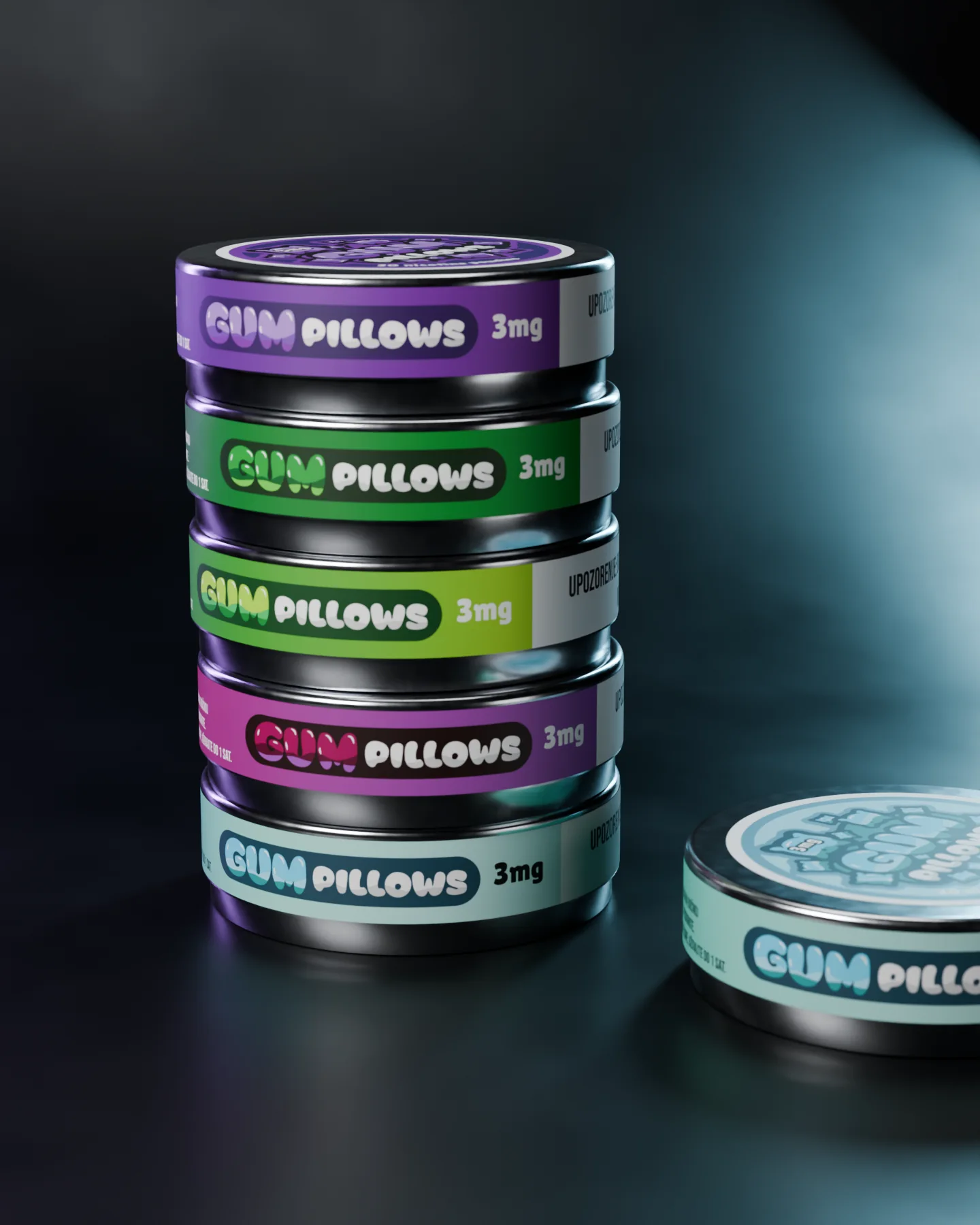
Supporting text shifts to the 228.6 × 14 mm wrap and the reverse.
-
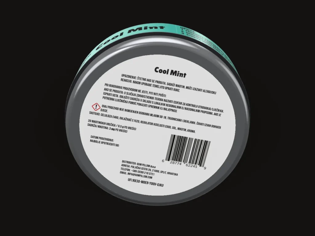
The reverse
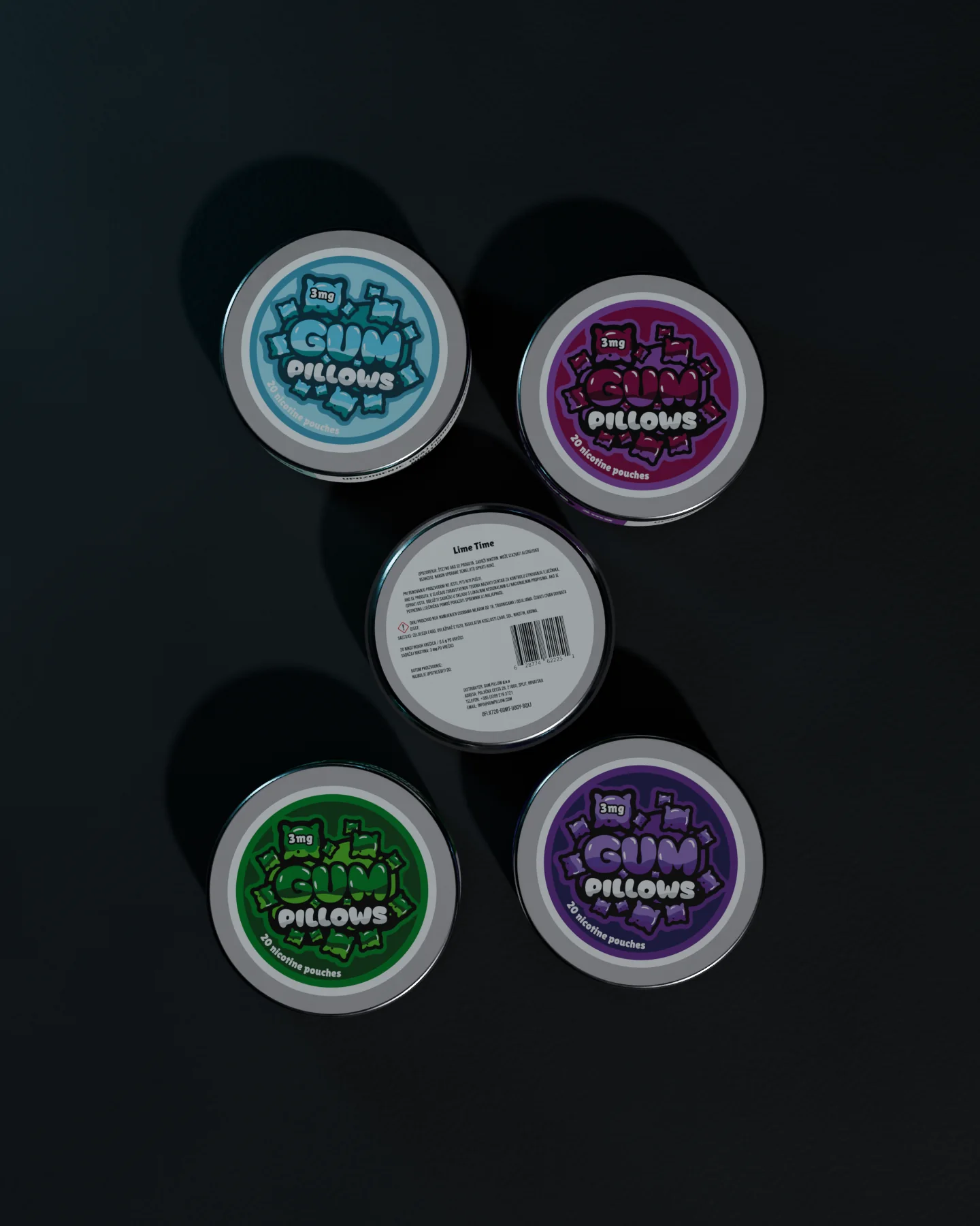
Every back label carries its own EAN-13 barcode and EU UFI code.
-
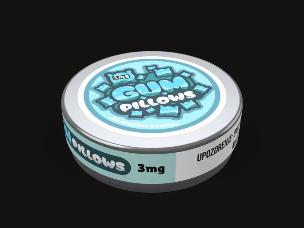
Five flavours
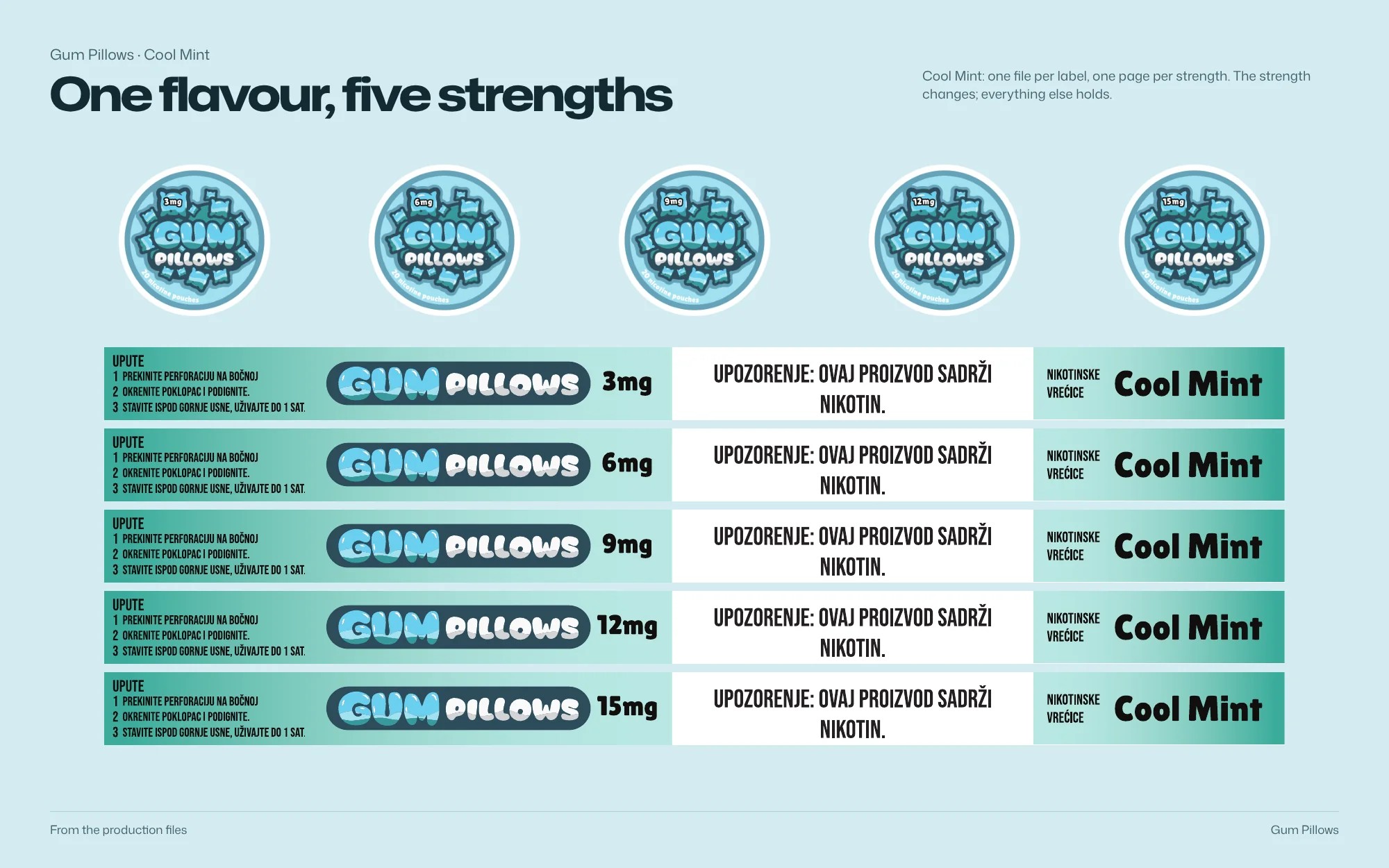
The production files cover 25 SKUs: five flavours, five strengths each.
-
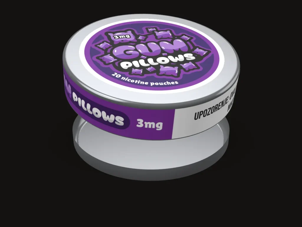
Twenty pouches a tin
Each lid states 20 nicotine pouches.
3D: the production artwork on the real dimensions
Identity
Colour, type and system
Palette
Sampled from the production files
- #323353 RGB 50 51 83
- #36923C RGB 54 146 60
- #903489 RGB 144 52 137
- #7DA39C RGB 125 163 156
- #9DD5E5 RGB 157 213 229
- #FBFBFB RGB 251 251 251
Type

System

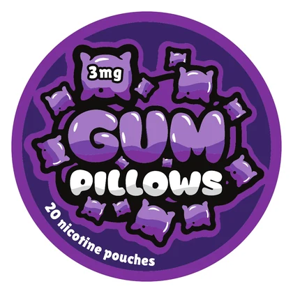
Palette sampled from the production files; type and system as printed
Brandbook
The system, board by board
 Open full-size image
 Open full-size image
 Open full-size image
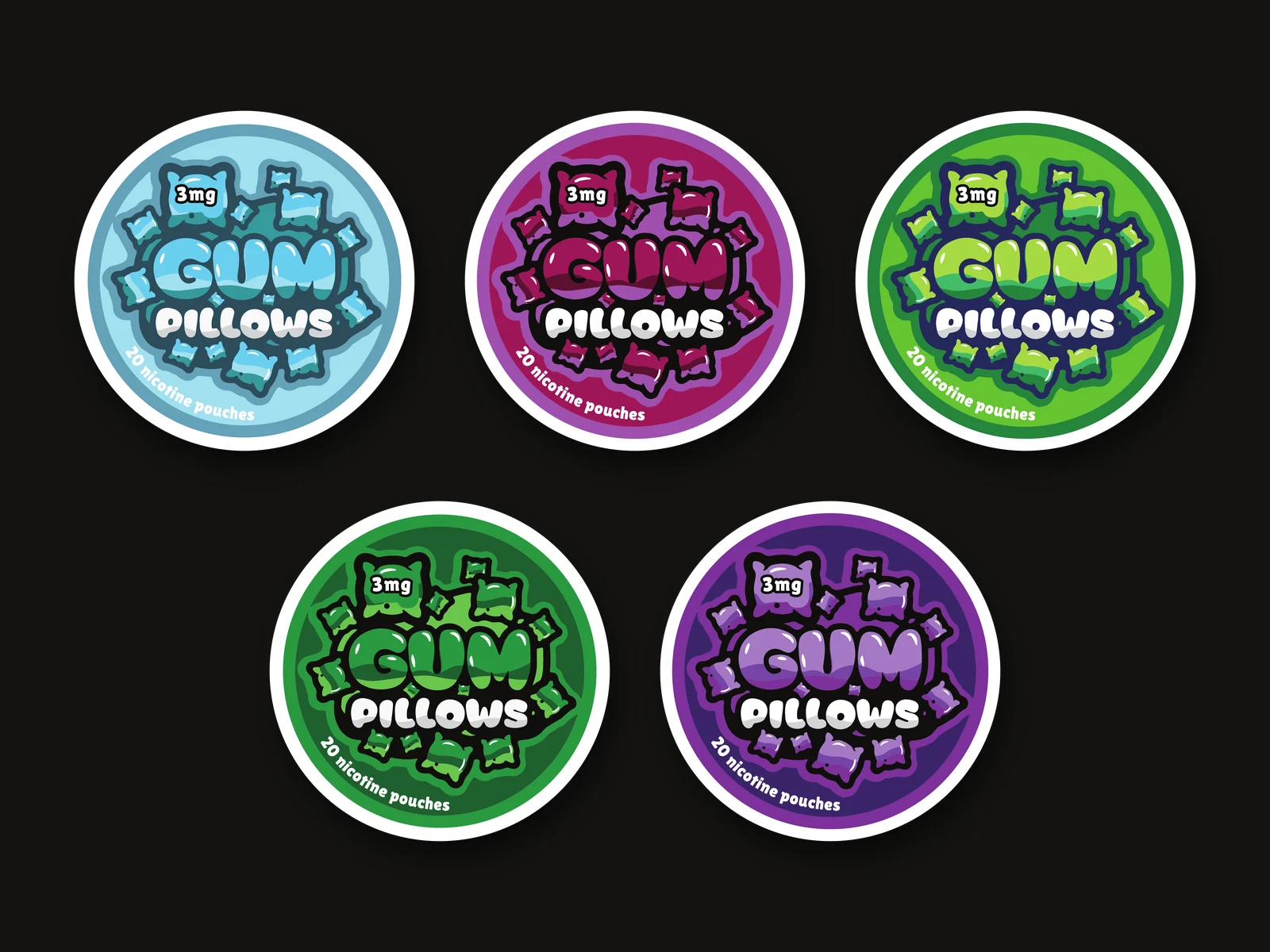
The artwork
Designed in detail
 Open full-size image
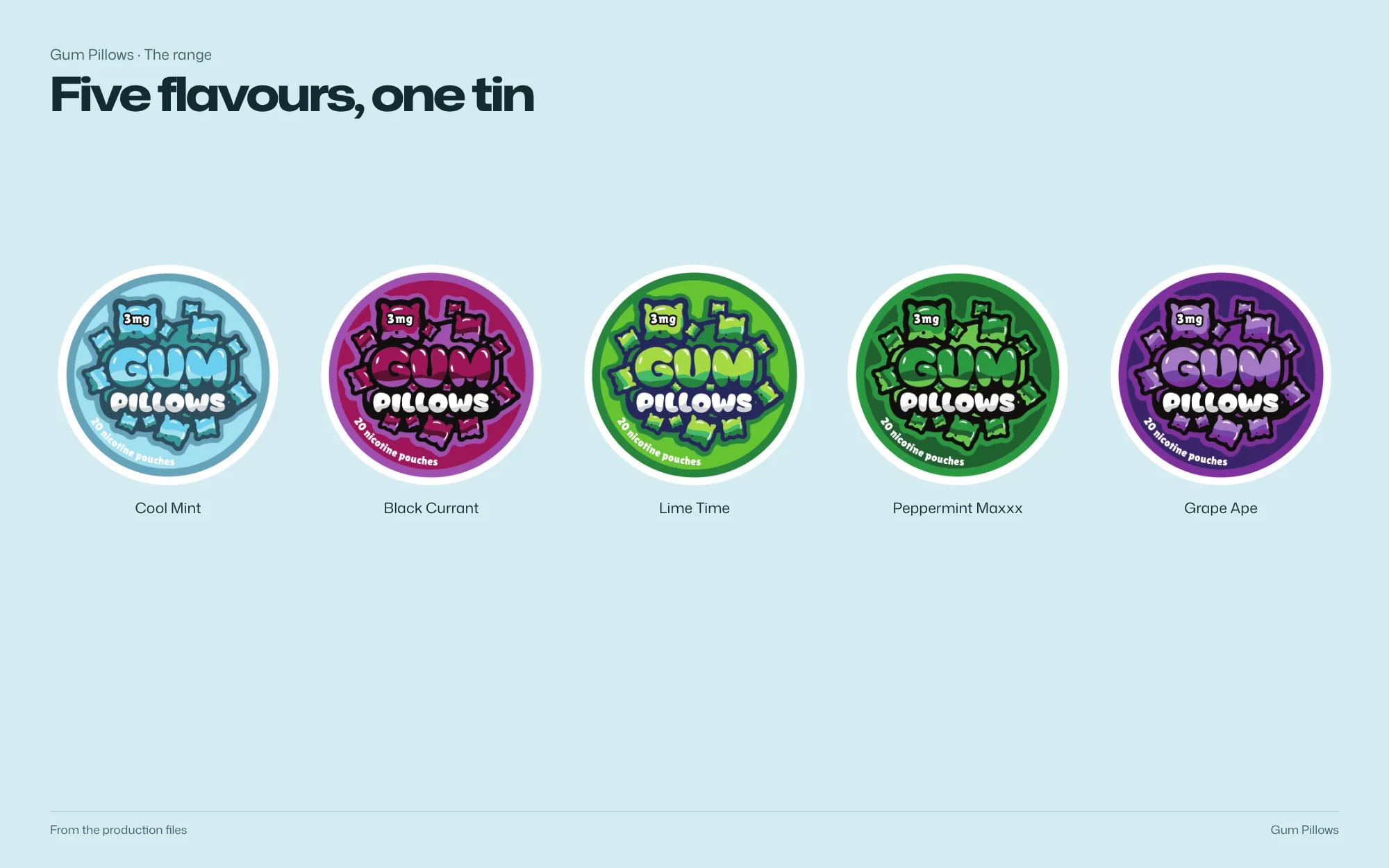
The range
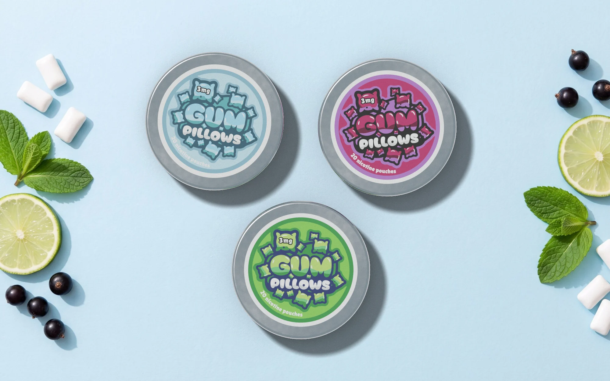
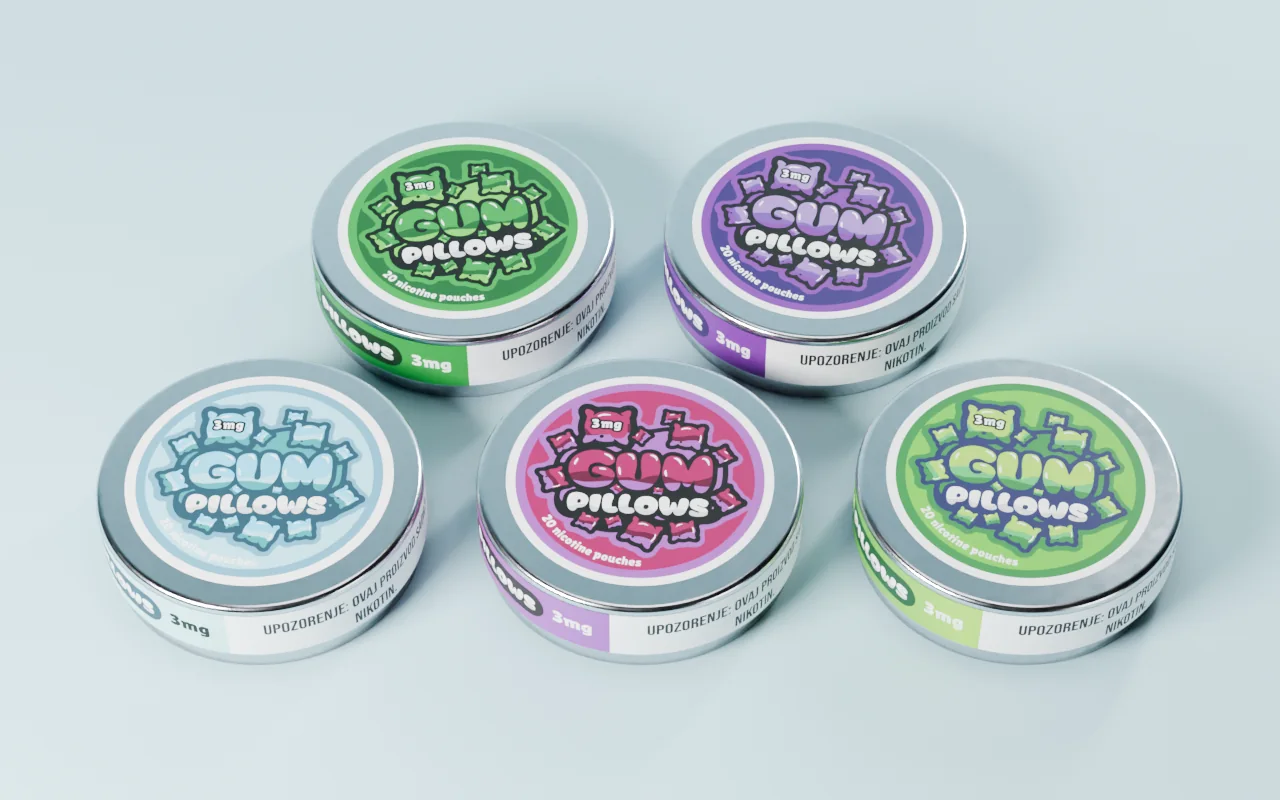
5 variants, one system
-
Cool Mint
-
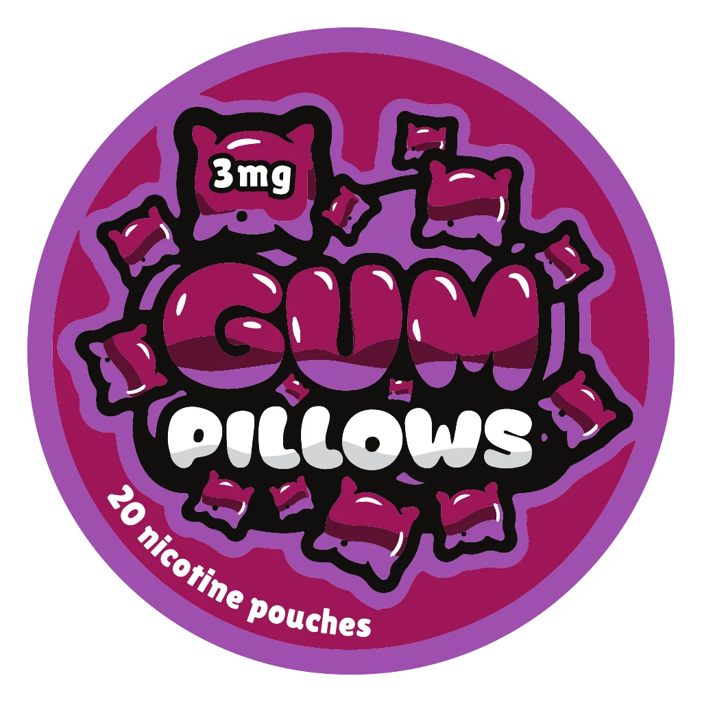 Black Currant
-
 Lime Time
-
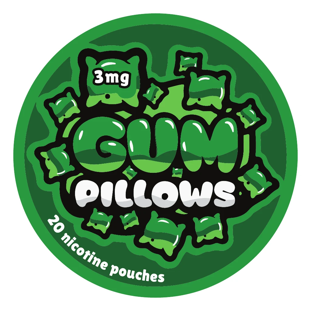 Peppermint Maxxx
-
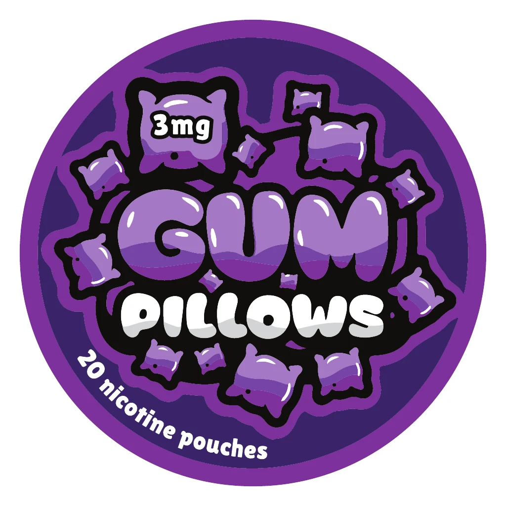 Grape Ape
Design decisions
Why it looks this way
-
 Open full-size image
Original artworkCool Mint lid The name becomes the shape
Rounded lettering and pillow-like shapes give the name a visual form and fill the lid, so the brand reads first.
-
 Open full-size image
Detail Hierarchy over decoration
The heavy stacked name dominates; flavour, strength and pouch count drop to a simpler supporting style.
-
 Open full-size image
Original artworkReverse label Information moves off the lid
Supporting text shifts to the wrap and reverse, so each surface stays purposeful.
-
 Open full-size image
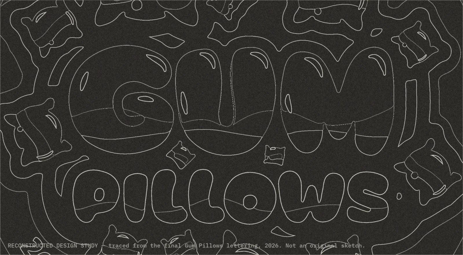
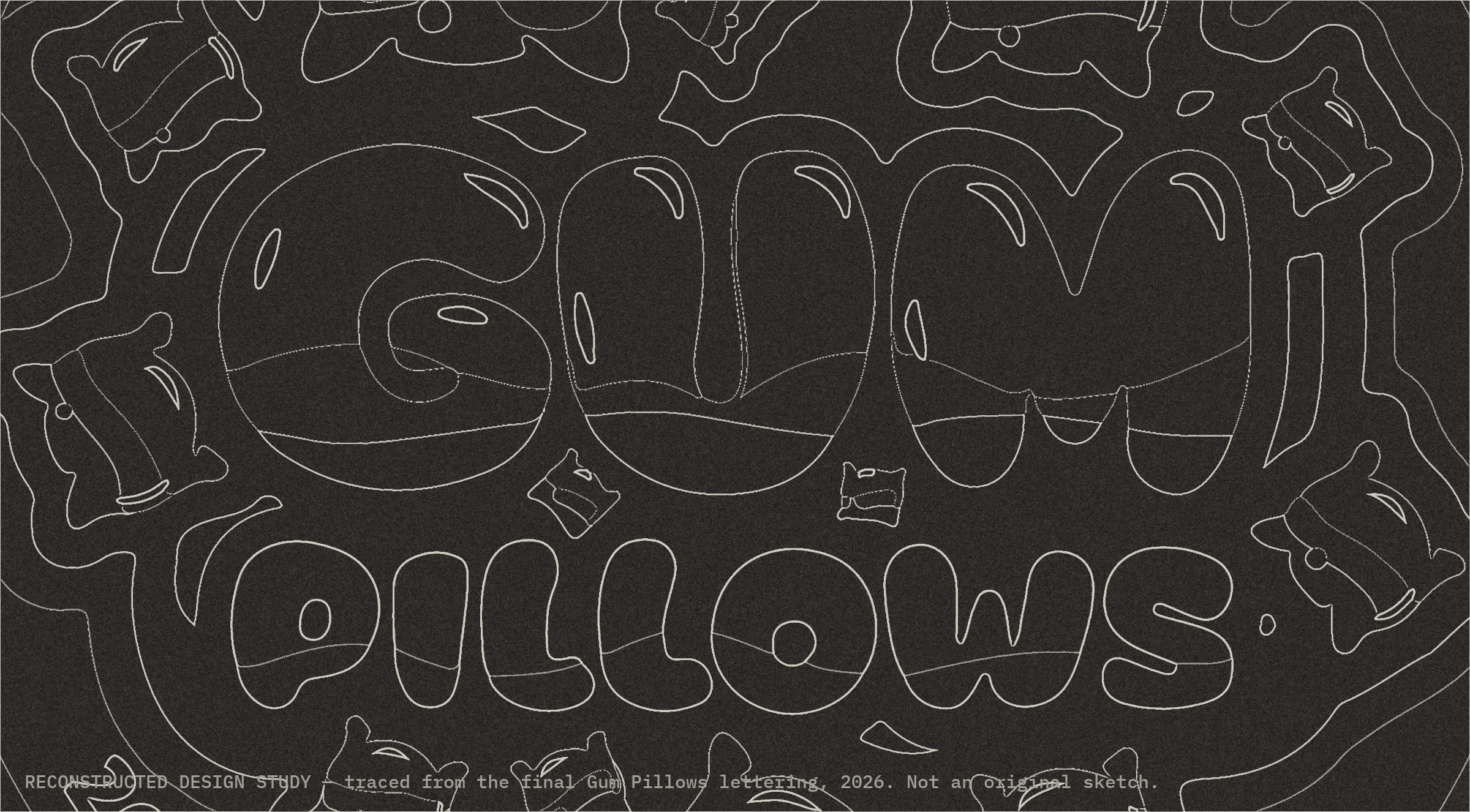
Reconstructed design studyTraced from the final lettering for this portfolio — not an early sketch Reading the letter shapes
An outline study isolates the soft, inflated forms.

In context
 Open full-size image
 Open full-size image
 Open full-size image
 Open full-size image
 Open full-size image
 Open full-size image
 Open full-size image
Campaign
A proposed direction
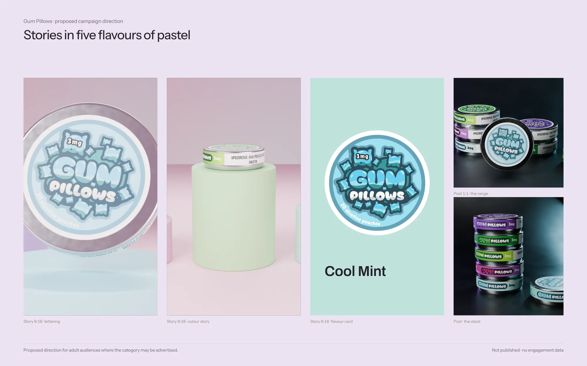 Open full-size image
By the numbers
- flavours
- 5
- flavours
- SKUs: five strengths each
- 25
- SKUs: five strengths each
- print-ready labels
- 75
- print-ready labels
- from first file to final artwork
- 16days
- from first file to final artwork
Process & productionFull write-up, print specs, timeline, files, credits
Overview
Gum Pillows uses the same round-tin format as CALI but needed its own voice. Five flavours are supplied: Cool Mint, Black Currant, Lime Time, Peppermint Maxxx and Grape Ape.
The challenge
The range needed a distinct personality that stays recognisable across five flavour designs and several packaging surfaces.
Creative direction
Rounded lettering and pillow shapes are the constant; flavour colour changes around that silhouette. Supporting information moves to the wrap and reverse so the lid stays about the brand.
What was delivered
Five flavour designs with front, reverse and wrap artwork.
Design value
A distinct visual voice supported by rules that can be reused across the family. It shows range design and coordinated artwork rather than a verified commercial uplift.
The problem is framed from the finished work, not quoted from a client brief.
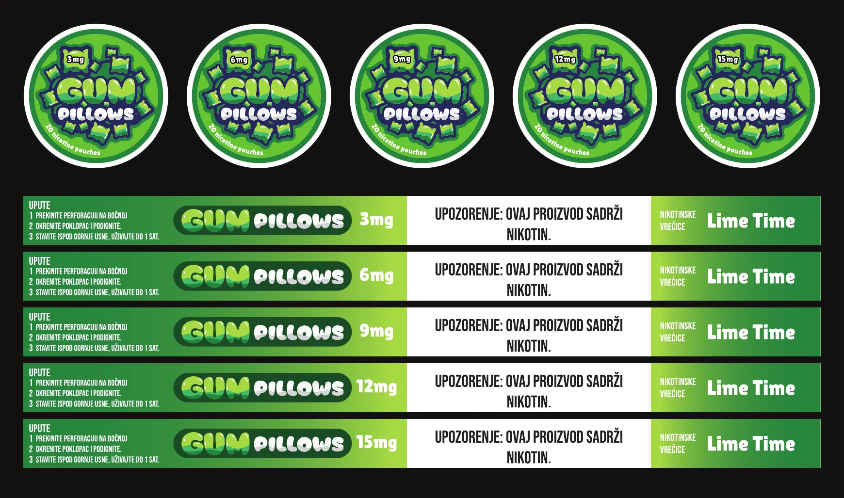
Delivered
- 25 face labels (5 flavours × 5 strengths)
- 25 wrap labels
- 25 back labels, each with EAN-13 and UFI code
Built to print
- Face label
- Ø 60 mm, one per SKU
- Wrap label
- 228.6 × 14 mm
- Back label
- Ø 60 mm, Croatian regulatory copy
- Strengths
- 3 · 6 · 9 · 12 · 15 mg for every flavour
- Codes
- EAN-13 barcode and EU UFI code on every SKU
- Files
- Adobe Illustrator, one vector PDF per label and strength
Timeline
- 7 Aug 2025
First face and wrap files
- 8 Aug 2025
Back labels for every strength
- 22 Aug 2025
Final artwork for all 25 SKUs
Production files
 Open full-size image
 Open full-size image
Evidence
- Verified fact
- Production files cover 25 SKUs (five flavours, five strengths each) with face, wrap and back labels; each lid states 20 nicotine pouches.
- Every back label carries its own EAN-13 barcode and EU UFI code.
- Design reading
- The lettering silhouette, not the frame, identifies the brand.
- Intended benefit
- A voice clearly different from CALI in the same tin format.
Credits & notes
- Brand identity and label artwork — Faraz Khadivdjam
- Lettering study — reconstructed for this portfolio
- Studio renders — made in Blender from the production artwork, 2026
- Studio composites — production artwork rendered in Blender on background plates generated with Magnific (Freepik) from text prompts, 2026
- Studio sets — production artwork on the 3D models, rendered in Blender, 2026 (no generated imagery)
- Flat lays — production artwork rendered in Blender on top-down scenes generated with Magnific (Freepik) from text prompts, 2026
In short
The rounded lettering does the brand work, so five flavours can change colour without losing the name.
Contact
Have a project in mind?
Tell me what you’re making, what you need designed, and your timeline. For design roles or collaborations, email me directly.
Email info@farazdesign.com