
Work Brand identity Music & digital
Uniqueness Music
A symbol with a digital life.
- Problem
- One mark had to organise channel artwork, motion content and branded items.
- Solution
- A geometric emblem and a steady wordmark, with atmospheric imagery carrying the mood.
- Result
- A visual language that extends across the music channel’s touchpoints.
My role Brand direction · logo · typography · digital graphics
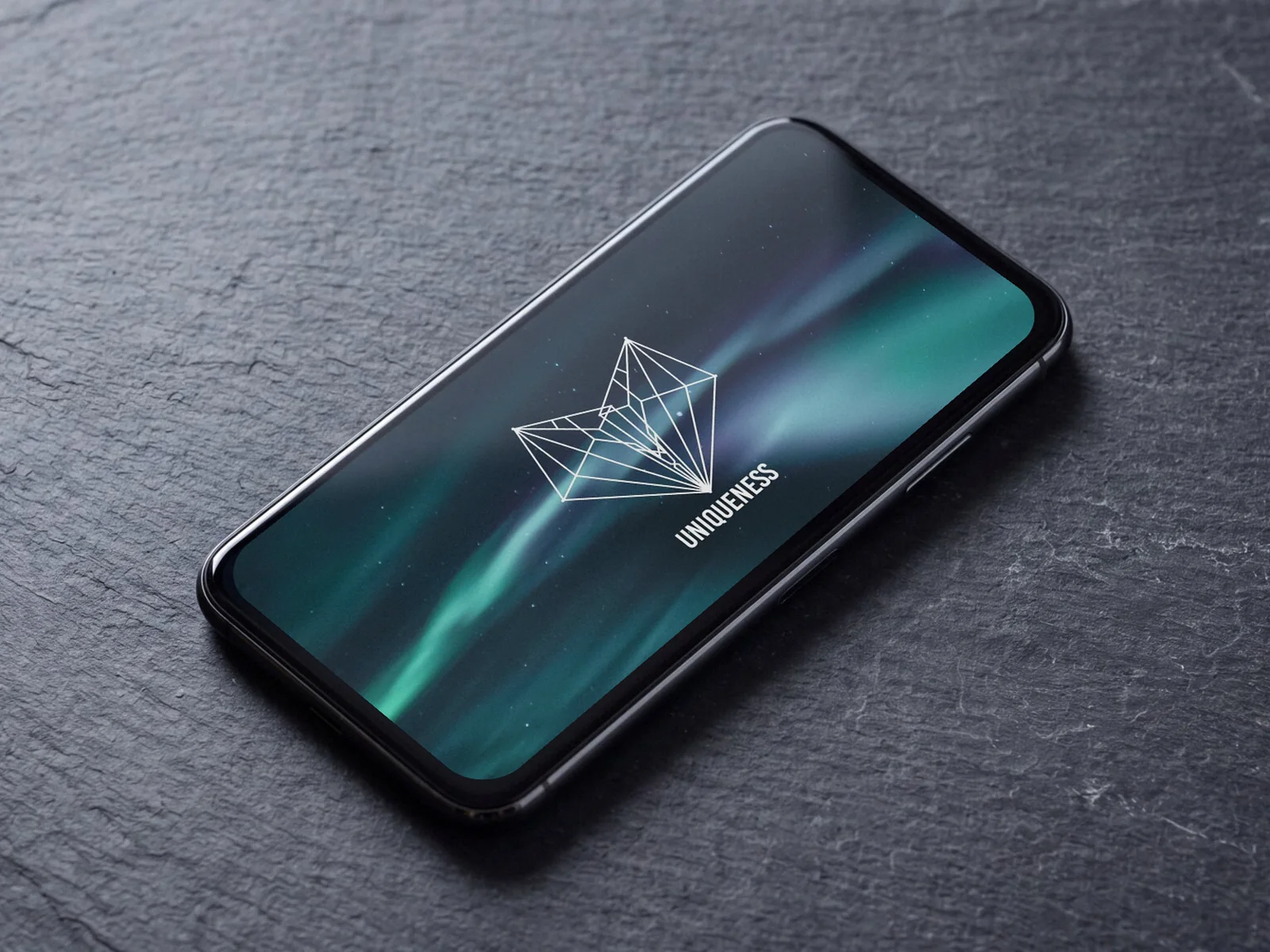
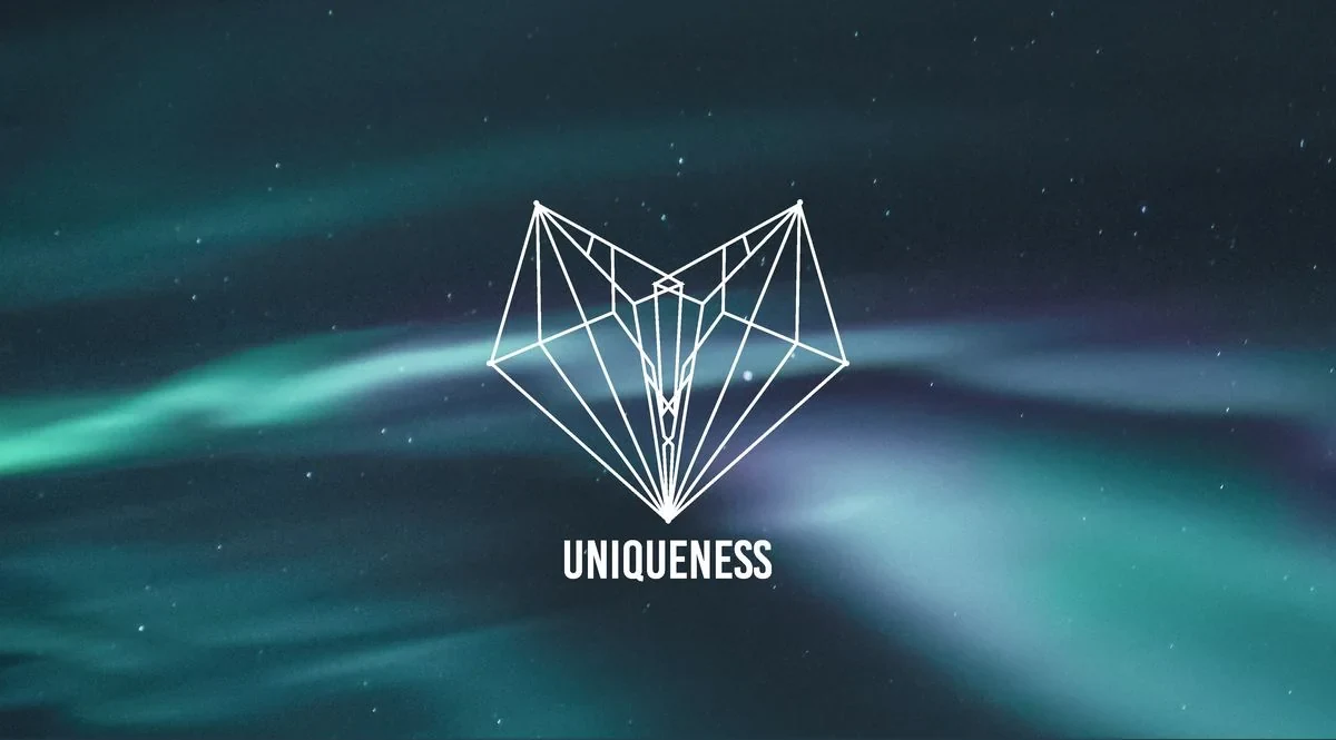
Brand direction for a music identity: a deer-and-diamond emblem, consistent lockups and an atmospheric palette for digital channels.
Part by part
From construction to lockup
-
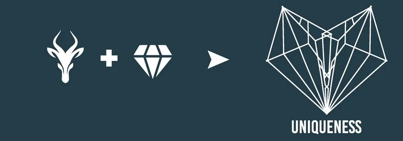
Two references, one emblem
Deer and diamond resolve into a single geometric emblem.
-
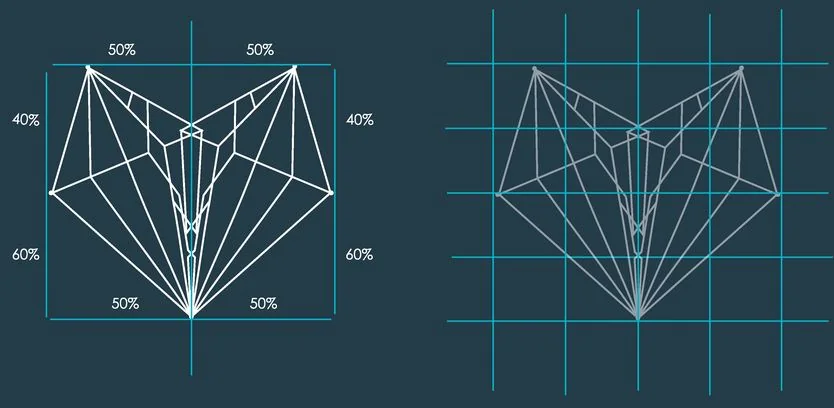
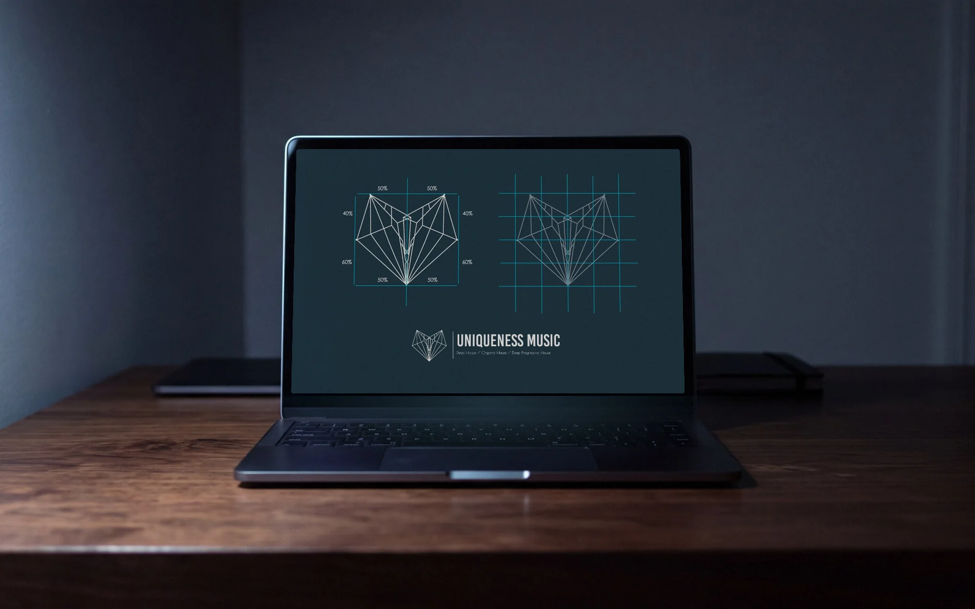
Construction you can repeat
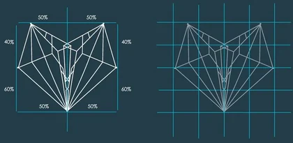
Proportions and alignment define the drawing at any size.
-

A consistent lockup
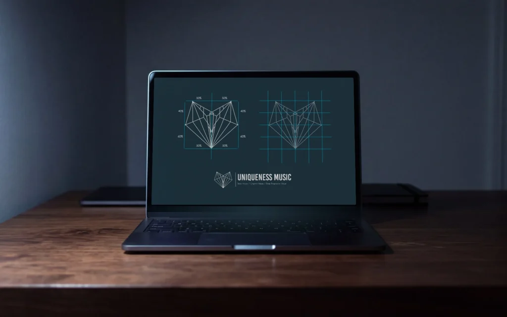
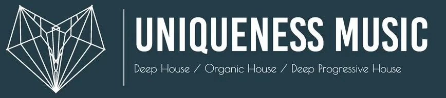
The emblem pairs with a fixed wordmark and a genre line.
-
Applications
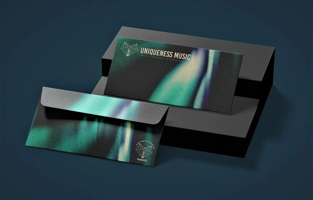
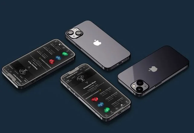
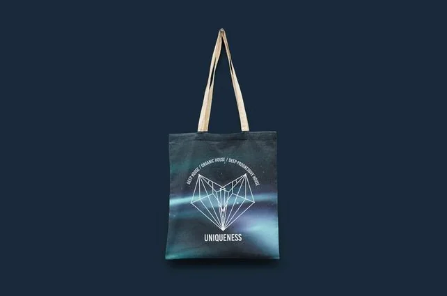
Laptop, stationery, phone and tote: labelled mockups, not delivered work.
-
One identity
Concept, construction and lockup from the original guidelines.
The design files, arranged in 3D
Identity
Colour, type and system
Palette
Sampled from the production files
- #13222A RGB 19 34 42
- #213E4A RGB 33 62 74
- #2D5967 RGB 45 89 103
- #4C838E RGB 76 131 142
- #88AFB8 RGB 136 175 184
Type
System

Palette sampled from the production files; type and system as printed
The artwork
Designed in detail
 Open full-size image
 Open full-size image
 Open full-size image
 Open full-size image
Design decisions
Why it looks this way
-
Open full-size image
Original artworkConcept Two references, one emblem
Deer and diamond references resolve into a single geometric emblem.
-
Open full-size image
Original artworkConstruction Construction you can repeat
Proportions and alignment define a consistent drawing at any size.
-
Open full-size image
Original artworkLockup A consistent lockup
The emblem pairs with a fixed wordmark and a genre line.
In context
 Open full-size image
Campaign
A proposed direction
 Open full-size image
Process & productionFull write-up, print specs, timeline, files, credits
Overview
Uniqueness is a music identity for deep, organic and progressive house. It needed a compact signature to connect channel artwork and branded applications.
The challenge
One mark had to organise a recognisable look across channel artwork, motion content and branded items.
Creative direction
A geometric emblem and a consistent wordmark hold the system together; atmospheric imagery and a restrained palette carry the mood.
What was delivered
Original guideline material with concept and construction diagrams, and the resolved lockup. The application images below are presentation mockups.
Design value
The system shows how one mark can organise a visual language across touchpoints. The mockups illustrate possible applications; they do not prove those items were produced.
The problem is framed from the finished work, not quoted from a client brief.
Delivered
- Identity guidelines
- Emblem construction
- Wordmark lockup
- YouTube banners, thumbnails, intro video and equalizer graphics (listed in the original portfolio, not shown here)
Evidence
- Verified fact
- Concept, construction and lockup come from the original guidelines.
- Design reading
- A strict construction lets the emblem stay consistent at any size.
Credits & notes
- Brand direction, logo and typography — Faraz Khadivdjam
- Application images — presentation mockups
- Studio composites — production artwork rendered in Blender on background plates generated with Magnific (Freepik) from text prompts, 2026
In short
An emblem built on construction lines, drawn to hold up on screens, covers and branded items.
Contact
Have a project in mind?
Tell me what you’re making, what you need designed, and your timeline. For design roles or collaborations, email me directly.
Email info@farazdesign.com