
CALI
An emblem that holds a nine-flavour range together.
- Problem
- Nine flavours and five strengths had to be recognisable at a glance on a 60 mm lid, with EU regulatory copy on every SKU.
- Solution
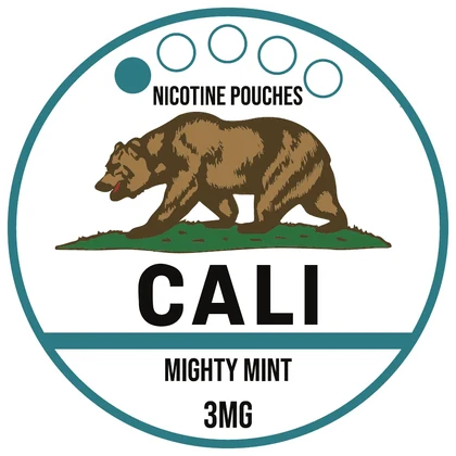
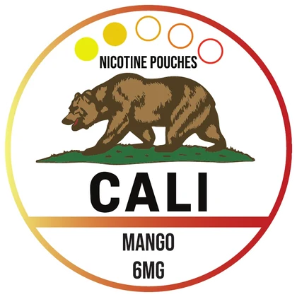
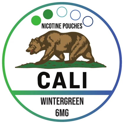
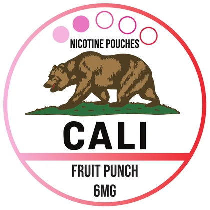
- A fixed bear emblem and frame, one colour per flavour, and a strength system that repeats on every label.
- Result
- 33 SKUs and 99 print-ready labels, delivered in two waves (August and November 2025), each with its own barcode and UFI code.
My role Brand identity · flavour architecture · label artwork
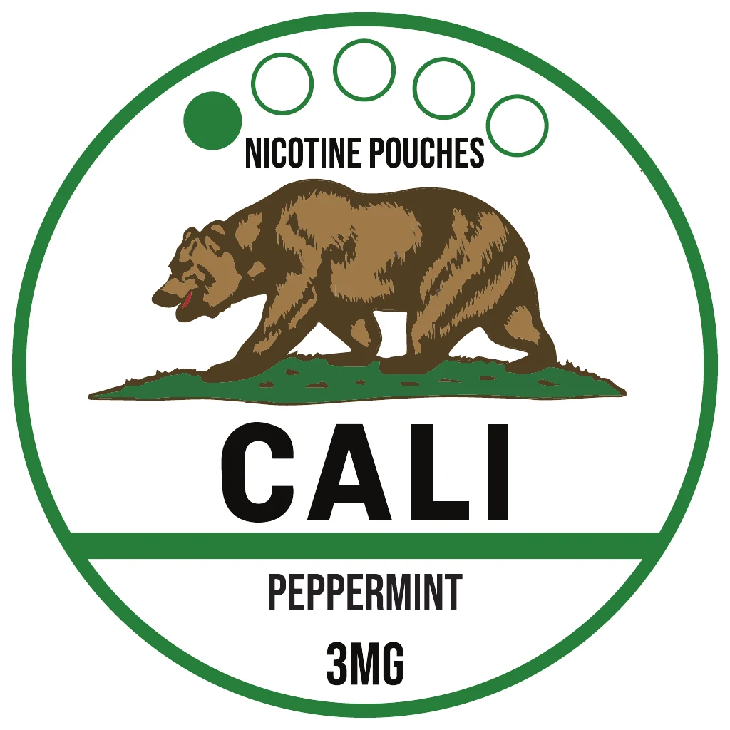
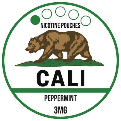
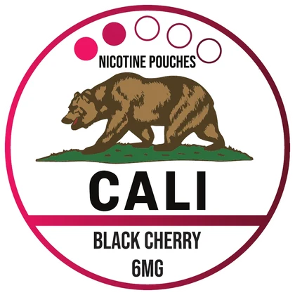
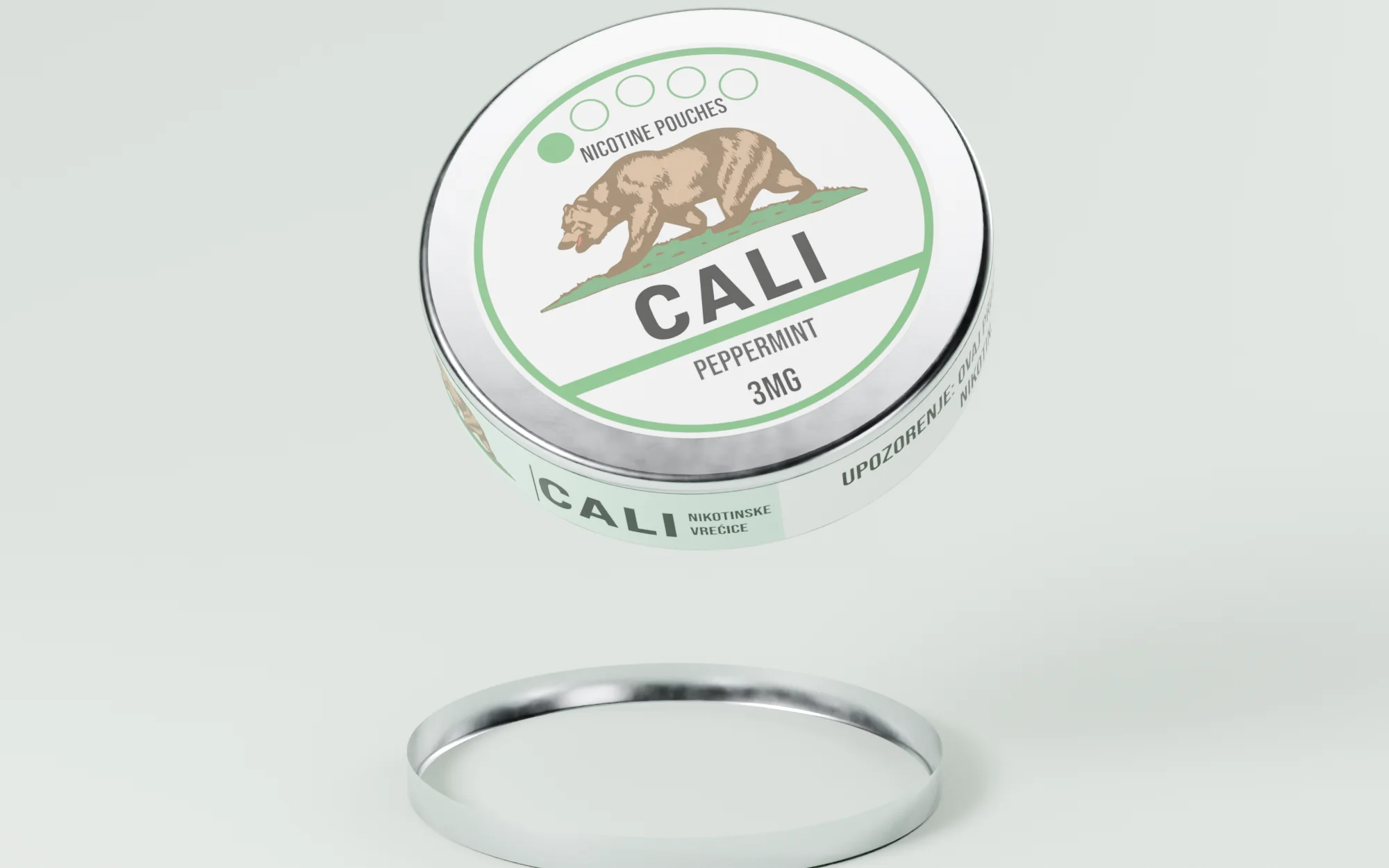
CALI Peppermint · 3 mg
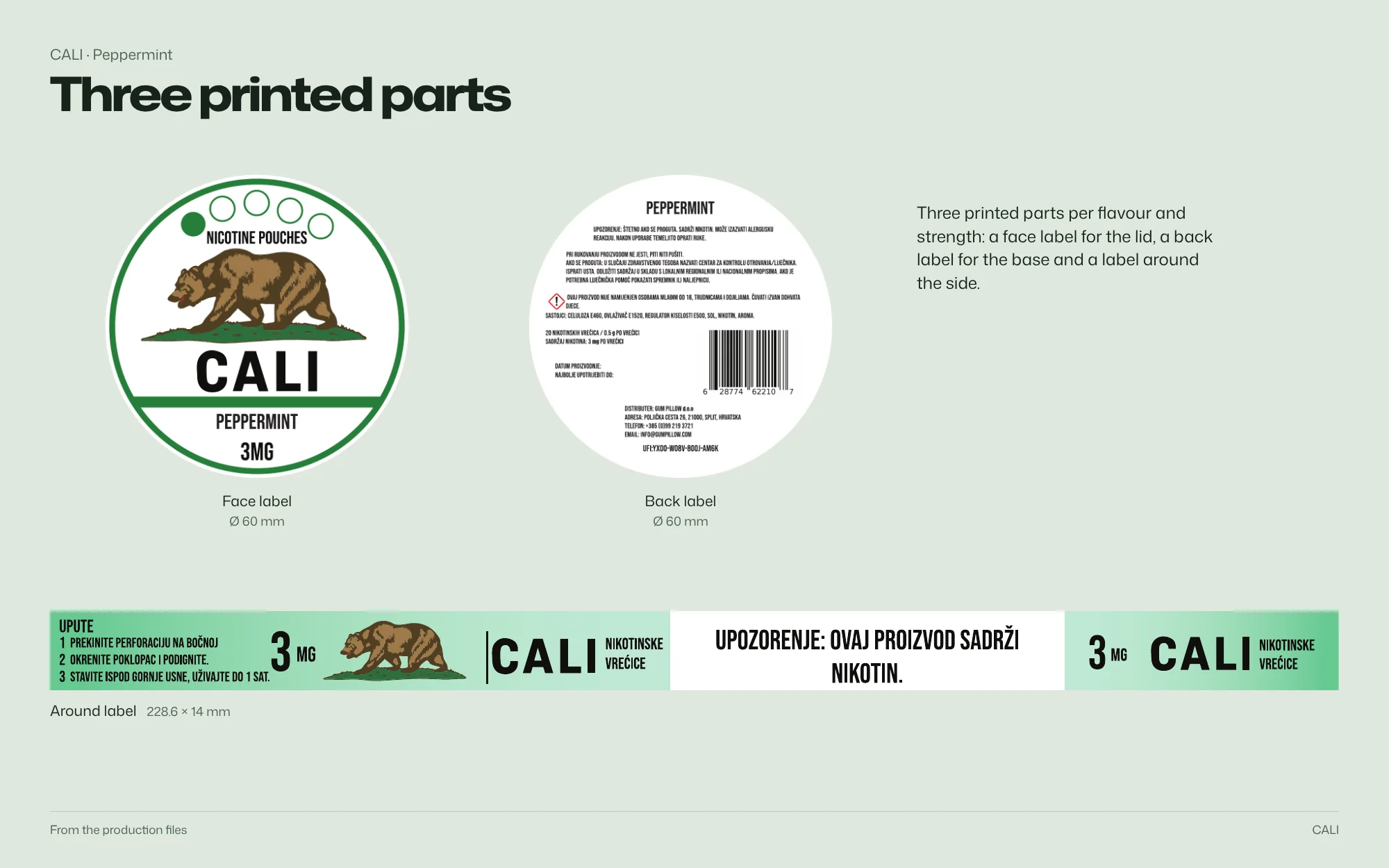
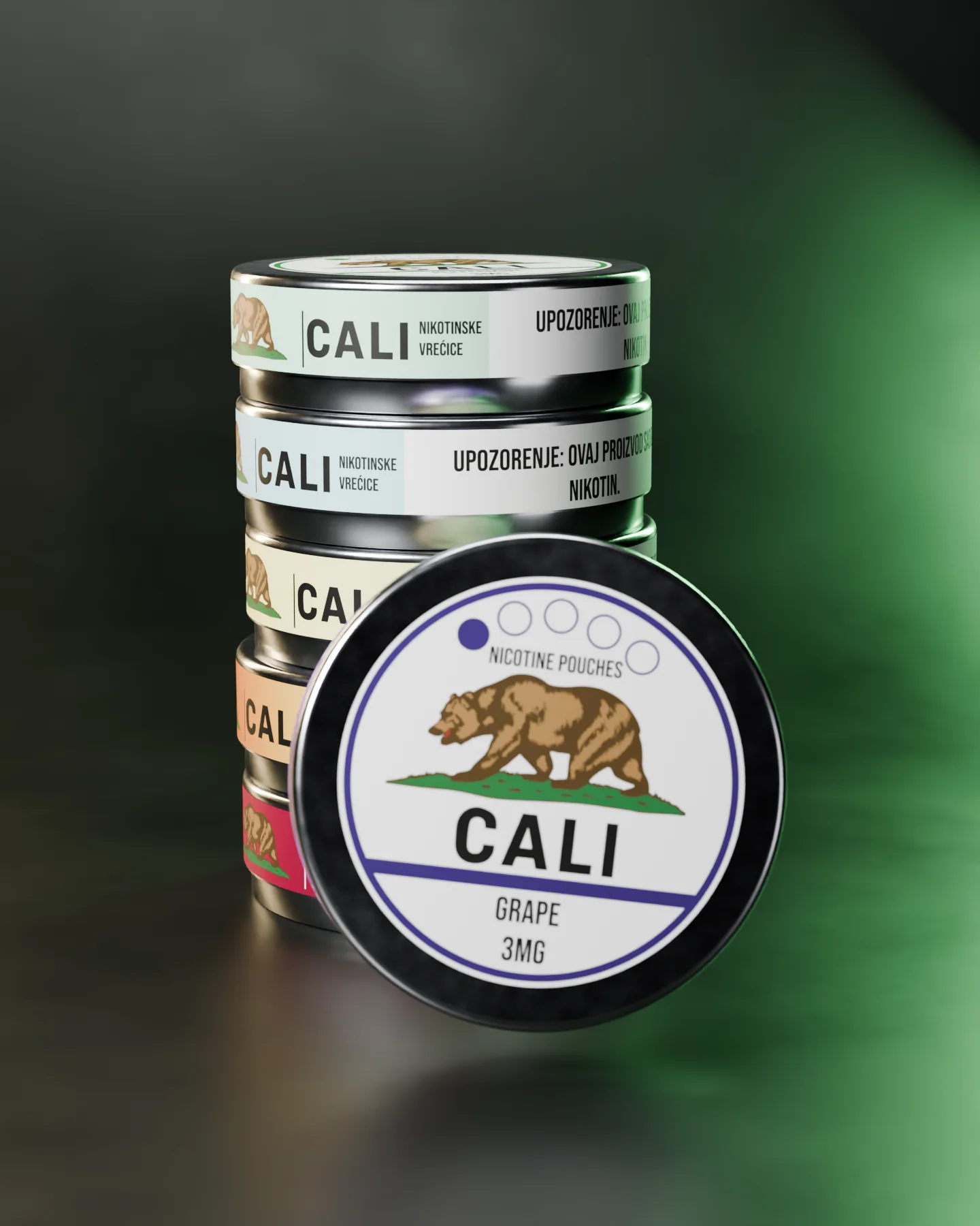
3D model — original artwork Ø 60 mm face label, 228.6 × 14 mm wrap and Ø 60 mm back label from the production files.
Brand identity and label artwork for a nine-flavour nicotine-pouch range: a fixed bear emblem and frame, with colour carrying each flavour.
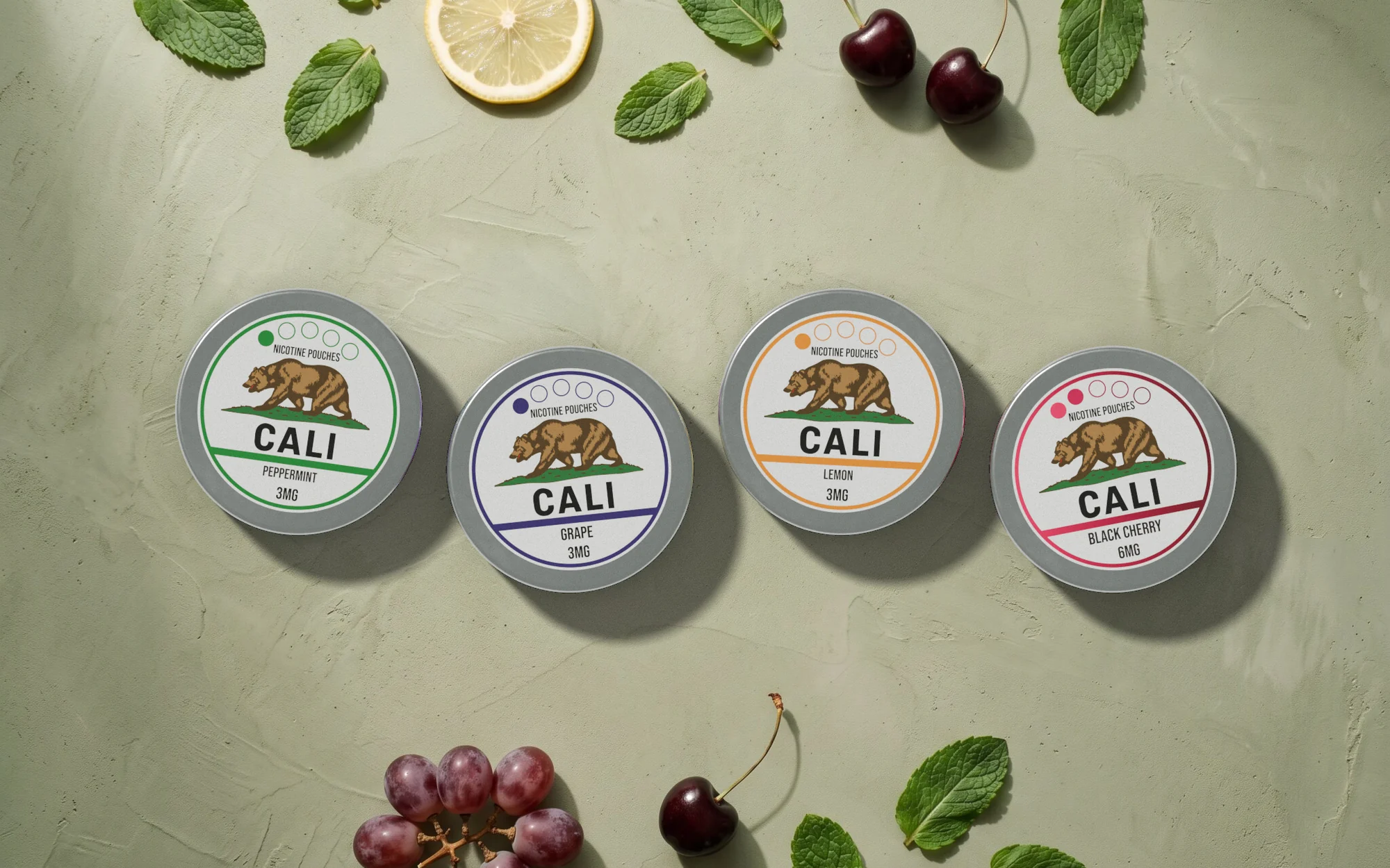 Open full-size image
Part by part
One bear, nine flavours
-

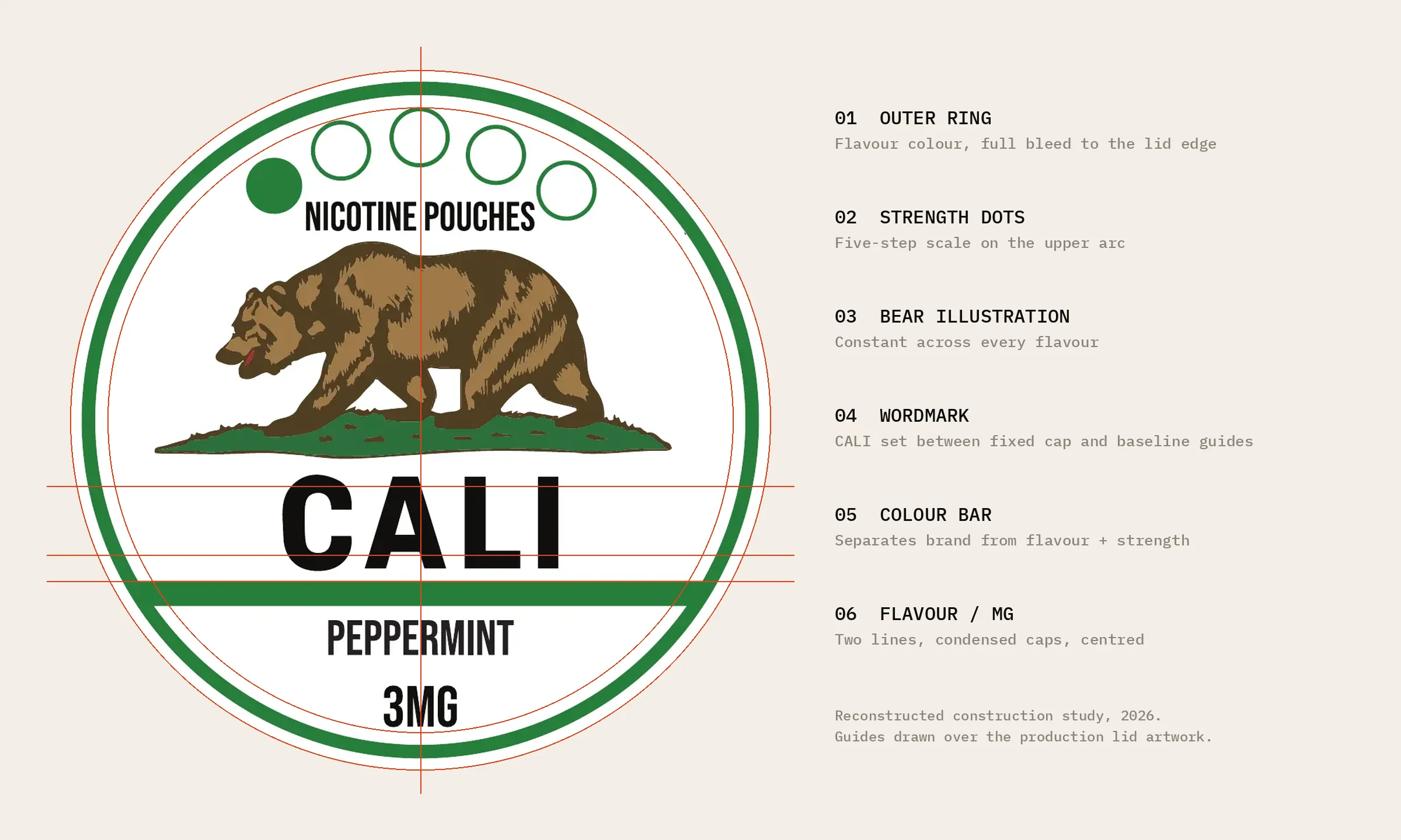
Bear and frame stay fixed
The bear emblem, CALI wordmark and concentric frame anchor every lid.
-
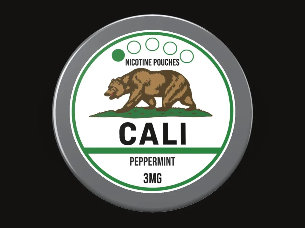
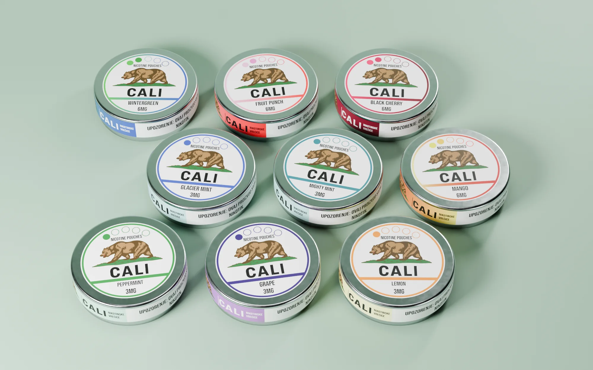
Colour carries the flavour
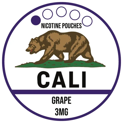
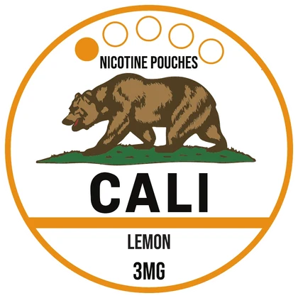
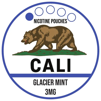
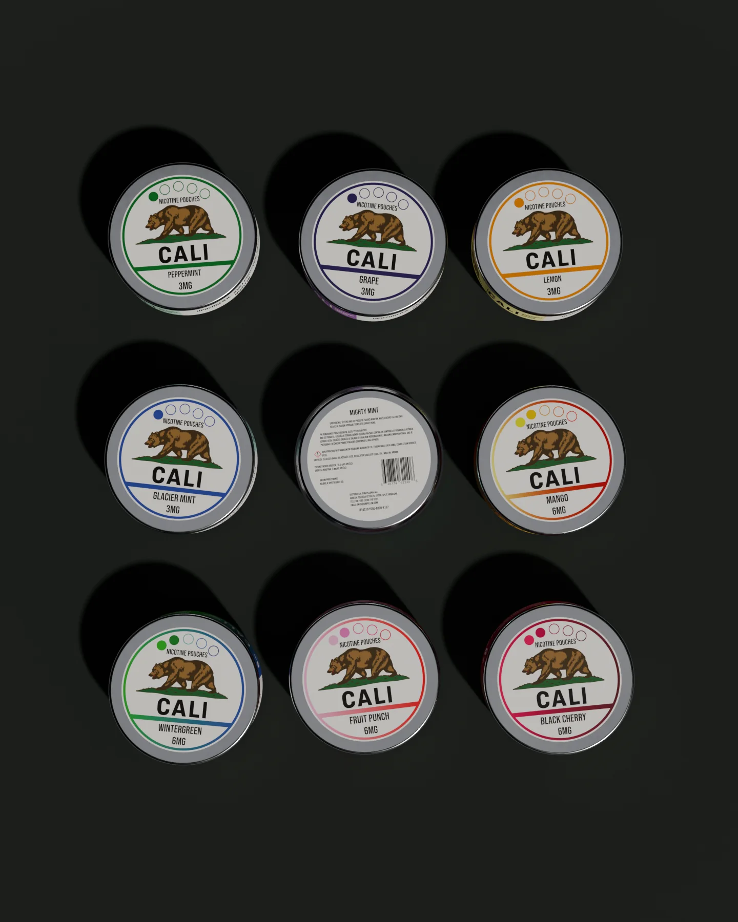
One colour in the outer ring and divider bar; the name sits in the same place on every lid.
-

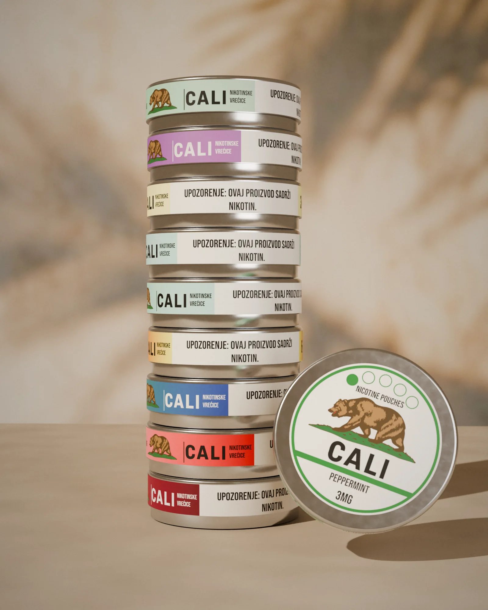
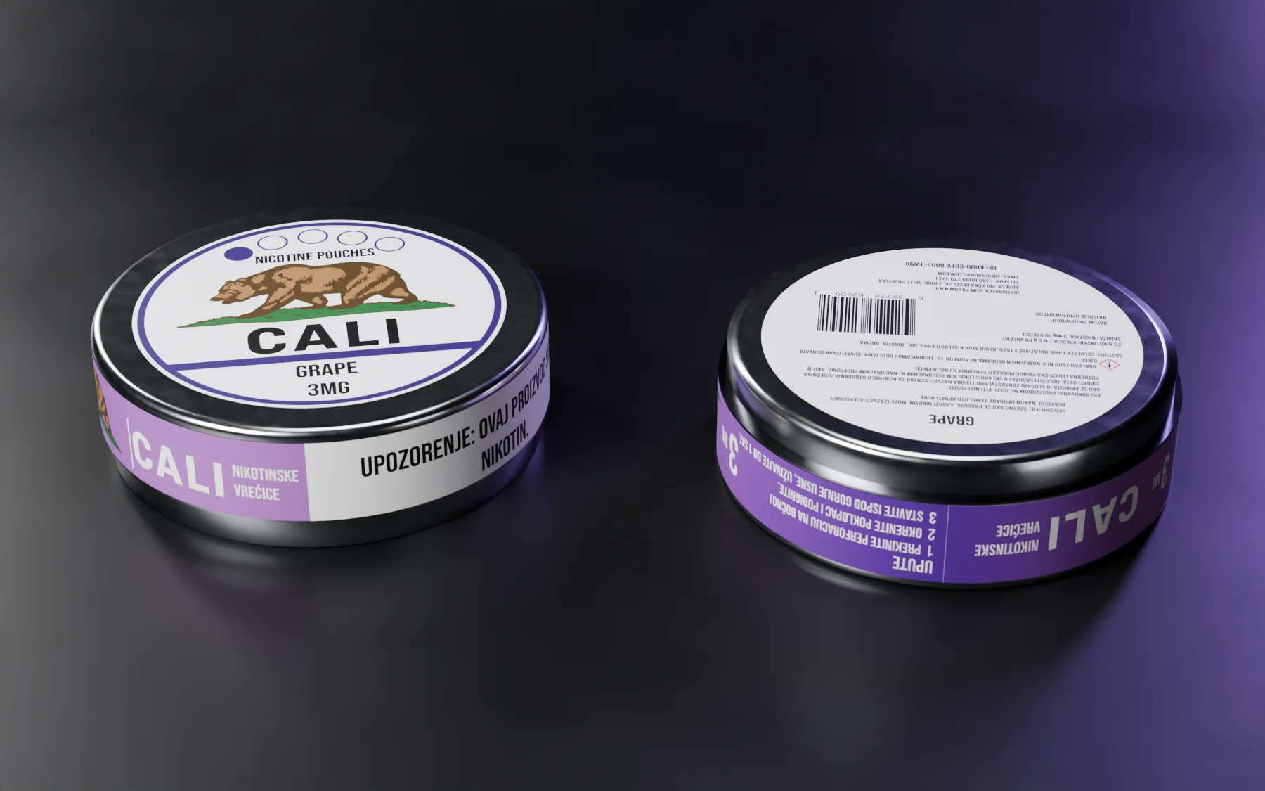
The wrap
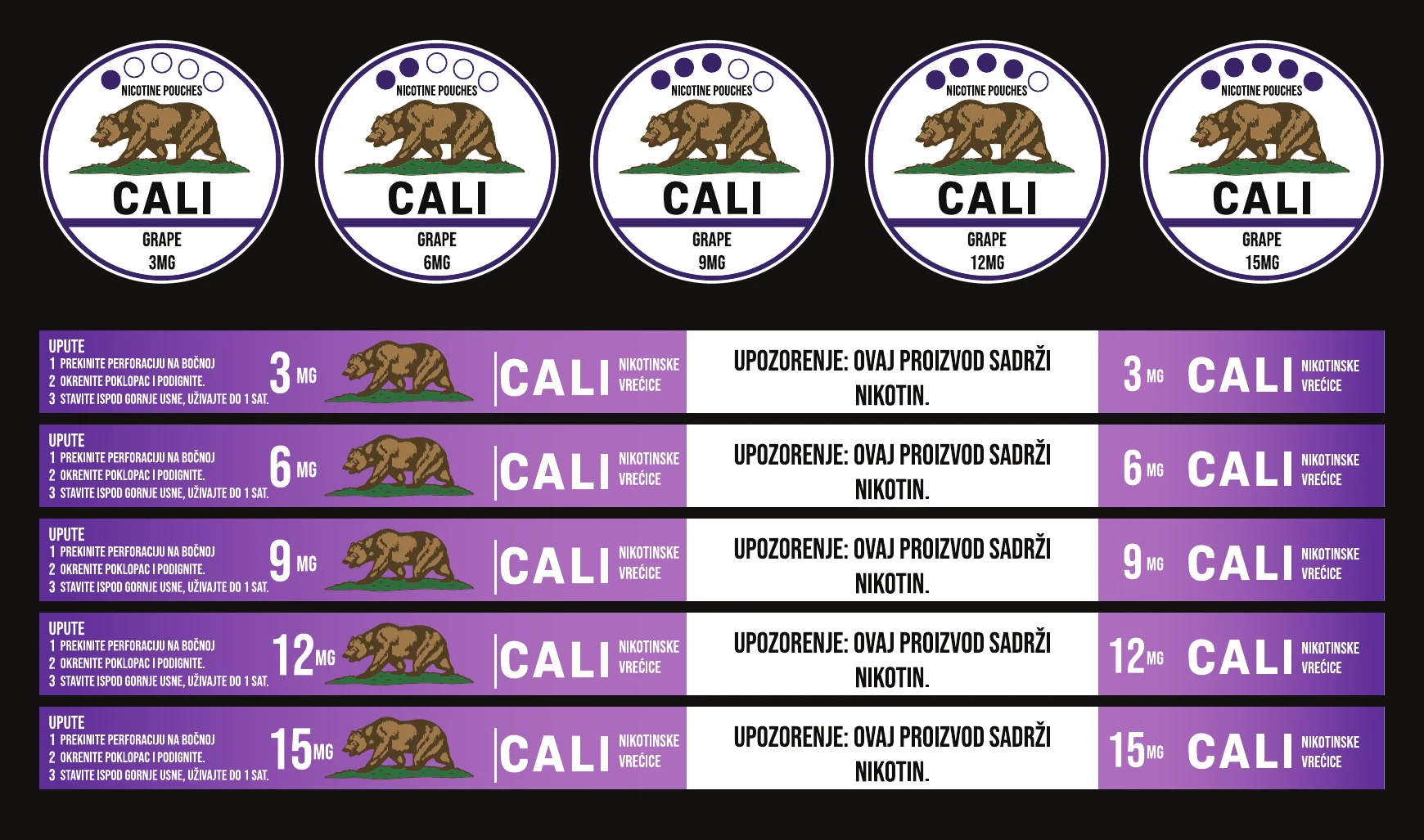
A 228.6 × 14 mm band keeps the brand visible around the rim.
-

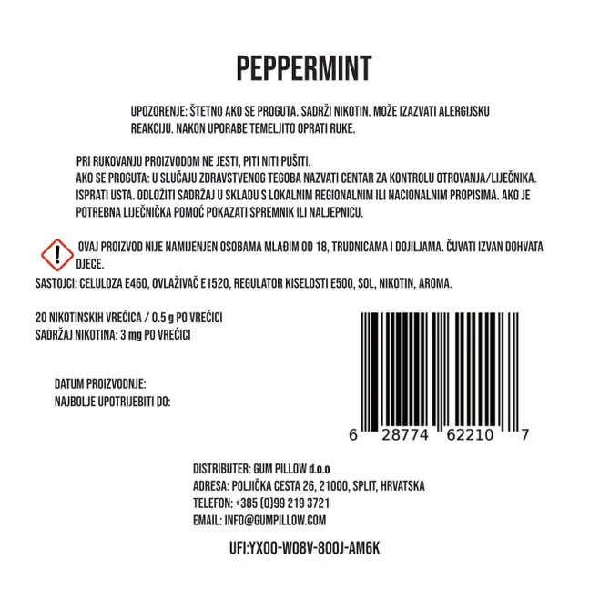
The reverse
A Ø 60 mm back label with the detailed copy, its own EAN-13 barcode and EU UFI code.
-

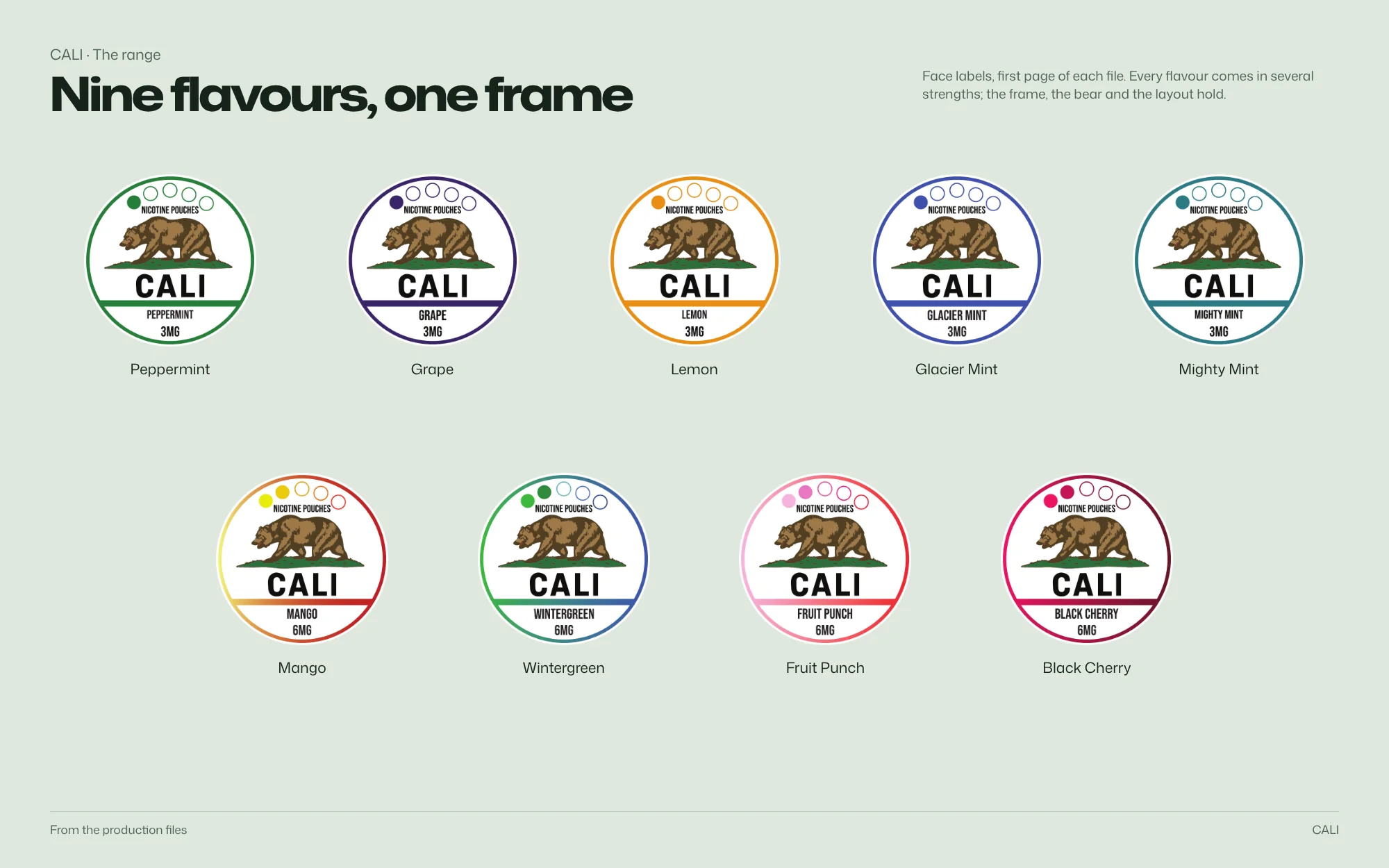
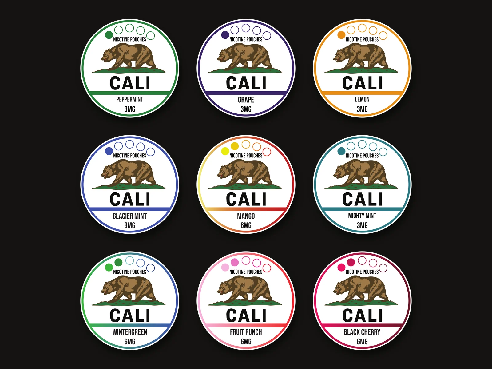
Nine flavours
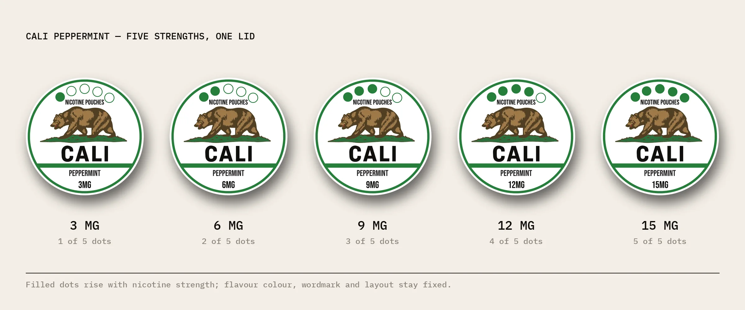
The production files cover 33 SKUs: nine flavours, two to five strengths each.
-

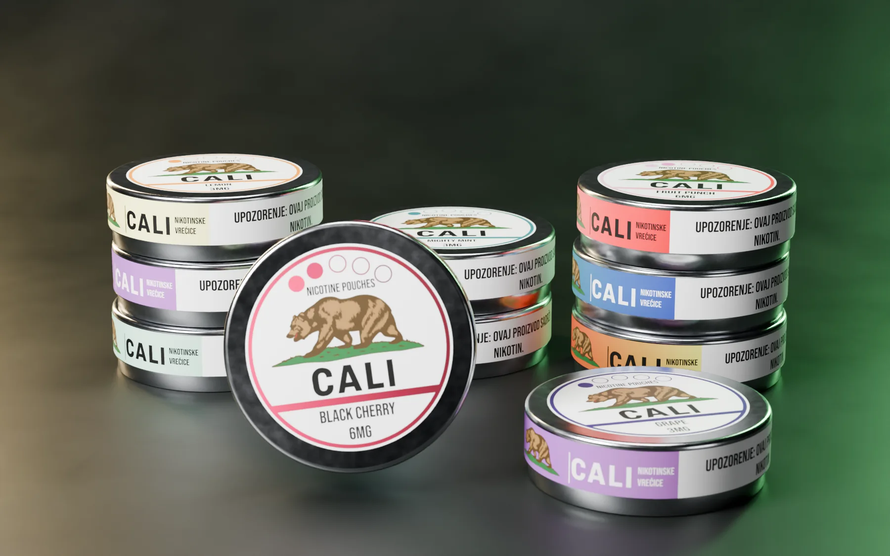
Lid and band, one system
Face, wrap and back labels exist for every SKU.
3D: the production artwork on the real dimensions
Identity
Colour, type and system
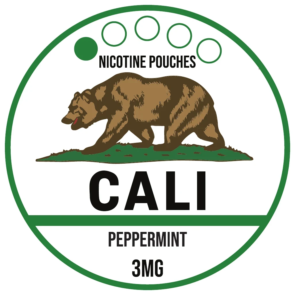
Palette
Sampled from the production files
- #4F3D2E RGB 79 61 46
- #366F5F RGB 54 111 95
- #B66C41 RGB 182 108 65
- #8B959A RGB 139 149 154
- #D8C5C2 RGB 216 197 194
- #FEFEFE RGB 254 254 254
Type

System
Palette sampled from the production files; type and system as printed
Brandbook
The system, board by board
 Open full-size image
 Open full-size image
 Open full-size image
The artwork
Designed in detail
 Open full-size image
The range
9 variants, one system
-
Peppermint · 3 mg
-
 Grape · 3 mg
-
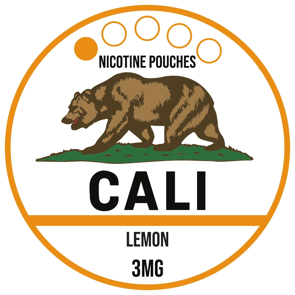 Lemon · 3 mg
-
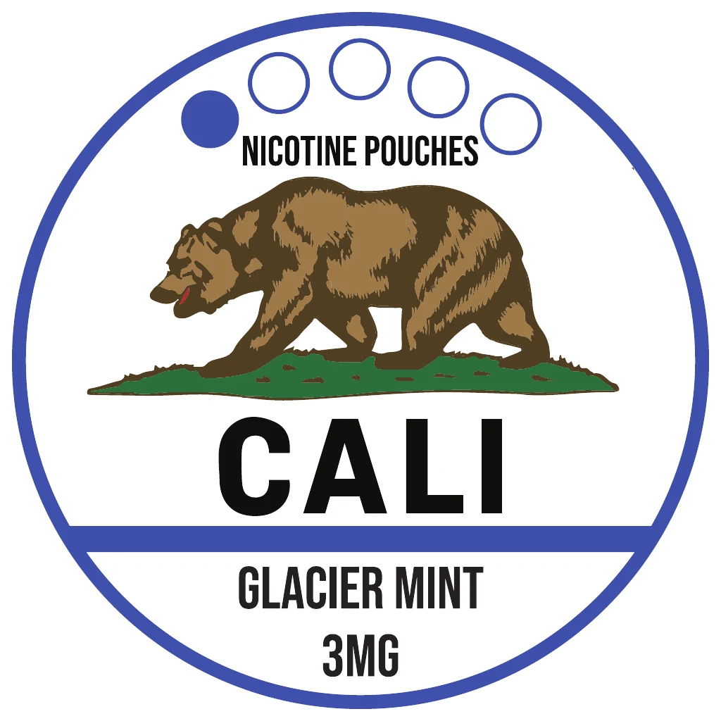 Glacier Mint · 3 mg
-
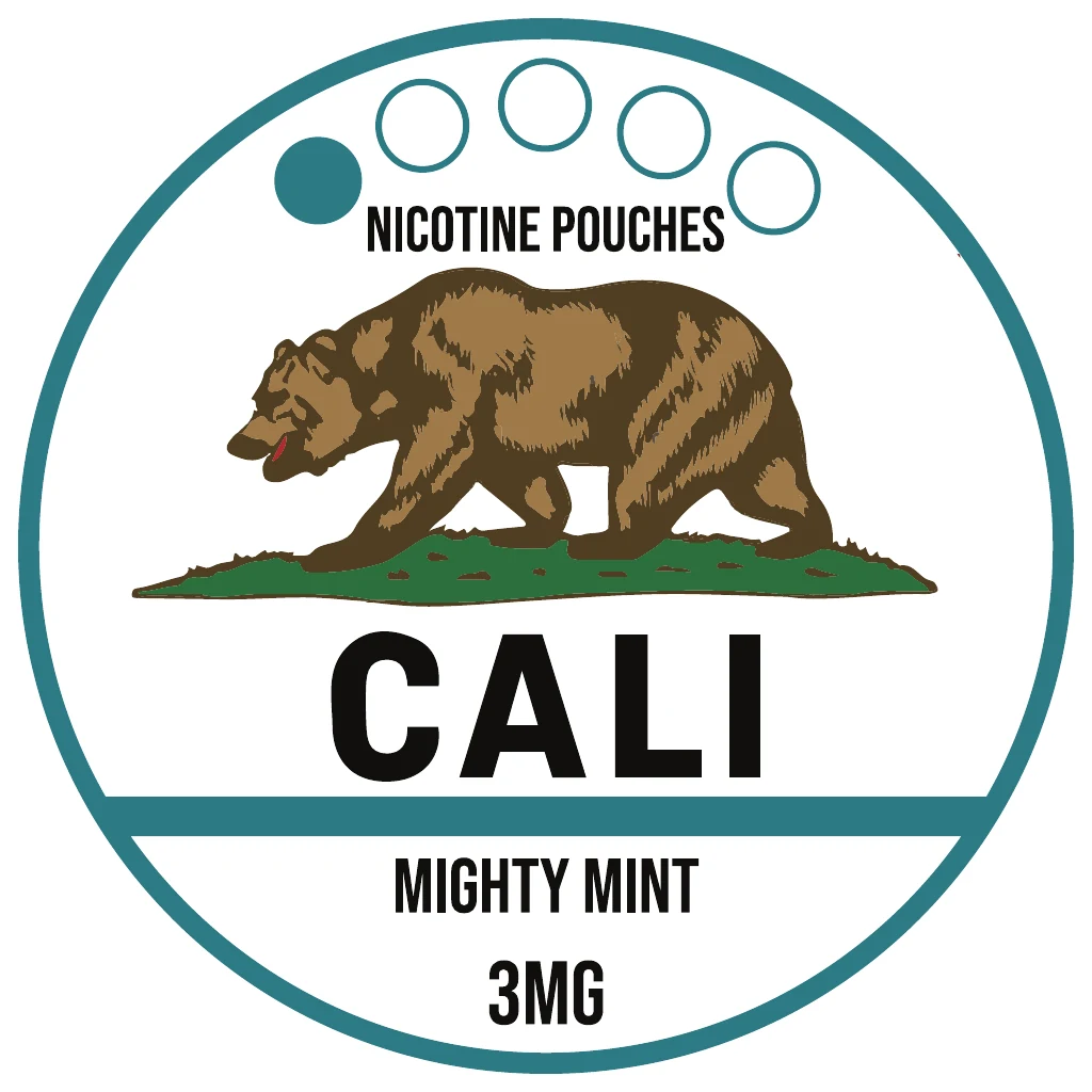 Mighty Mint · 3 mg
-
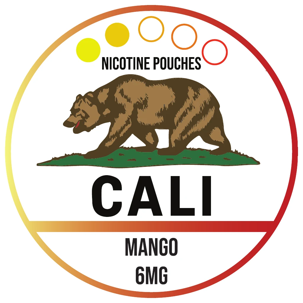 Mango · 6 mg
-
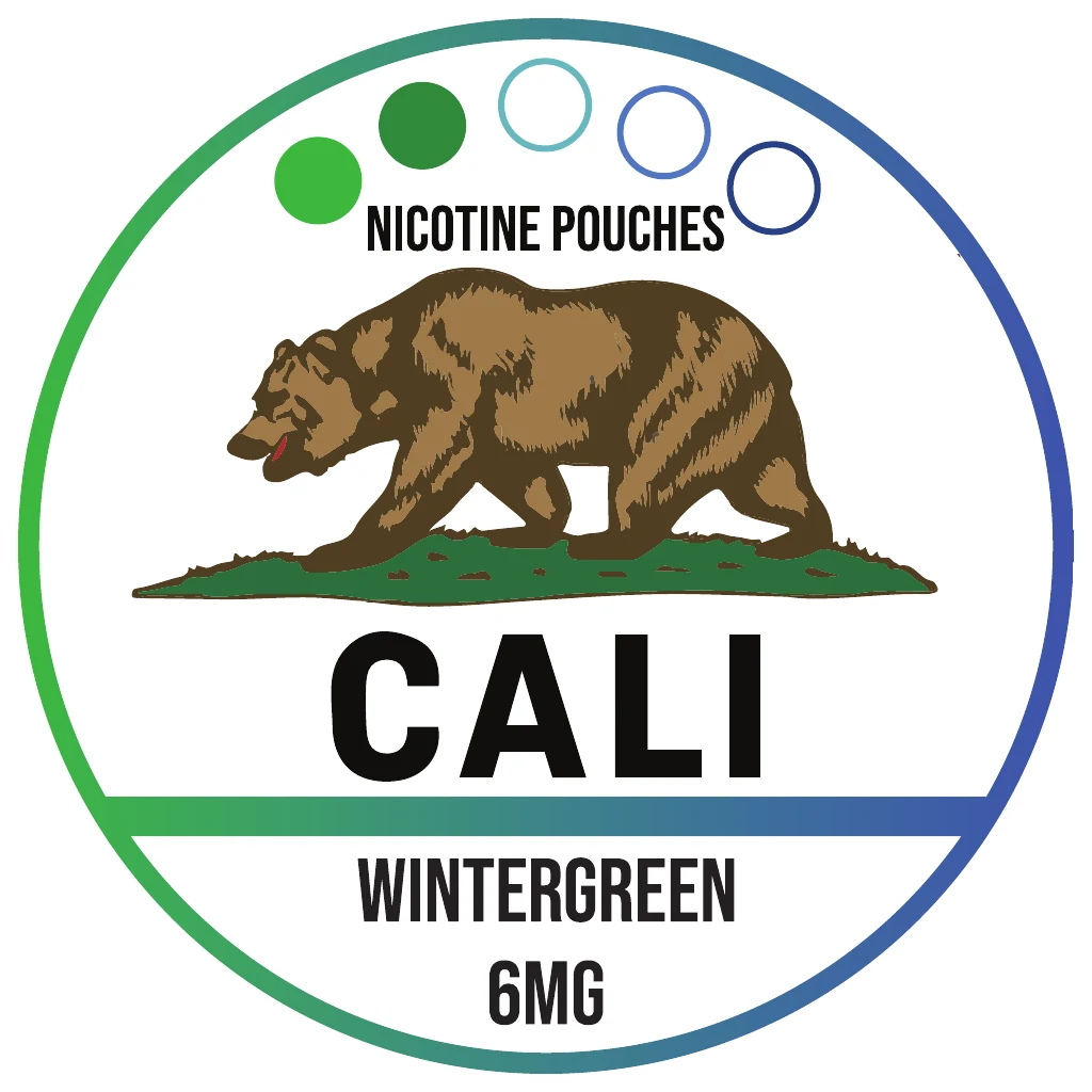 Wintergreen · 6 mg
-
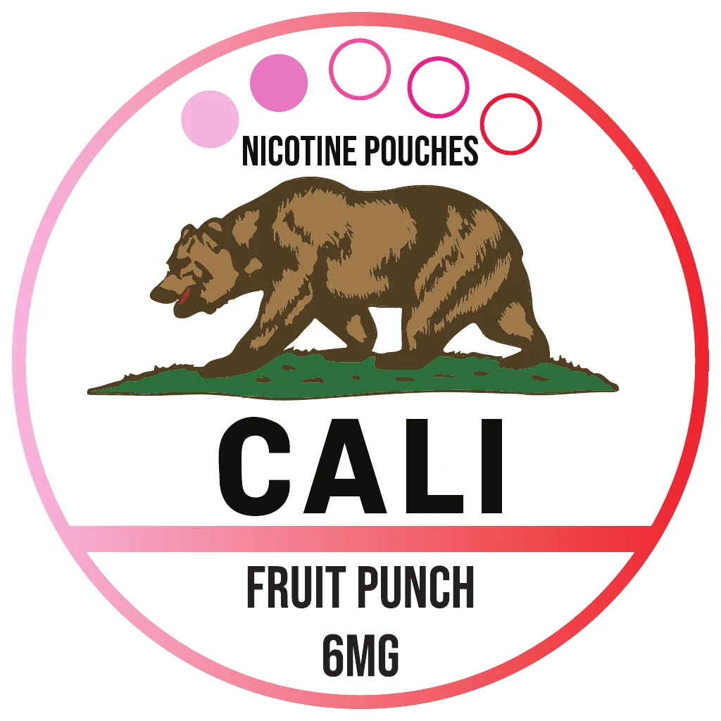 Fruit Punch · 6 mg
-
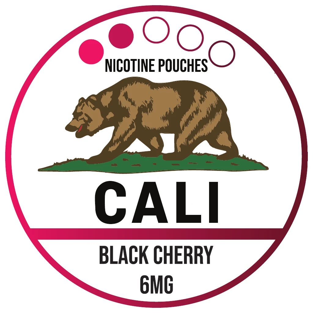 Black Cherry · 6 mg
Design decisions
Why it looks this way
-
 Open full-size image
Original artworkPeppermint lid Bear and frame stay fixed
The bear emblem, CALI wordmark and concentric frame anchor every lid. They never move, so the brand stays constant while the range grows.
-
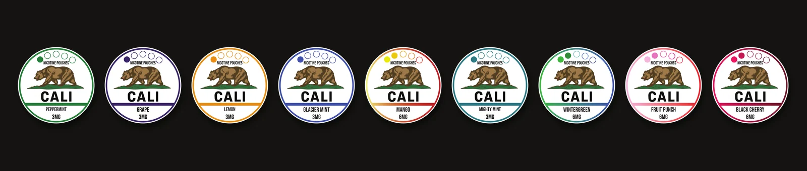 Open full-size image
Original artwork Colour carries the flavour
Each flavour gets one colour in the outer ring and divider bar; the name sits in the same place on every lid.
-
 Open full-size image
Original artworkReverse label Each surface has a job
The lid carries identity and flavour, the wrap keeps the brand visible around the rim, and the reverse holds the detailed copy and barcode.
In context
 Open full-size image
 Open full-size image
 Open full-size image
 Open full-size image
 Open full-size image
 Open full-size image
 Open full-size image
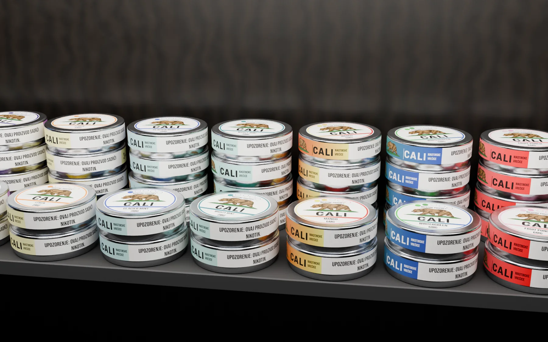 Open full-size image
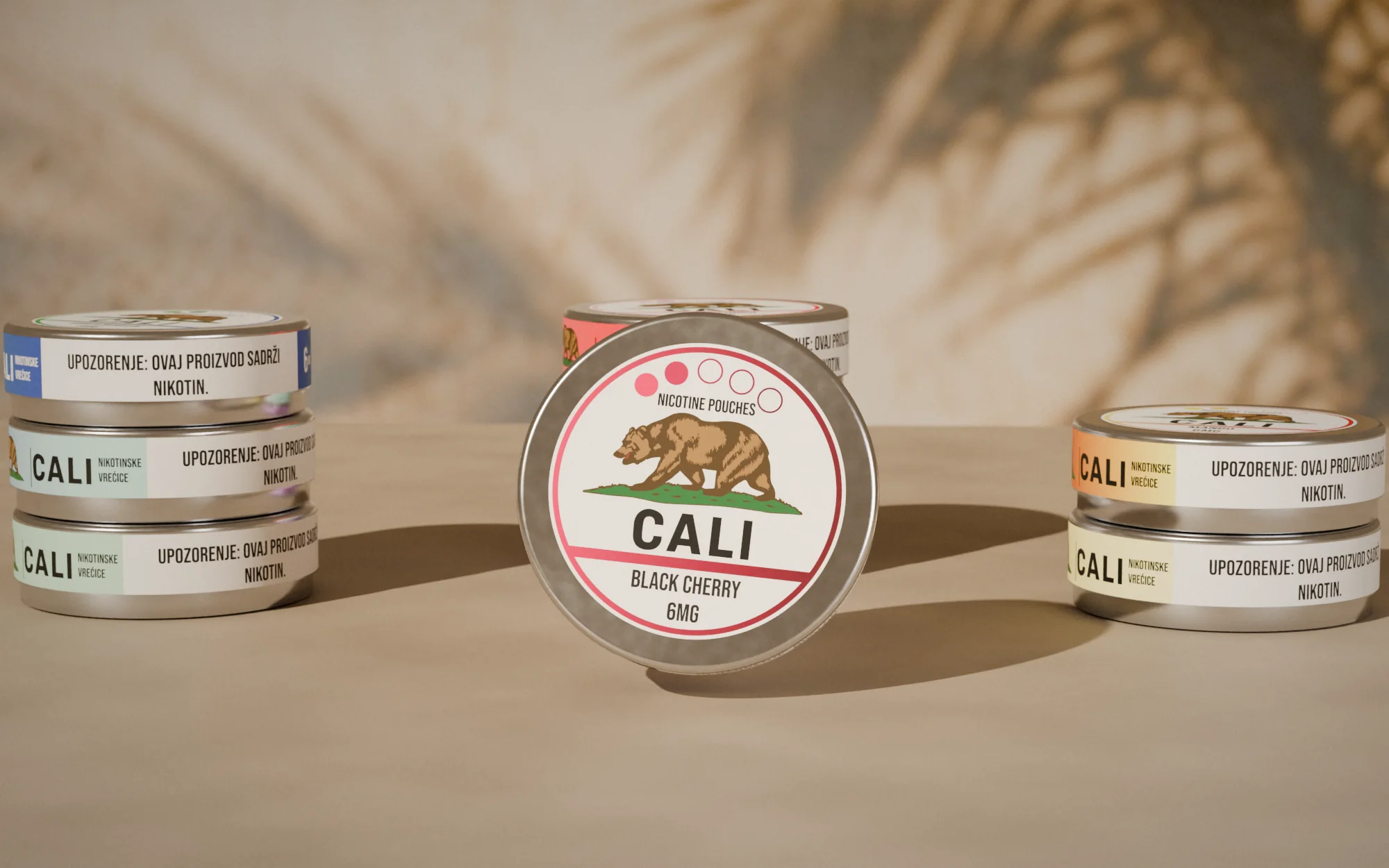 Open full-size image
Campaign
A proposed direction
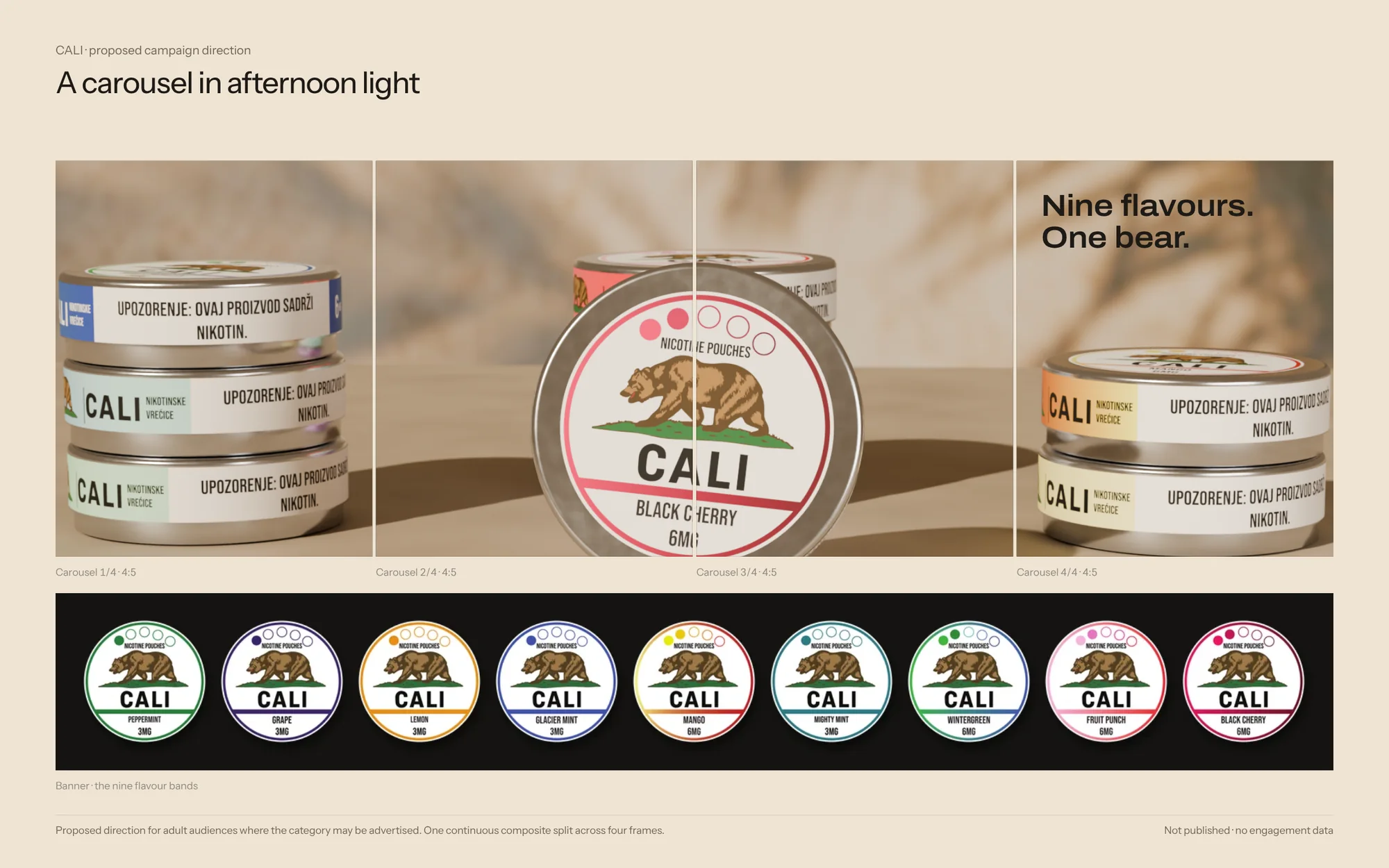 Open full-size image
By the numbers
- flavours on one system
- 9
- flavours on one system
- SKUs, each with its own barcode and UFI code
- 33
- SKUs, each with its own barcode and UFI code
- print-ready labels: face, wrap and back
- 99
- print-ready labels: face, wrap and back
- release waves: five flavours, then four more
- 2
- release waves: five flavours, then four more
Before / after
Back label: first proof to final
Drag to compare the first proof with the final file. The design was already set; this is the production pass that makes a label printable and compliant.
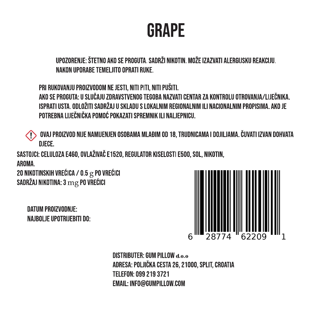

What changed
- An EU UFI code (poison-centre identifier) added for every SKU
- Address localised: “Croatia” became “Hrvatska”
- Phone number set in international format, +385 (0)99…
- Unit glyphs (g, mg) that had fallen back to a serif now set in the label typeface
- Ingredient line re-broken so the last word no longer sits alone
- Hazard pictogram enlarged
Process & productionFull write-up, print specs, timeline, files, credits
Overview
CALI is a nicotine-pouch brand in a round tin. Each tin carries three printed parts: the round lid, a narrow wrap band and a reverse label for the detailed copy, which is in Croatian.
The challenge
Nine flavours needed individual recognition without weakening the CALI identity across a small circular lid and its supporting labels.
Creative direction
Fixed: the bear emblem, CALI wordmark, concentric frame and label hierarchy. Variable: one colour per flavour in the ring and divider, and the flavour name. Strength is shown as printed on each production file.
What was delivered
Nine flavour lids with wrap and reverse artwork, prepared in the strength versions found in the production files.
Design value
A consistent family makes variants easier to compare and gives a repeatable foundation for further artwork. This is design rationale, not a measured retail result.
The problem is framed from the finished work, not quoted from a client brief.
Delivered
- 33 face labels (9 flavours × strengths)
- 33 wrap labels
- 33 back labels, each with EAN-13 and UFI code
- Strength system, 3–15 mg
Built to print
- Face label
- Ø 60 mm, one per SKU
- Wrap label
- 228.6 × 14 mm
- Back label
- Ø 60 mm, Croatian regulatory copy
- Strengths
- 3 · 6 · 9 · 12 · 15 mg (first five flavours); 6 · 15 mg (later four)
- Codes
- EAN-13 barcode and EU UFI code on every SKU
- Files
- Adobe Illustrator, one vector PDF per label and strength
Timeline
- 30 Jul 2025
First back-label proofs: three versions in one day
- 5 Aug 2025
Face labels for Peppermint, Grape, Lemon, Glacier Mint, Mighty Mint
- 22 Aug 2025
Back labels finalised with UFI codes and localised address
- 7 Nov 2025
Second wave starts: Mango, Wintergreen, Fruit Punch, Black Cherry
- 25 Nov 2025
Second-wave files final, same system
Production files
 Open full-size image
 Open full-size image
 Open full-size image
 Open full-size image
Evidence
- Verified fact
- Production files cover 33 SKUs (nine flavours, two to five strengths each), with face, wrap and back labels for every SKU.
- Every back label carries its own EAN-13 barcode and EU UFI code.
- Production files: 60 mm round lid and reverse labels; 228.6 × 14 mm wrap band.
- The reverse label names the distributor: Gum Pillow d.o.o., Split, Croatia.
- Design reading
- Colour, not layout, distinguishes the flavours.
- Intended benefit
- Variants are easy to compare at a glance.
Credits & notes
- Brand identity and label artwork — Faraz Khadivdjam
- Construction overlay — reconstructed for this portfolio
- Studio renders — made in Blender from the production artwork, 2026
- Studio composites — production artwork rendered in Blender on background plates generated with Magnific (Freepik) from text prompts, 2026
- Studio sets — production artwork on the 3D models, rendered in Blender, 2026 (no generated imagery)
- Flat lays — production artwork rendered in Blender on top-down scenes generated with Magnific (Freepik) from text prompts, 2026
In short
One emblem, one frame and a dot scale carry nine flavours and five strengths across 99 labels.
Contact
Have a project in mind?
Tell me what you’re making, what you need designed, and your timeline. For design roles or collaborations, email me directly.
Email info@farazdesign.com