
Work Custom lettering Packaging
The Squishlist
Product names with their own handwriting.
- Problem
- Each product name needed its own character inside an existing masterbrand.
- Solution
- Every name drawn as the main graphic, with its own letterforms and colour.
- Result
- Four product names lettered, with the masterbrand kept intact.
My role Custom product lettering · packaging graphics
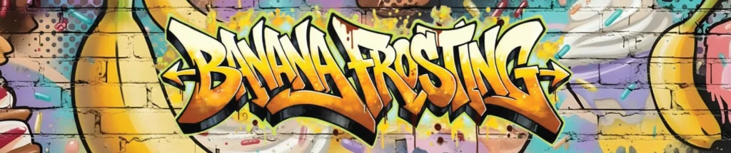
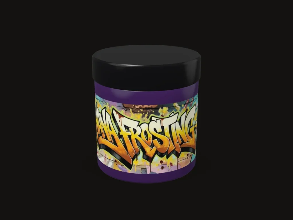
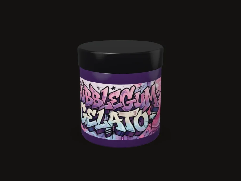
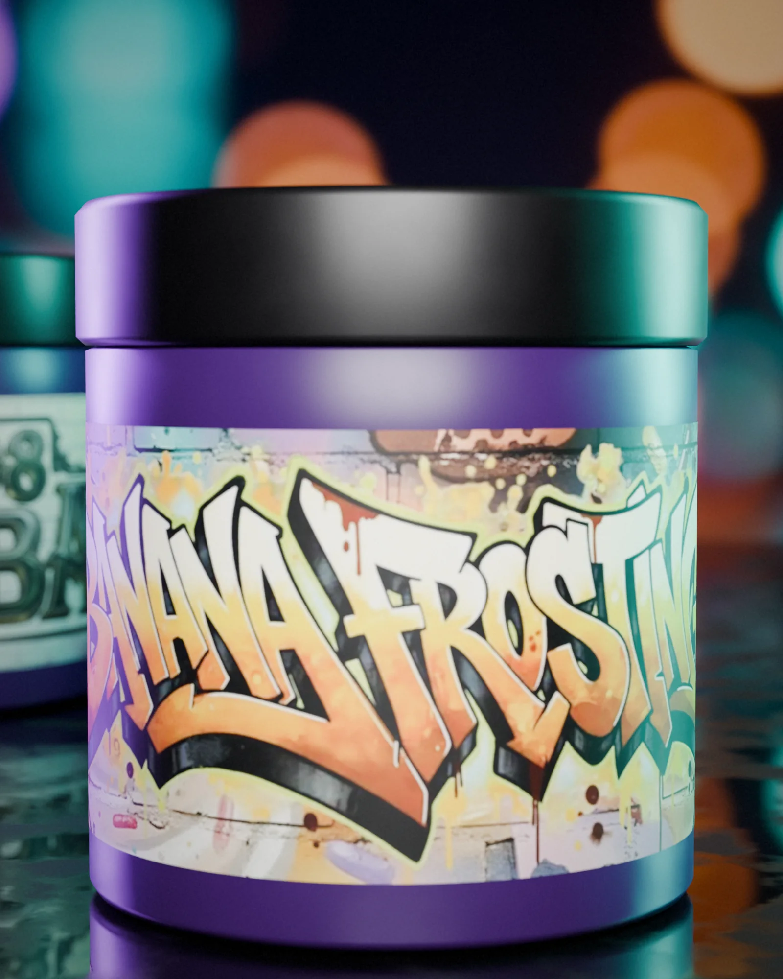
The Squishlist Banana Frosting
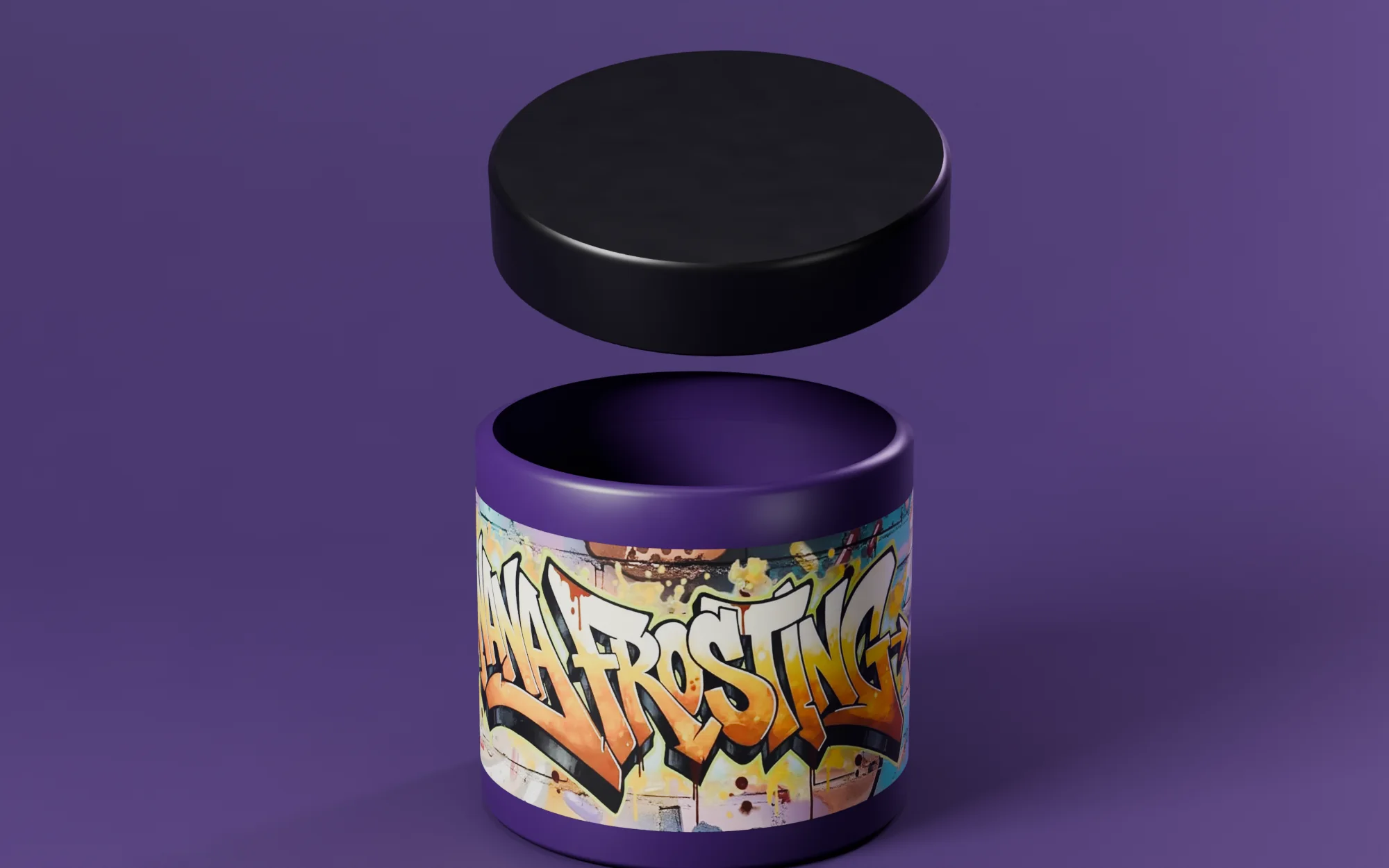
3D model — original artwork Product lettering is mine; wrap backgrounds use AI-assisted imagery. Jar colour follows the presentation mockup; the lid is shown plain.
Custom product-name lettering and jar-wrap artwork within the existing Squishlist masterbrand.
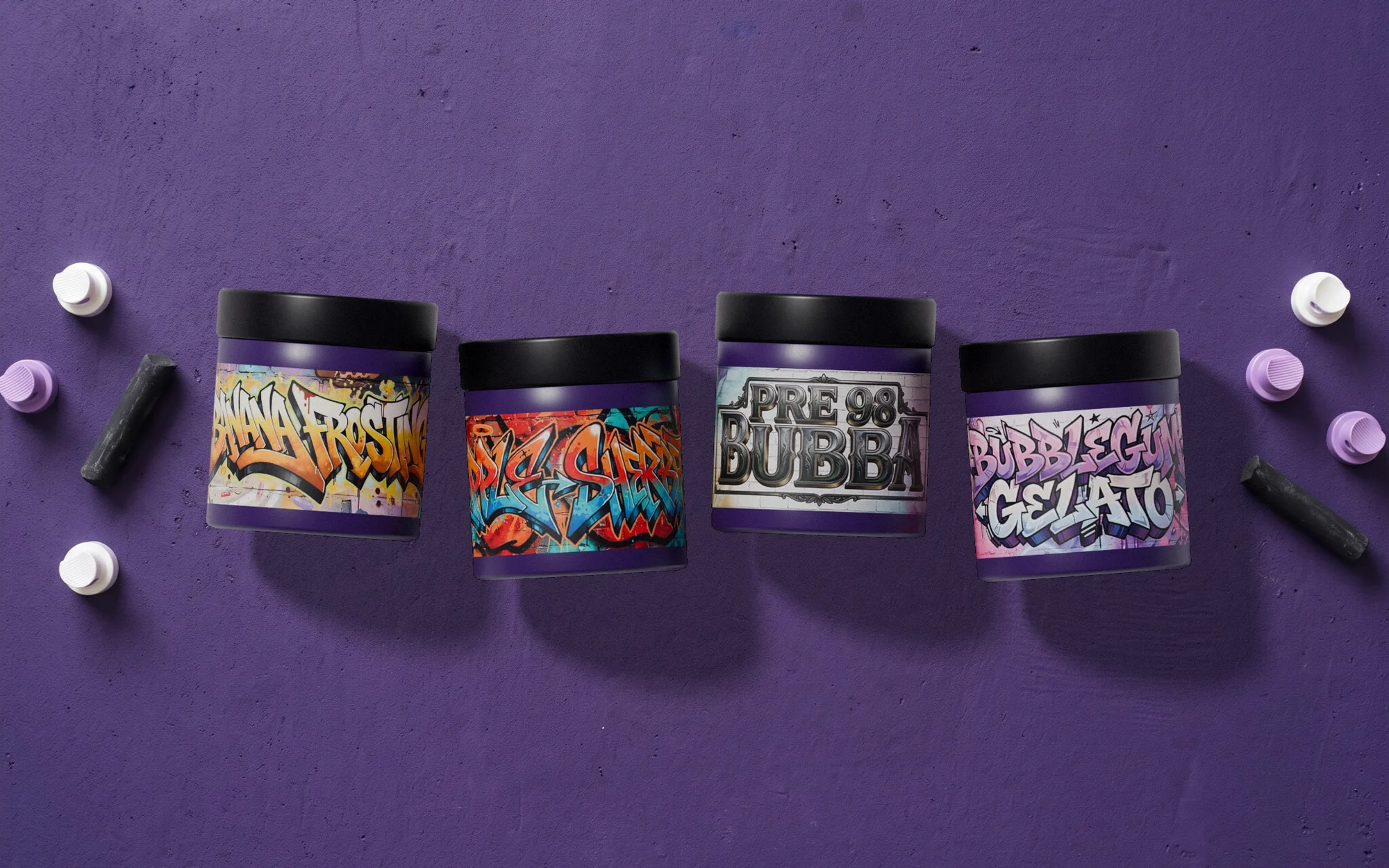 Open full-size image
Part by part
Names drawn as the graphic
-

The name is the illustration
Product-name lettering on each wrap, inside the existing Squishlist masterbrand.
-
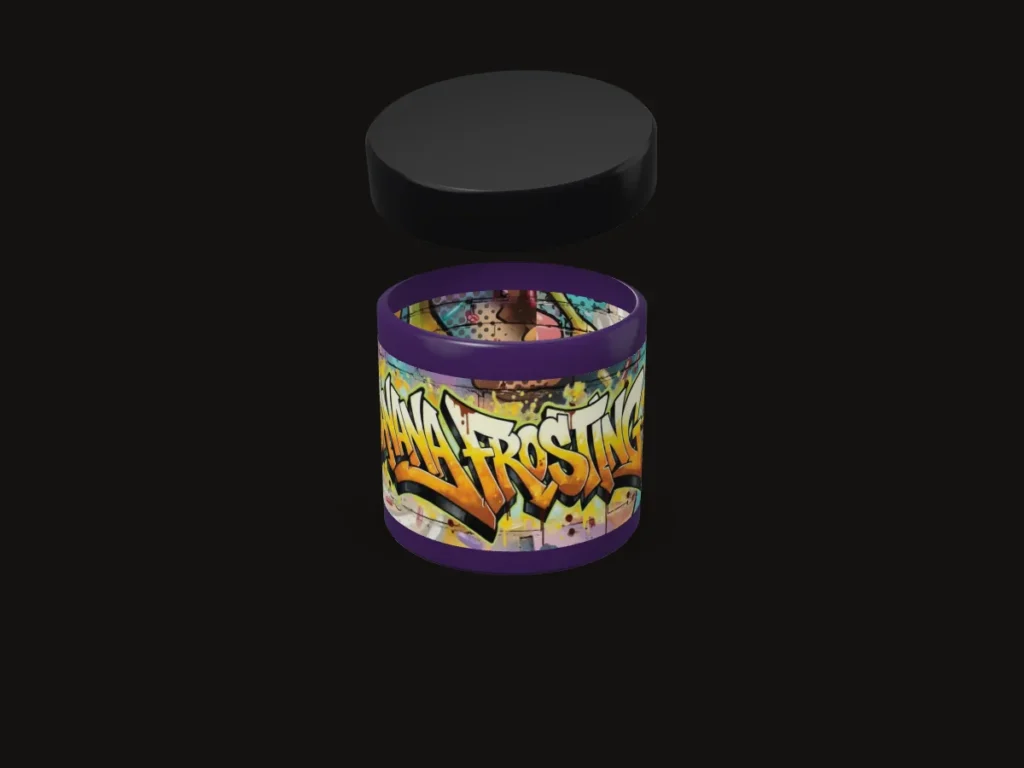
The wrap does the work
The lid is shown plain; the lettering and wrap are the design.
-
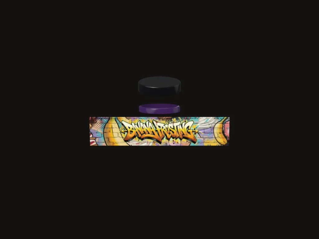
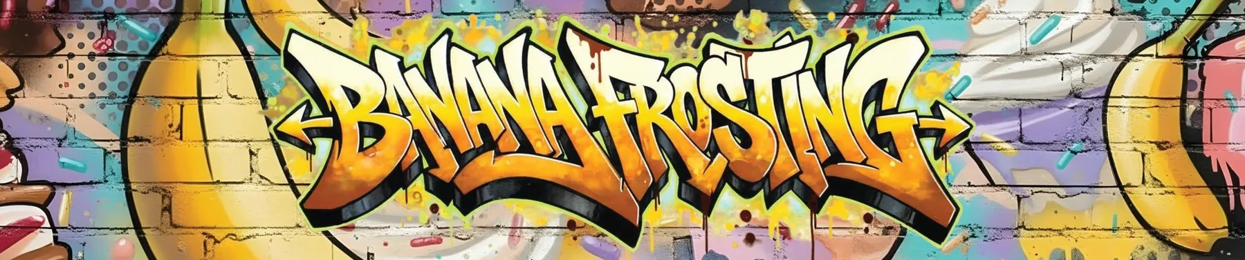
The full wrap
Opened flat: compressed proportions, uneven rhythm and extended terminals.
-
Four names, one hand
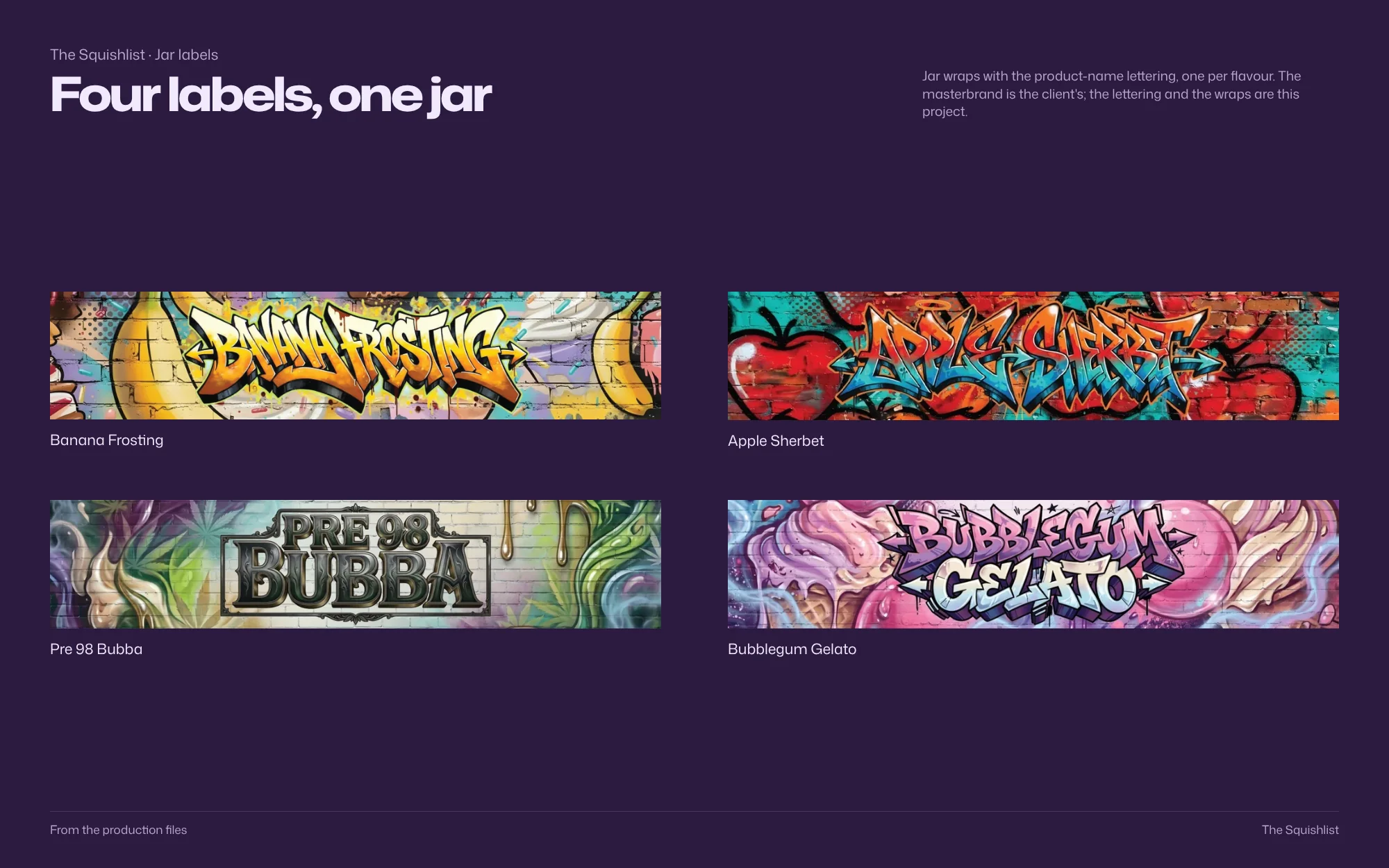
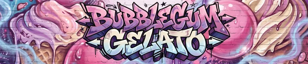
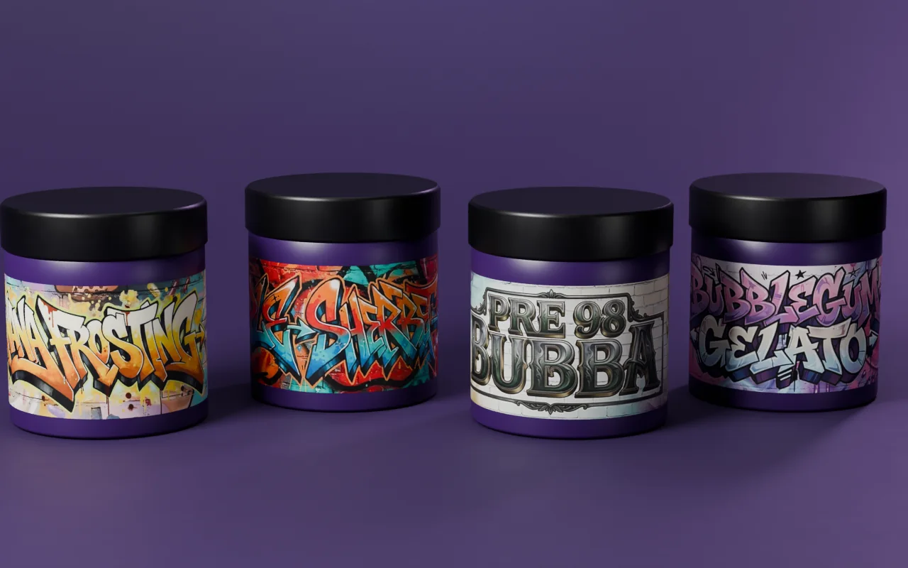
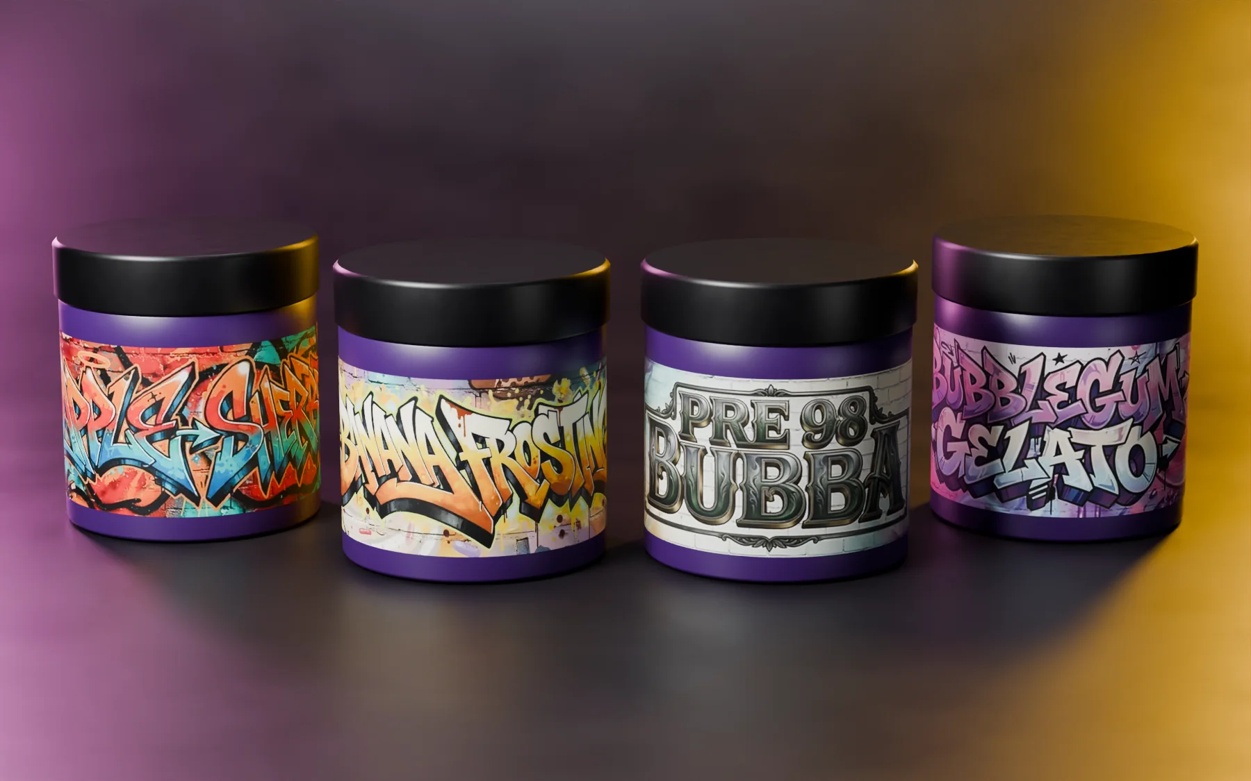
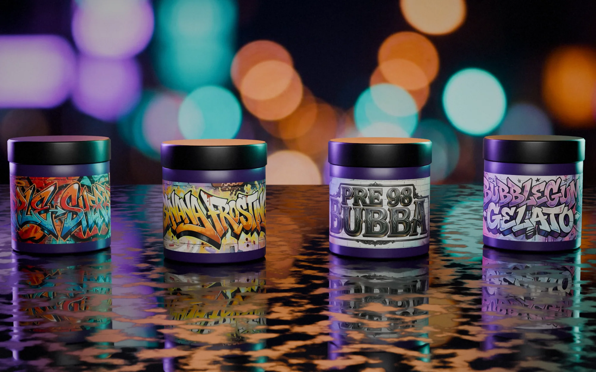
Banana Frosting, Apple Sherbet, Pre 98 Bubba and Bubblegum Gelato.
-
Heavy outlines
Outlines keep the names in front of detailed, AI-assisted backgrounds.
3D: the production artwork on the real dimensions
Identity
Colour, type and system

Palette
Sampled from the production files
- #3B3637 RGB 59 54 55
- #A54032 RGB 165 64 50
- #359499 RGB 53 148 153
- #887878 RGB 136 120 120
- #D7A445 RGB 215 164 69
- #CDBBB9 RGB 205 187 185
Type
System
Palette sampled from the production files; type and system as printed
Brandbook
The system, board by board
 Open full-size image
The artwork
Designed in detail
 Open full-size image
 Open full-size image
 Open full-size image
 Open full-size image
The range
4 variants, one system
-
Banana Frosting
-
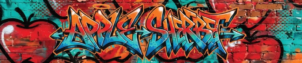
 Apple Sherbet
-
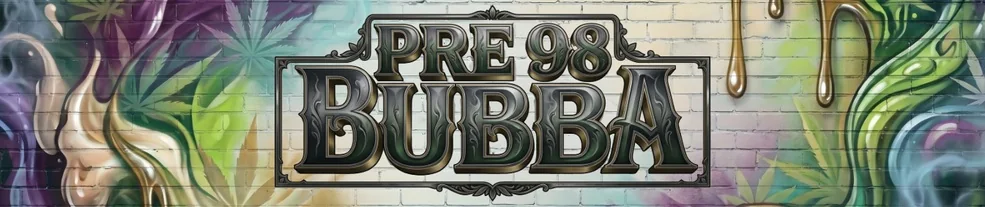
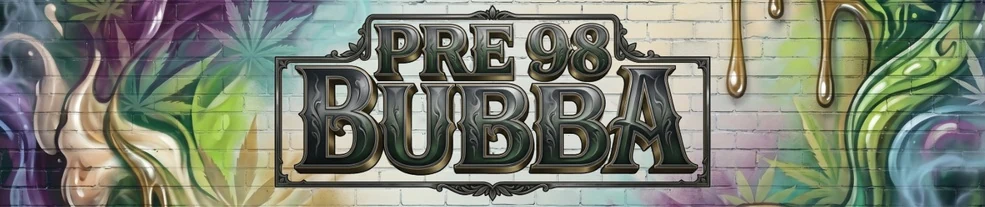 Pre 98 Bubba
-
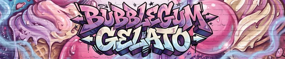 Bubblegum Gelato
Design decisions
Why it looks this way
-
 Open full-size image
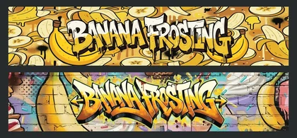
Original artworkBanana Frosting wrap The name is the illustration
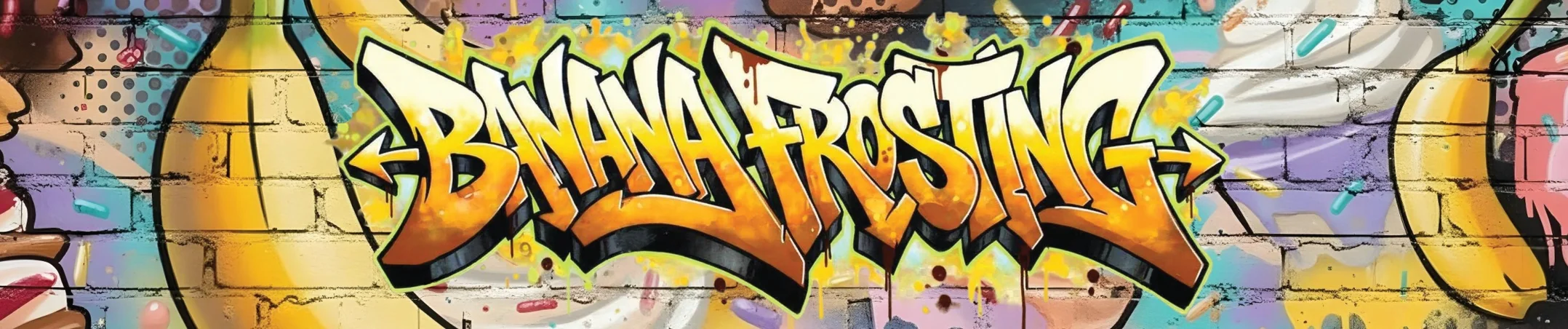
Banana Frosting is drawn as the main graphic: compressed proportions, uneven rhythm and extended terminals give it a recognisable silhouette.
-
 Open full-size image
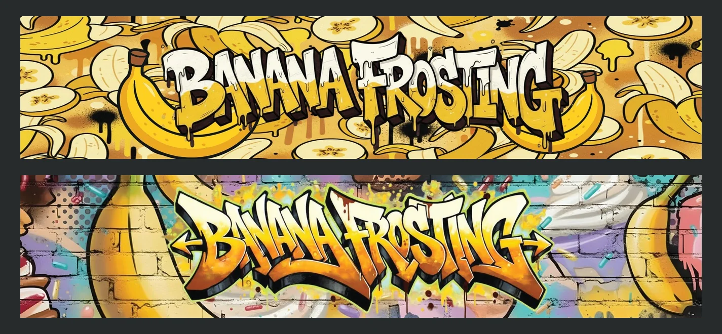
Original artwork Working versions, same letterforms
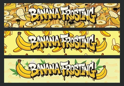
Three original working versions keep the custom lettering while trying different background treatments.
-
 Open full-size image
Original artwork Softer or sharper
Rounded letters on a warm field read playful; pointed terminals, black outlines and the brick field give the name a more assertive presence. A comparison of original files, not a dated history.
-
 Open full-size image
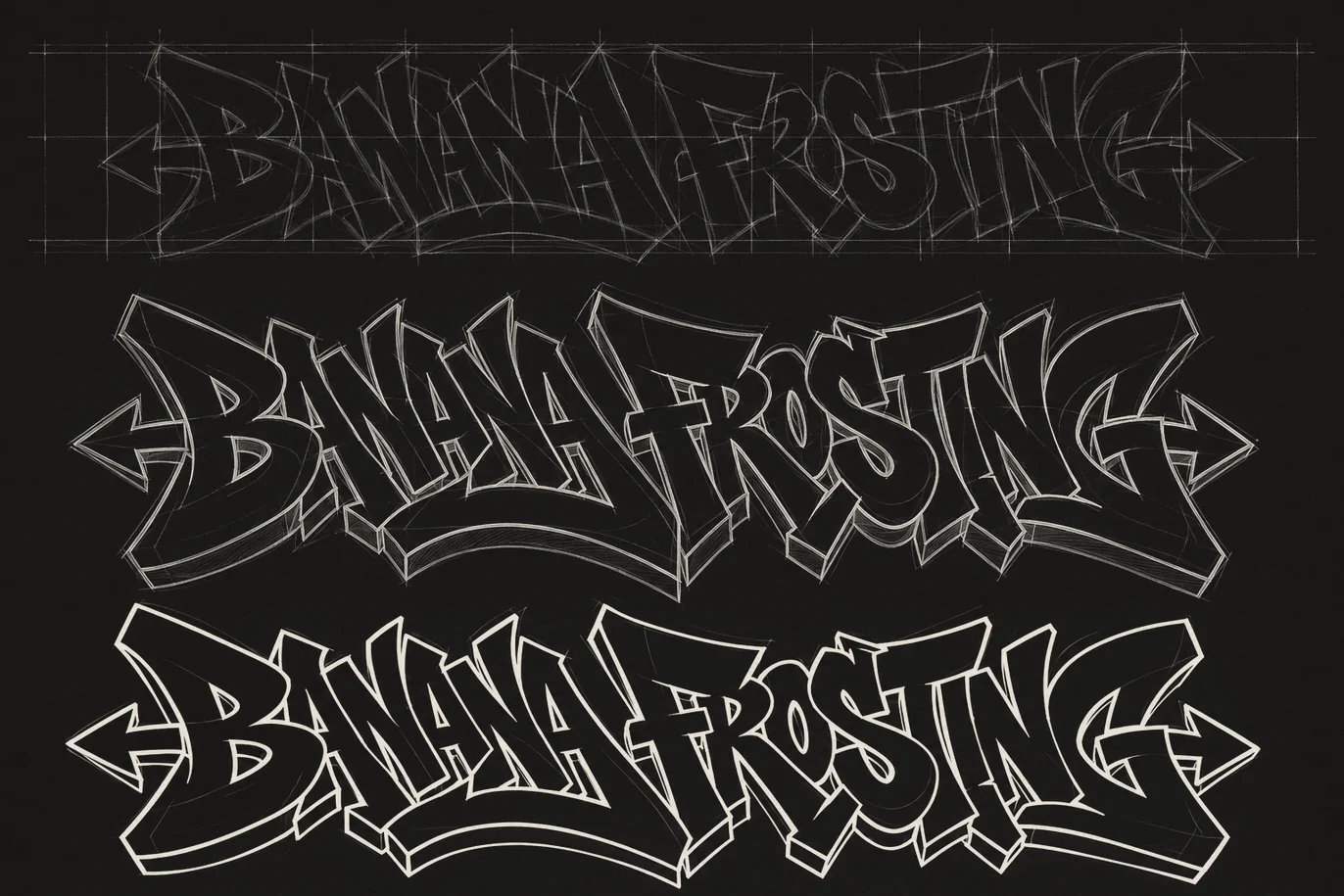
Reconstructed design studyReconstructed for this portfolio — not an original sketch Making the structure visible
A skeleton and outline study isolates the compression, slant and overlaps of the letters.
In context
 Open full-size image
 Open full-size image
 Open full-size image
 Open full-size image
 Open full-size image
Campaign
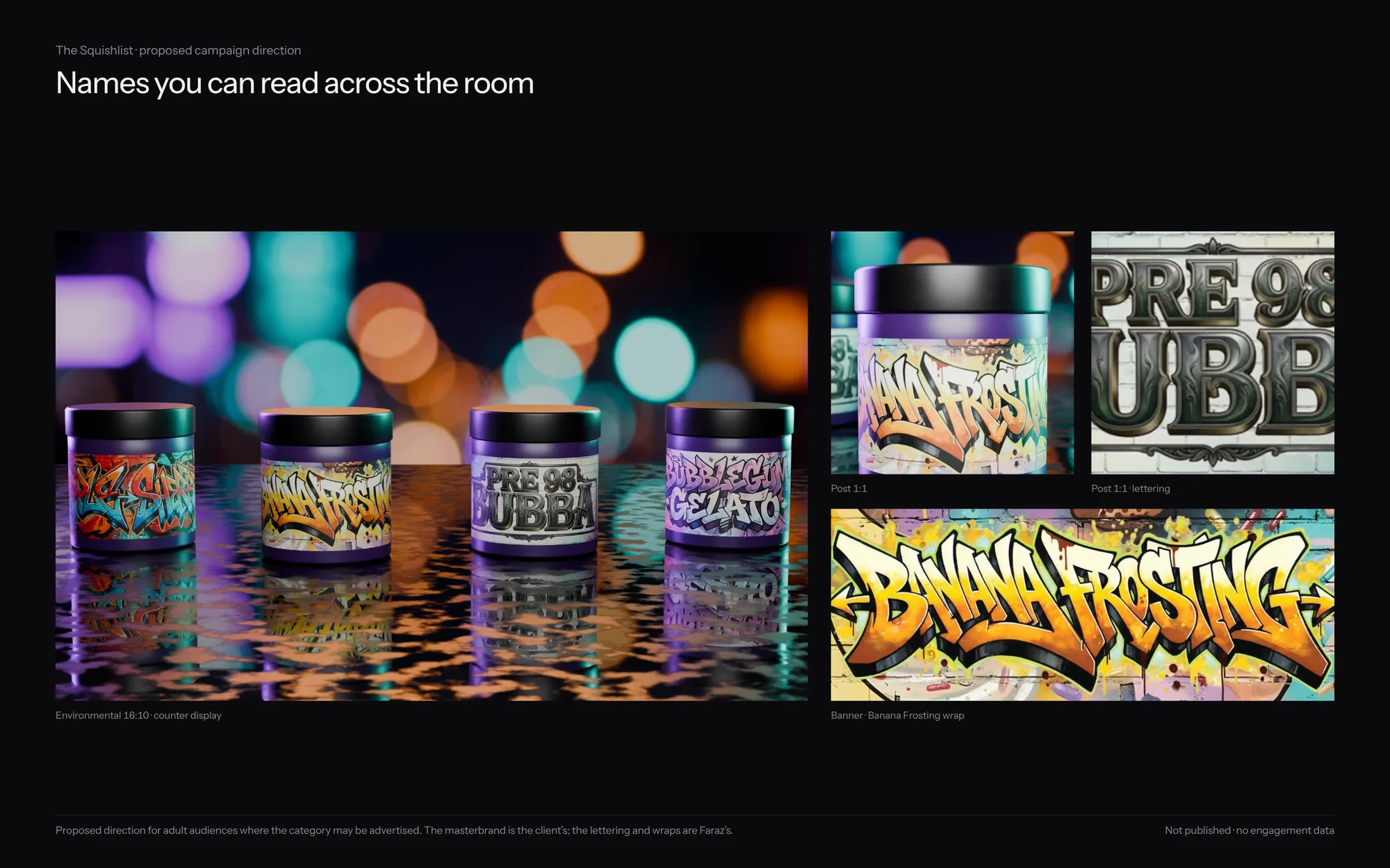
A proposed direction
 Open full-size image
By the numbers
- product names lettered
- 4
- product names lettered
- existing masterbrand kept intact
- 1
- existing masterbrand kept intact
Process & productionFull write-up, print specs, timeline, files, credits
Overview
The Squishlist is an existing brand. My part was the product-name lettering and the packaging artwork for individual products, composed into jar wraps under that masterbrand.
The challenge
Within an existing masterbrand, each product name needed its own personality while staying usable on a small-format label.
Creative direction
Each name is drawn as the main graphic — with its own letter shapes, rhythm and colour — and set into a wrap that keeps the masterbrand context.
What was delivered
Custom product-name lettering and packaging compositions, including several Banana Frosting versions and supplied wrap artwork for four products.
Design value
Distinctive name treatments give each product a recognisable character within the masterbrand. The portfolio shows the lettering and compositions, not ownership of the masterbrand or market performance.
The problem is framed from the finished work, not quoted from a client brief.
Delivered
- Product-name lettering
- Jar-wrap artwork
- Alternative visual treatments
Evidence
- Verified fact
- Lettering wraps are supplied for Banana Frosting, Apple Sherbet, Pre 98 Bubba and Bubblegum Gelato.
- Three original Banana Frosting working versions are in the source files.
- Design reading
- Heavy outlines keep the names dominant over detailed backgrounds.
Credits & notes
- Product lettering and wrap artwork — Faraz Khadivdjam
- Squishlist masterbrand — existing brand, not Faraz’s design
- Some imagery in this project is AI-assisted (as noted in the original portfolio)
- Studio renders — made in Blender from the production artwork, 2026
- Studio composites — production artwork rendered in Blender on background plates generated with Magnific (Freepik) from text prompts, 2026
- Studio sets — production artwork on the 3D models, rendered in Blender, 2026 (no generated imagery)
- Flat lays — production artwork rendered in Blender on top-down scenes generated with Magnific (Freepik) from text prompts, 2026
In short
Four names, four characters, and the masterbrand left intact.

Contact
Have a project in mind?
Tell me what you’re making, what you need designed, and your timeline. For design roles or collaborations, email me directly.
Email info@farazdesign.com