
VYBE
A six-flavour range that reads as one brand
Role Visual identity and packaging system
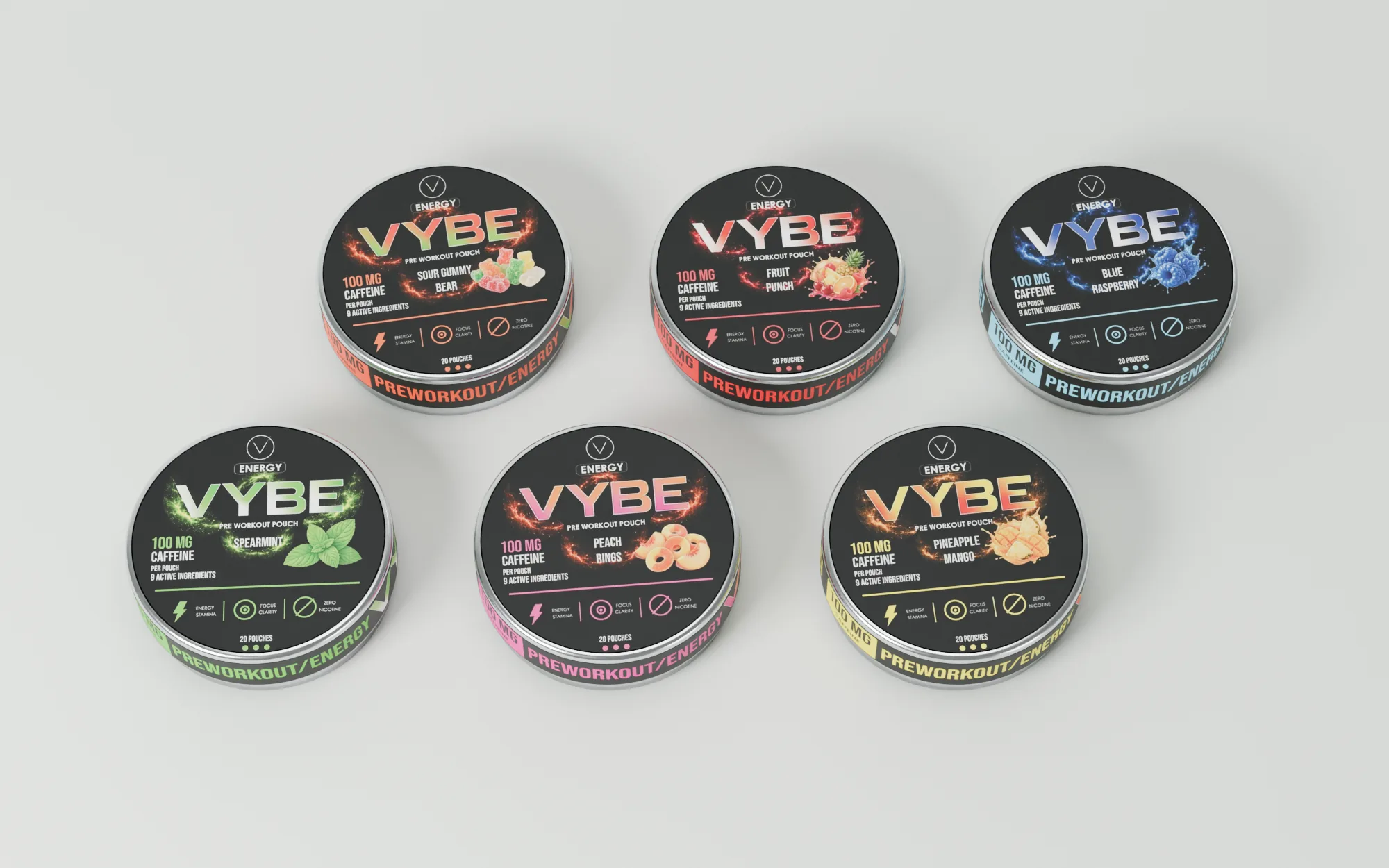
The design challenge
One frame for six flavours
Six energy-pouch flavours had to be easy to distinguish on a small round lid. I set the VYBE wordmark, caffeine information and flavour name in fixed positions. Colour and flavour artwork do the work of telling each tin apart.
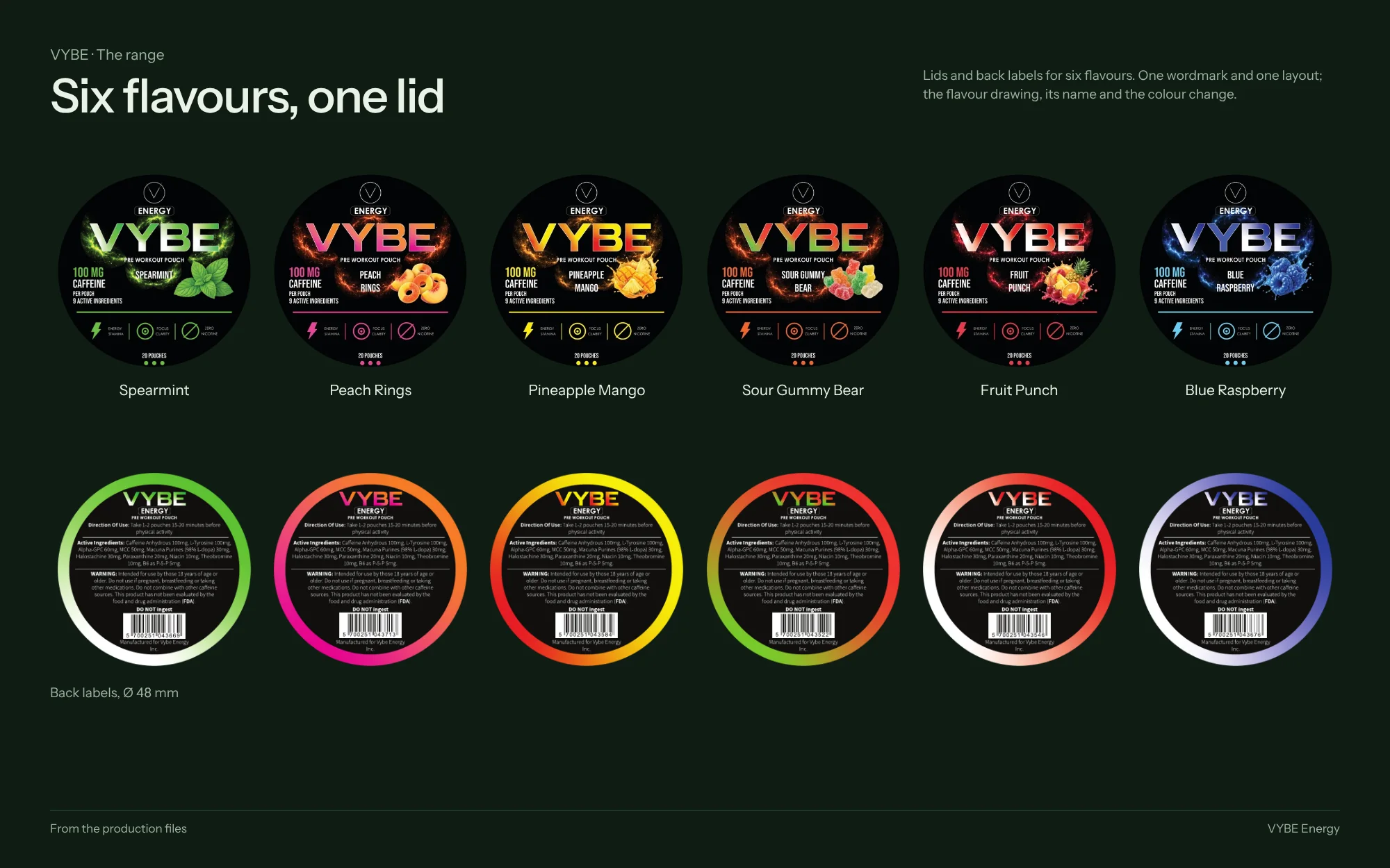
The system
Fixed positions, flexible colour
-
 Open full-size image
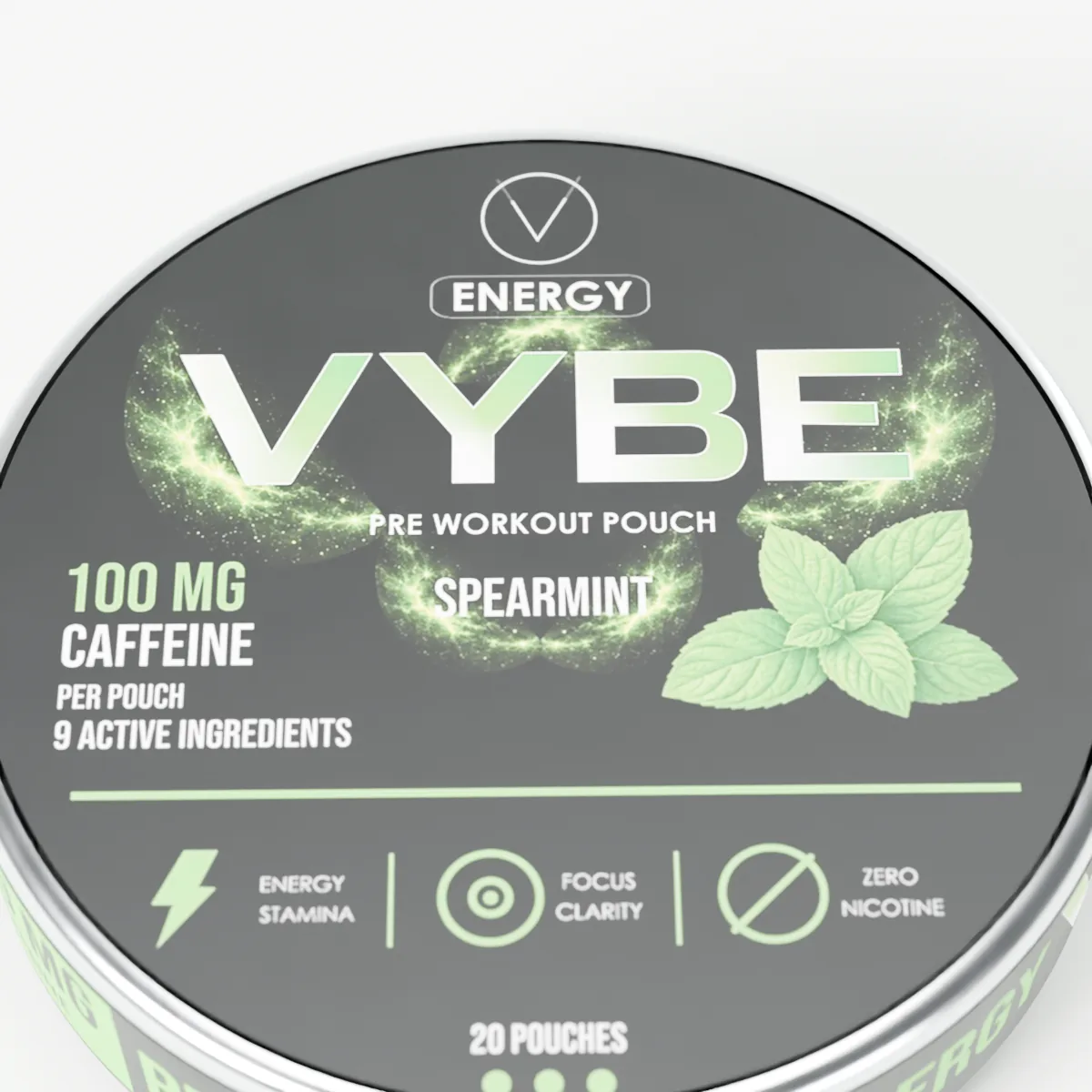
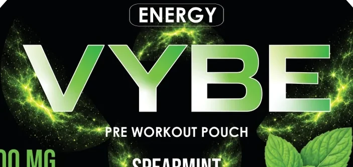
Studio render — production artworkSpearmint lid, close Wordmark and dose hold their place
The VYBE wordmark, the 100 mg caffeine line and the flavour name sit in the same positions on every lid.
-
 Open full-size image
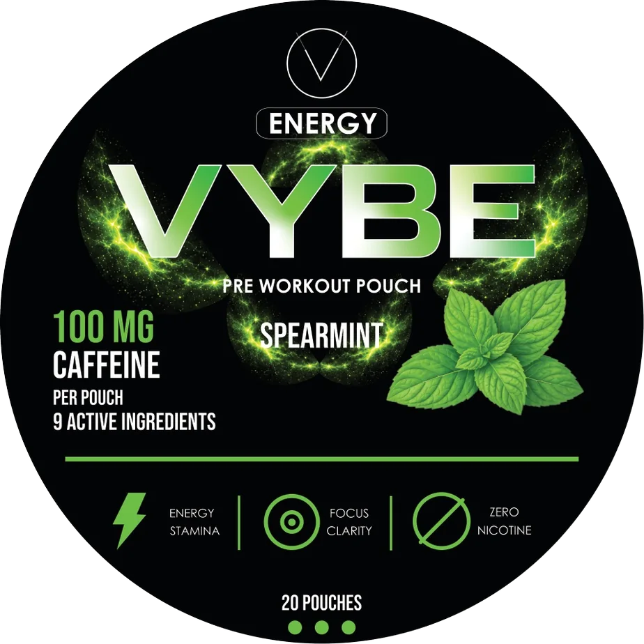
Original artworkSpearmint lid Colour and artwork do the sorting
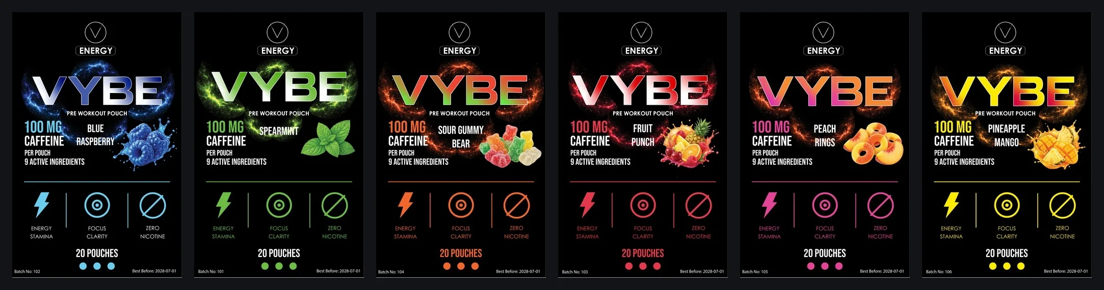
Each flavour changes only its colour and illustration, so six tins separate at a glance.
-
 Open full-size image
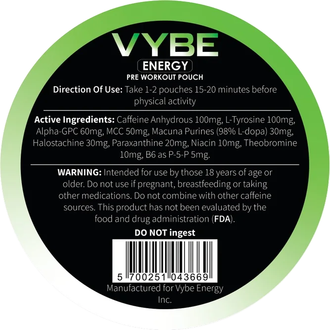
Original artworkReverse label Three surfaces, one pack
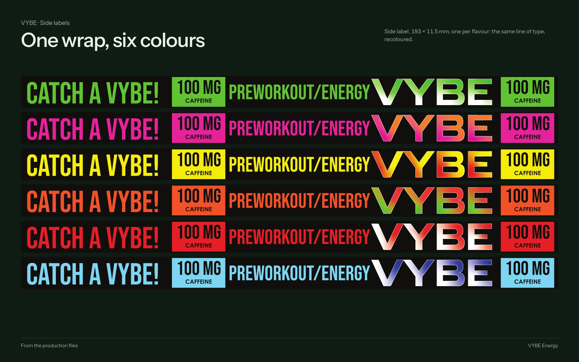
The reverse label separates the detailed copy from the identity; the narrow side wrap repeats the brand so it stays visible as the tin turns.
I applied that hierarchy across 18 lid, side and back labels, then adapted it to a taller rectangular format.
Identity
Colour, type and system
Palette
Sampled from the production files
- #040507 RGB 4 5 7
- #3E302B RGB 62 48 43
- #6C8775 RGB 108 135 117
- #C56342 RGB 197 99 66
- #DEC993 RGB 222 201 147
Type

Palette sampled from the production files; type and system as printed
Brandbook and range
What stays, what changes
Select a board to open it at full resolution.
Original artwork
The files, at readable size
 Open full-size image
In use
Where it meets people
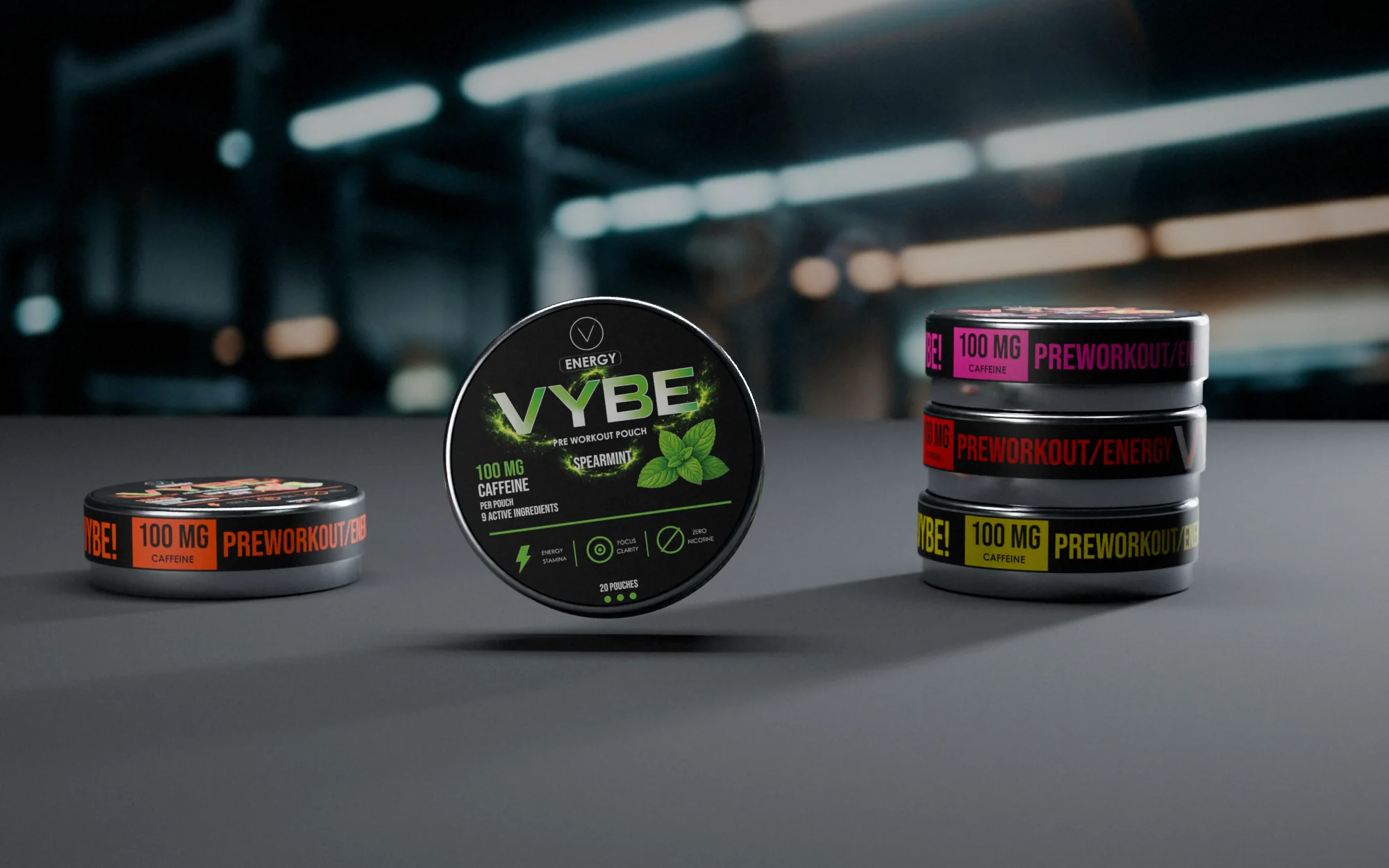 Open full-size image
Part by part
One tin, six flavours
-
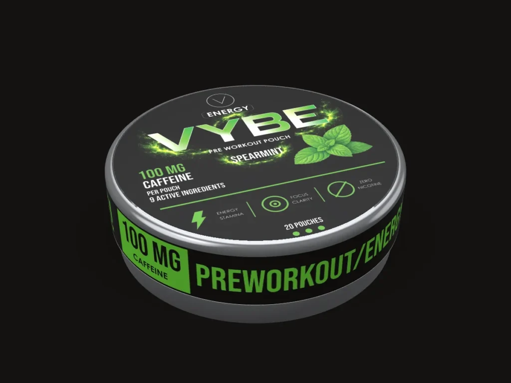
An angular wordmark leads
Visual identity and packaging for a six-flavour energy range in a round tin.
-
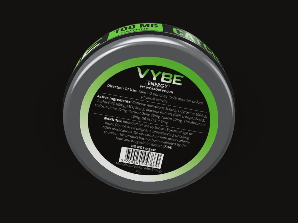
The reverse
A Ø 48 mm back label holds the detailed copy, apart from the identity.
-
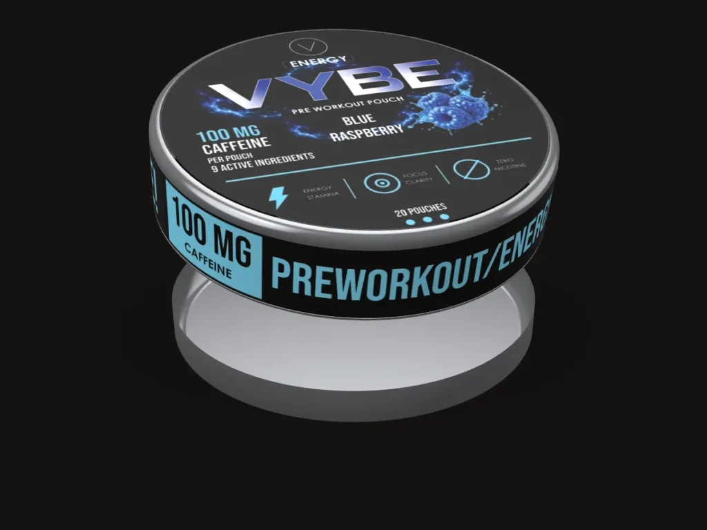
Six flavours
Spearmint, Peach Rings, Pineapple Mango, Sour Gummy Bear, Fruit Punch and Blue Raspberry.
3D: the production artwork on the real dimensions
Delivered
What I delivered
- Six flavour lid labels
- Six side labels, 193 × 11.5 mm
- Six back labels, Ø 48 mm
- Six taller rectangular label layouts
- flavours on one system
- 6
- print-ready labels: lid, side and back
- 18
- layouts including the rectangular format
- 24
- for all twelve side and back labels
- 5 days
Print specs, process and creditsSizes, the full write-up, files and sources
Built to print
- Side label
- 193 × 11.5 mm wrap
- Back label
- Ø 48 mm: directions, active ingredients, warnings, FDA disclaimer
- Barcode
- EAN-13 on the back label
- Fixed callout
- 100 mg caffeine per pouch
- Files
- Adobe Illustrator, vector PDF per label
Overview
VYBE Energy is a pre-workout pouch in a round tin; every lid states 100 mg caffeine per pouch. The supplied range has six flavours: Spearmint, Peach Rings, Pineapple Mango, Sour Gummy Bear, Fruit Punch and Blue Raspberry.
The challenge
A six-flavour range needed distinct variants while keeping a clear family identity. The front, reverse and wrap also had to work as connected parts of the same pack.
Creative direction
Fixed: the wordmark, product category and order of information. Variable: flavour colour, imagery and name. The same rules carry from the lid to the reverse label, the narrow side wrap and a taller rectangular label format.
What was delivered
Six flavour identities with lid, reverse and side artwork, plus six taller label layouts that carry the system into a rectangular format.
Design value
The system gives the brand a repeatable way to distinguish variants without rebuilding each label. Sales or recognition gains were not measured.
The problem is framed from the finished work, not quoted from a client brief.
Timeline
- 4 Jul 2026
Side and back labels for all six flavours
- 8 Jul 2026
Side labels final
Evidence
- Verified fact
- Six flavour lids are supplied, each stating 100 mg caffeine per pouch.
- Lid, reverse label, side wrap and six rectangular layouts are in the source files.
- Design reading
- Fixed positions with a changing flavour colour make the range read as one family.
- Intended benefit
- New flavours can be added by changing colour, imagery and name.
Credits & notes
- Identity and label artwork — Faraz Khadivdjam
- Studio renders — made in Blender from the production artwork, 2026
- Studio composites — production artwork rendered in Blender on background plates generated with Magnific (Freepik) from text prompts, 2026
- Studio sets — production artwork on the 3D models, rendered in Blender, 2026 (no generated imagery)
- Flat lays — production artwork rendered in Blender on top-down scenes generated with Magnific (Freepik) from text prompts, 2026
A fixed frame and six flavour signals: one brand at arm’s length, six products up close.
Contact
Have a project in mind?
Tell me what you’re making, what you need designed, and your timeline. For design roles or collaborations, email me directly.
Email info@farazdesign.com