
Manhattan
Two directions inside one packaging format.
- Problem
- Brand identity had to find room on a pack dominated by mandatory health warnings.
- Solution
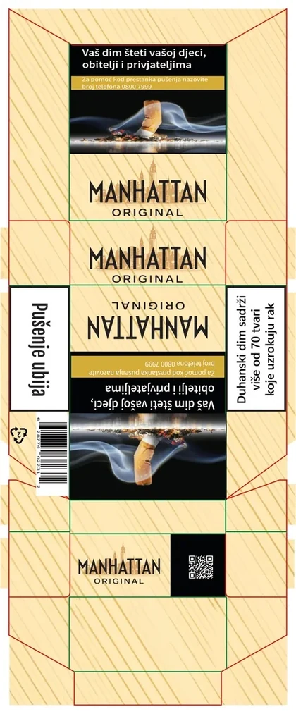
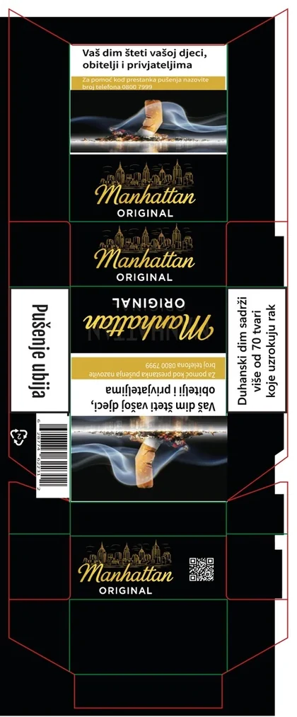
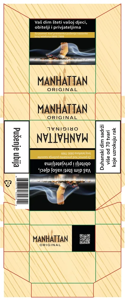
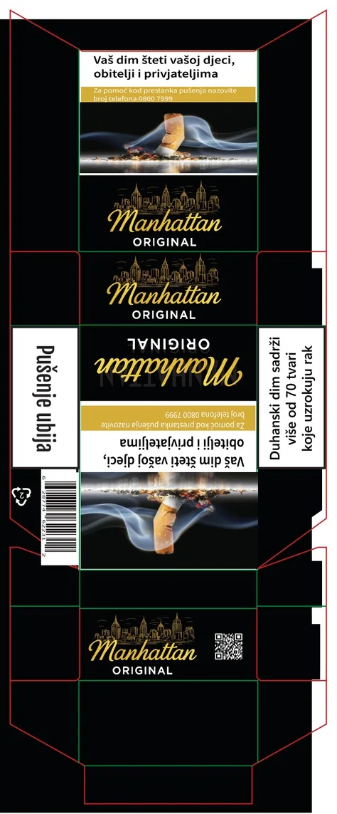
- Two art directions on one structure: beige with architectural lettering, and black with gold script.
- Result
- Two complete pack directions sharing one structure.
My role Packaging graphics · alternative design directions

Manhattan Original Script and skyline · flip-top pack
3D model — original artwork Folded from the supplied dieline: every panel turns on its real crease.
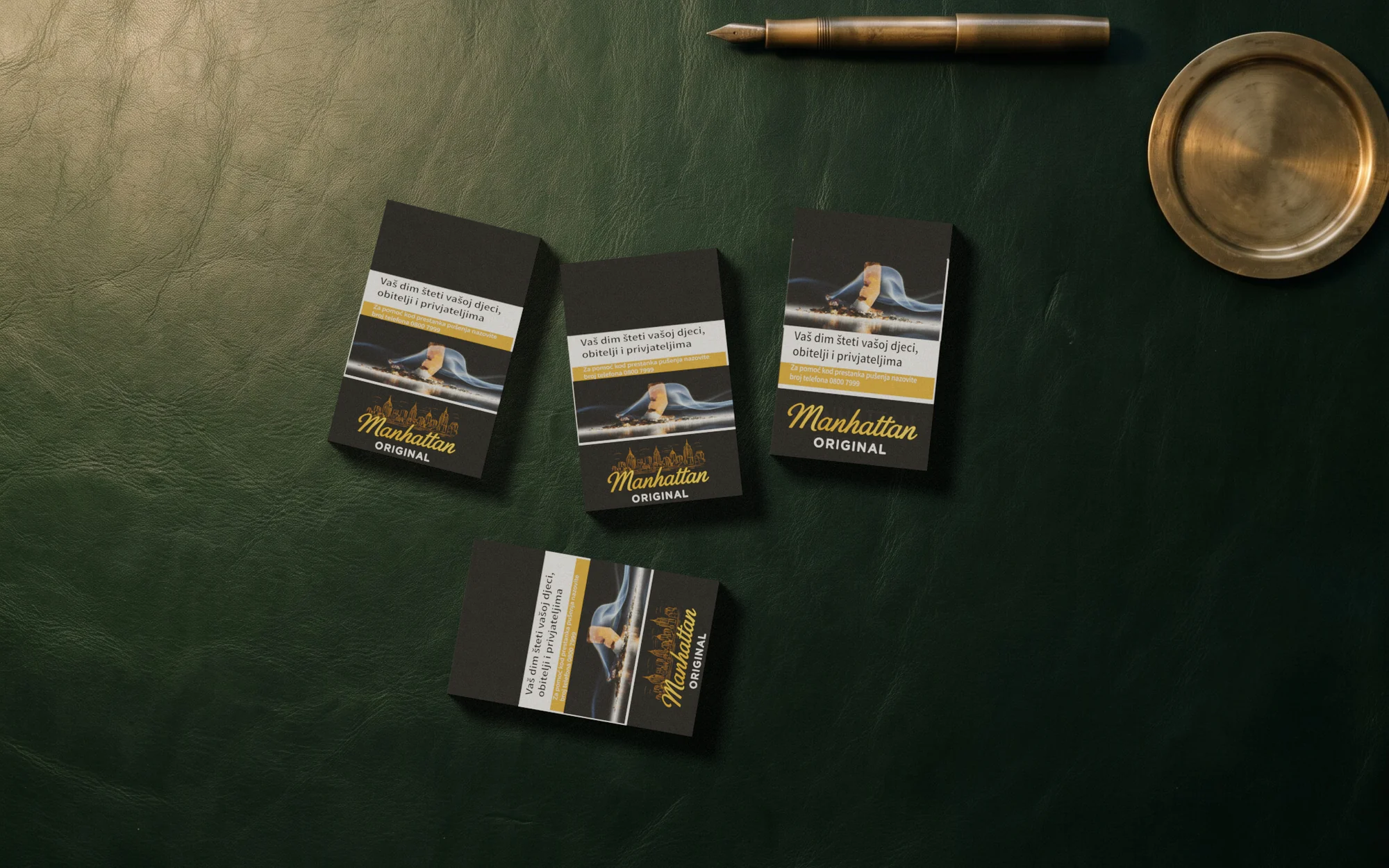
Packaging graphics for a flip-top cigarette pack in two alternative directions: script and skyline, or architectural lettering.
 Open full-size image
Part by part
One sheet, folded into a pack
-
One sheet, one pack
A flip-top pack of about 55.5 × 87 × 23 mm, folded here from the supplied dieline.
-

Script and skyline
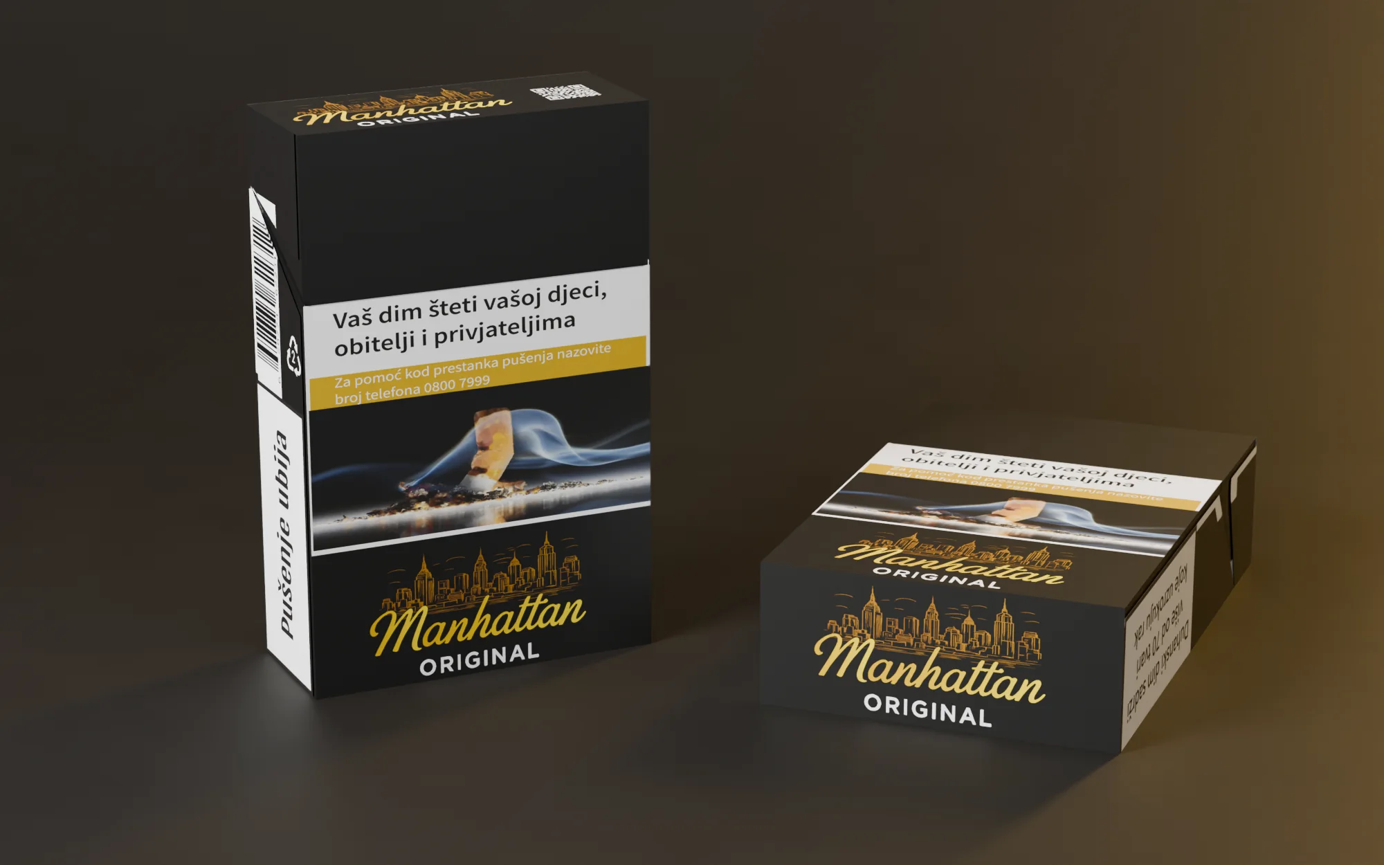
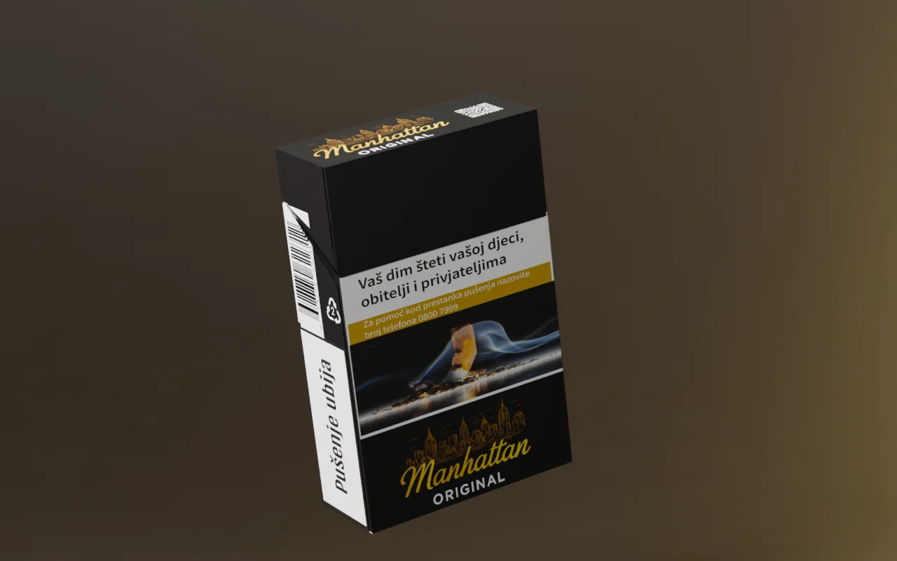
Gold script and a line-drawn skyline on black; the mark sits at the foot of the front.
-

Warnings on every face
Front and back carry the picture warning; the sides carry the two text warnings and the barcode.
-
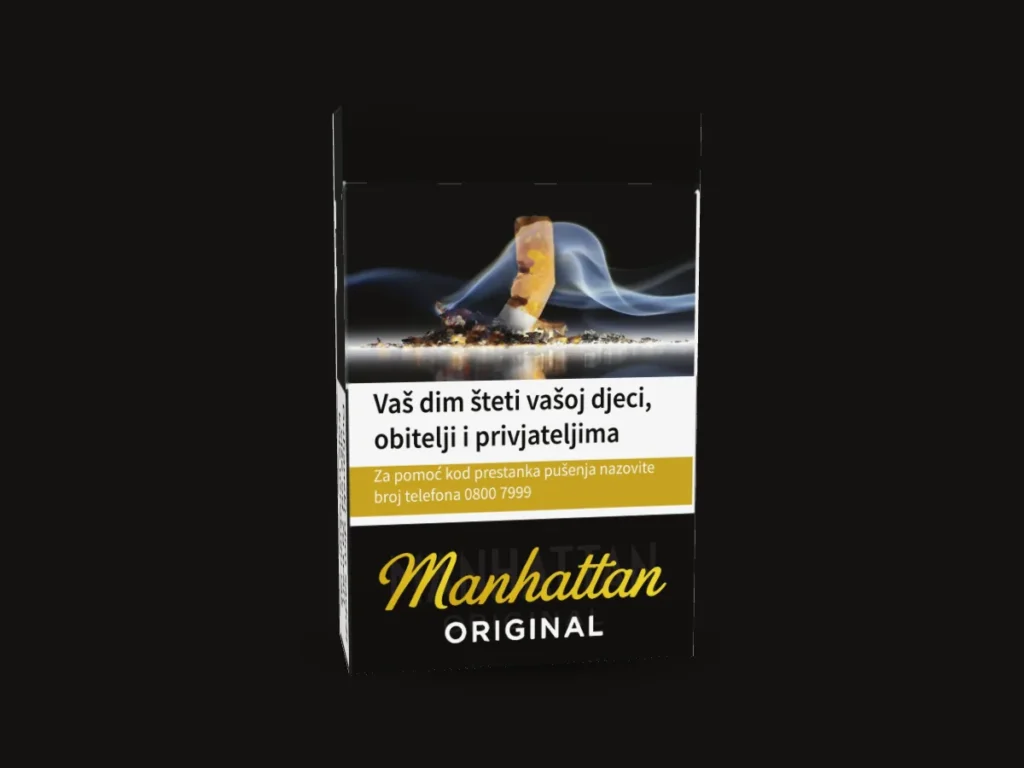
The back
The picture warning repeats on the back, above the mark.
-

The lid
The top of the lid carries the mark and a QR code.
-

Opened on its creases
Each panel turns on its real crease: inner flaps first, then the sides, then the lid and back.
-
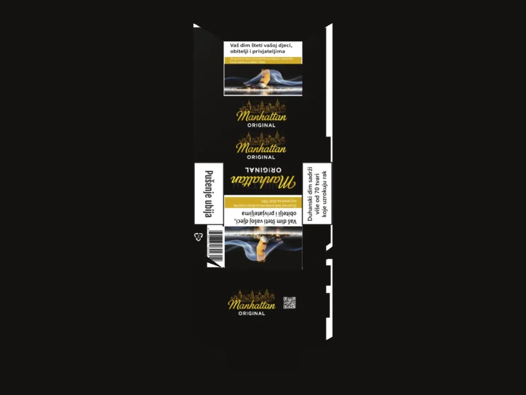
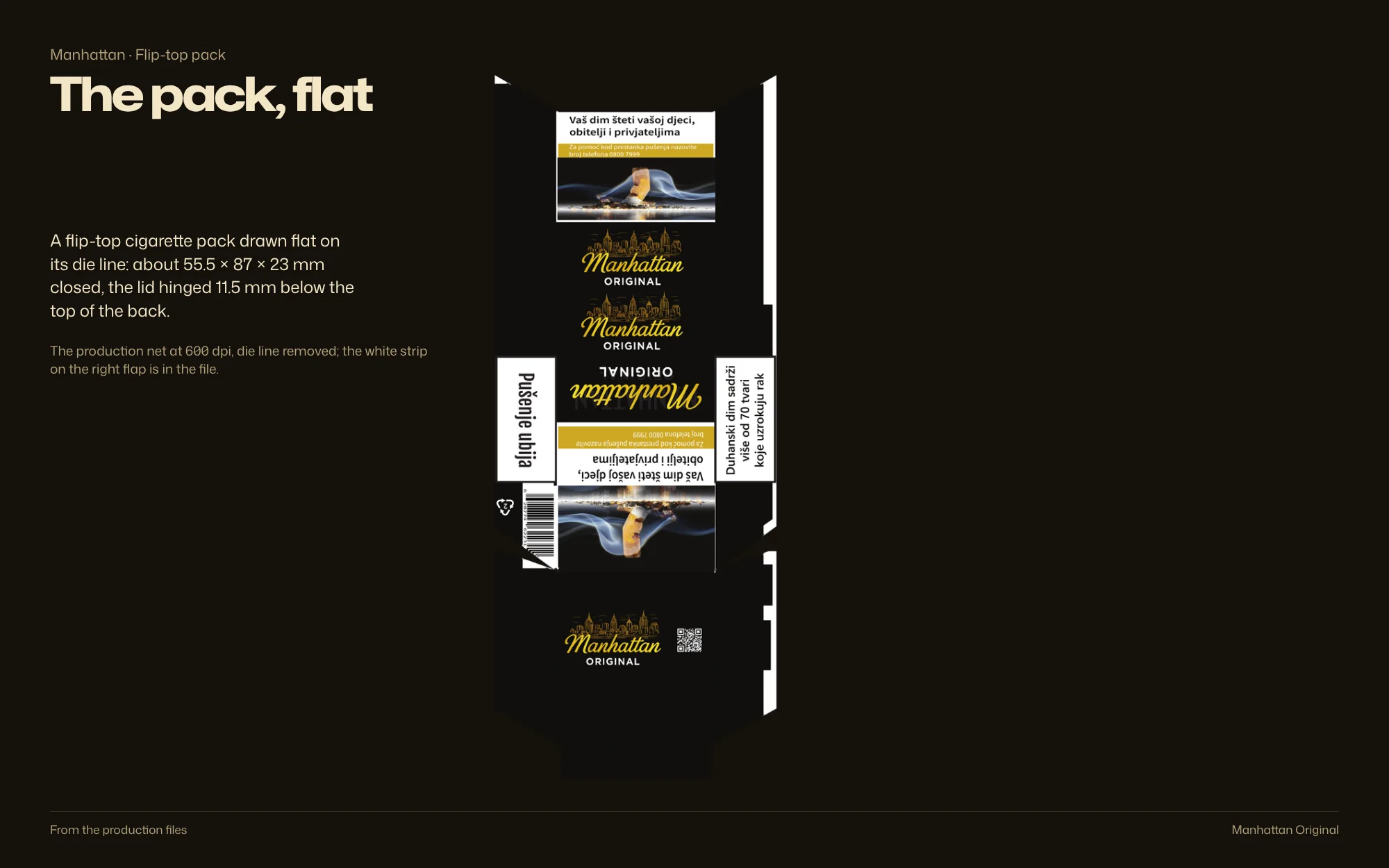
The flat dieline
The printed net as supplied: about 98 × 246 mm, with the die-cut outline.
3D: the supplied dieline, folded in the browser
Identity
Colour, type and system
Palette
Sampled from the production files
- #060708 RGB 6 7 8
- #3A372F RGB 58 55 47
- #797569 RGB 121 117 105
- #C3B286 RGB 195 178 134
- #F6E1B0 RGB 246 225 176
- #F9F7F6 RGB 249 247 246
Type
System
Palette sampled from the production files; type and system as printed
Brandbook
The system, board by board
 Open full-size image
Design decisions
Why it looks this way
-
 Open full-size image
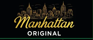
Original artwork Script and skyline
A flowing script and gold skyline on black: a simpler, higher-contrast palette.
-
 Open full-size image
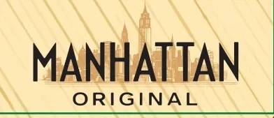
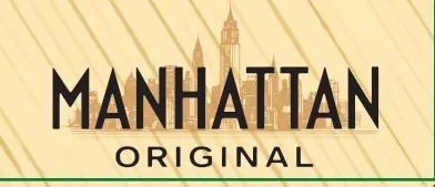
Original artwork Architectural lettering
Angular, condensed capitals echo the skyline; a warm beige field and diagonal texture add rhythm.
In context
 Open full-size image
 Open full-size image
By the numbers
- complete pack directions
- 2
- complete pack directions
- shared structure for both
- 1
- shared structure for both
Before / after
Two directions, one format
Drag to compare. Brand panels, warnings, side copy, barcode and closure flaps stay in place; only the typography and palette change. These are alternative directions, not a before-and-after.
Process & productionFull write-up, print specs, timeline, files, credits
Overview
Manhattan is a flip-top cigarette pack with a large mandatory warning area. Two directions explore different ways to give the brand presence inside the same format; the sources do not say which was chosen.
The challenge
Make room for an identifiable brand inside a warning-heavy pack.
Creative direction
Both directions keep the same broad structure — brand panels, warnings, side copy, barcodes and closure flaps — and change only the typographic voice and palette.
What was delivered
Two original front directions and two complete pack artworks.
Design value
The comparison shows range in art direction within one physical format. It does not establish which direction was chosen or how either performed.
The problem is framed from the finished work, not quoted from a client brief.
Delivered
- Two front-panel directions
- Two complete pack dielines
Built to print
- Format
- Flip-top cigarette pack, about 55.5 × 87 × 23 mm closed
- Directions
- Beige with architectural lettering · black with gold script
- Mandatory copy
- Croatian health warnings, side panels and barcode
Evidence
- Verified fact
- Two complete pack layouts are supplied, beige and black; the black one as a vector dieline.
- The dieline folds to a flip-top pack of about 55.5 × 87 × 23 mm, with the lid hinged 11.5 mm below the top of the back.
- Design reading
- Typography alone shifts the tone between the two directions.
Credits & notes
- Packaging graphics — Faraz Khadivdjam
- Studio view — AI-assisted presentation mockup
- Shown as alternative directions, not a before-and-after
- Studio composites — production artwork rendered in Blender on background plates generated with Magnific (Freepik) from text prompts, 2026
- Studio sets — production artwork on the 3D models, rendered in Blender, 2026 (no generated imagery)
- Flat lays — production artwork rendered in Blender on top-down scenes generated with Magnific (Freepik) from text prompts, 2026
In short
Two complete directions, both working inside the same mandatory warning layout.
Contact
Have a project in mind?
Tell me what you’re making, what you need designed, and your timeline. For design roles or collaborations, email me directly.
Email info@farazdesign.com